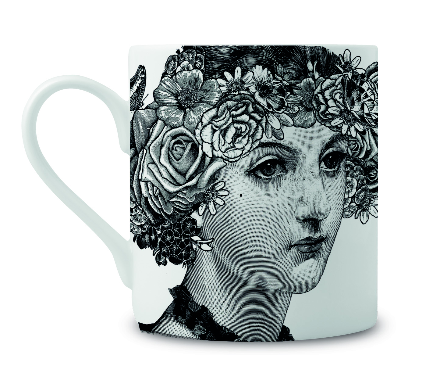
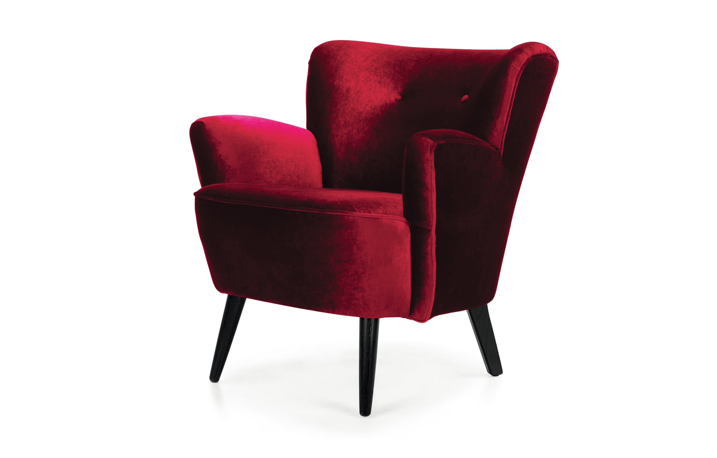
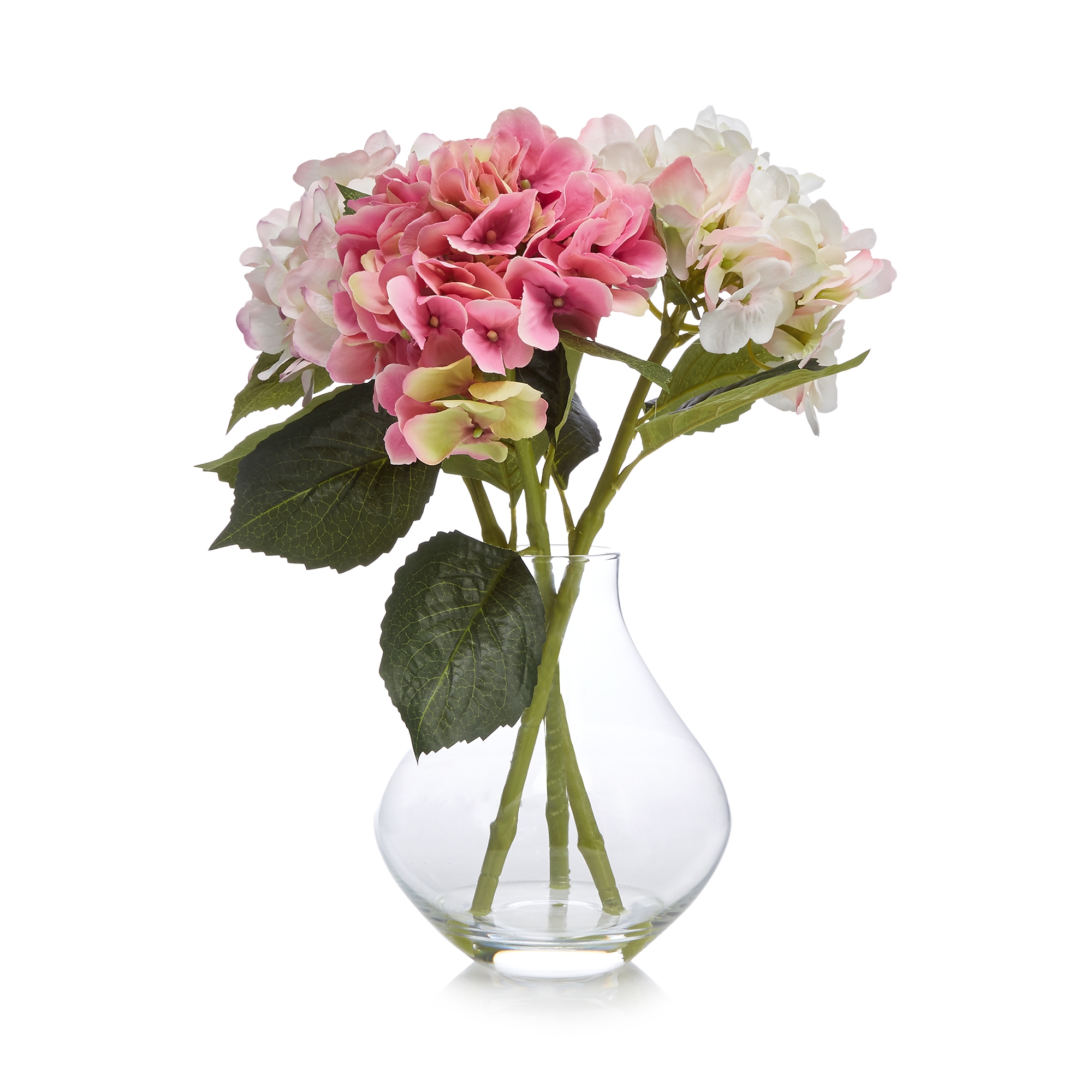
Move over pastels, hello dark and dramatic modern florals (Inside my latest Cosmo column)
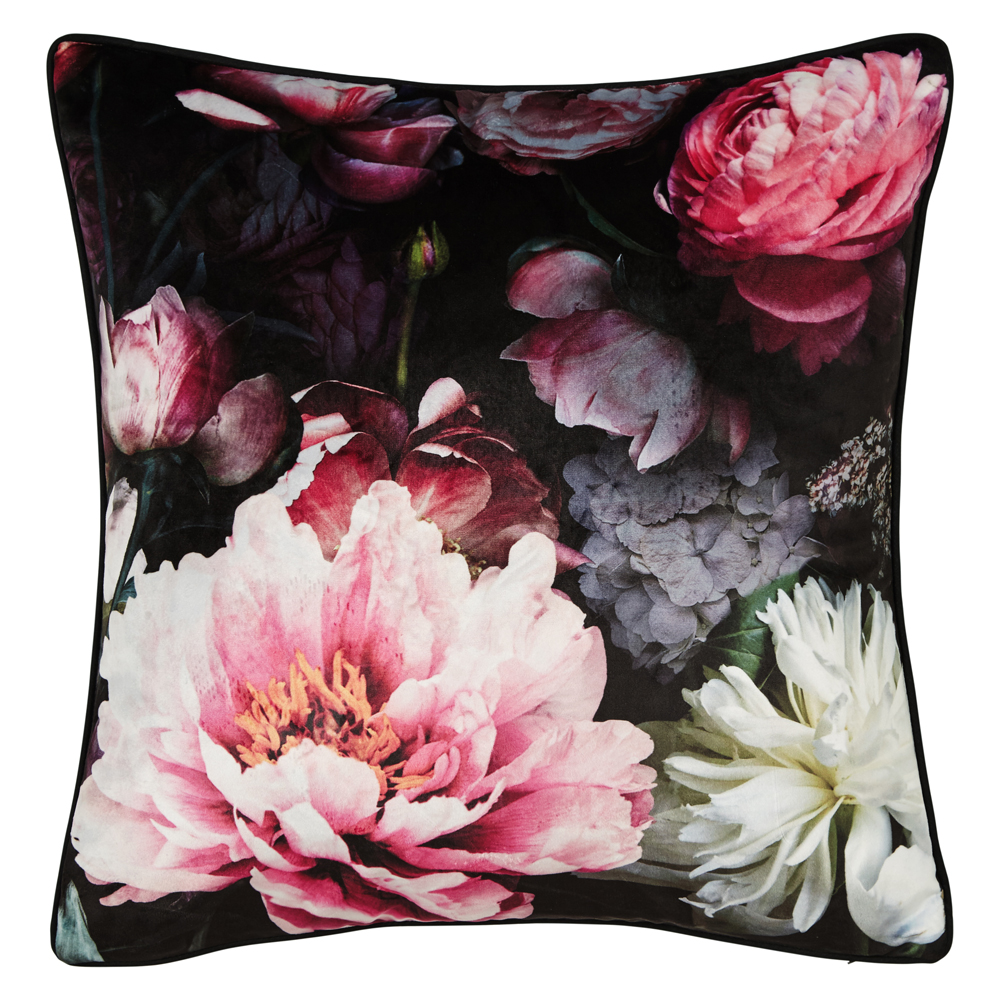
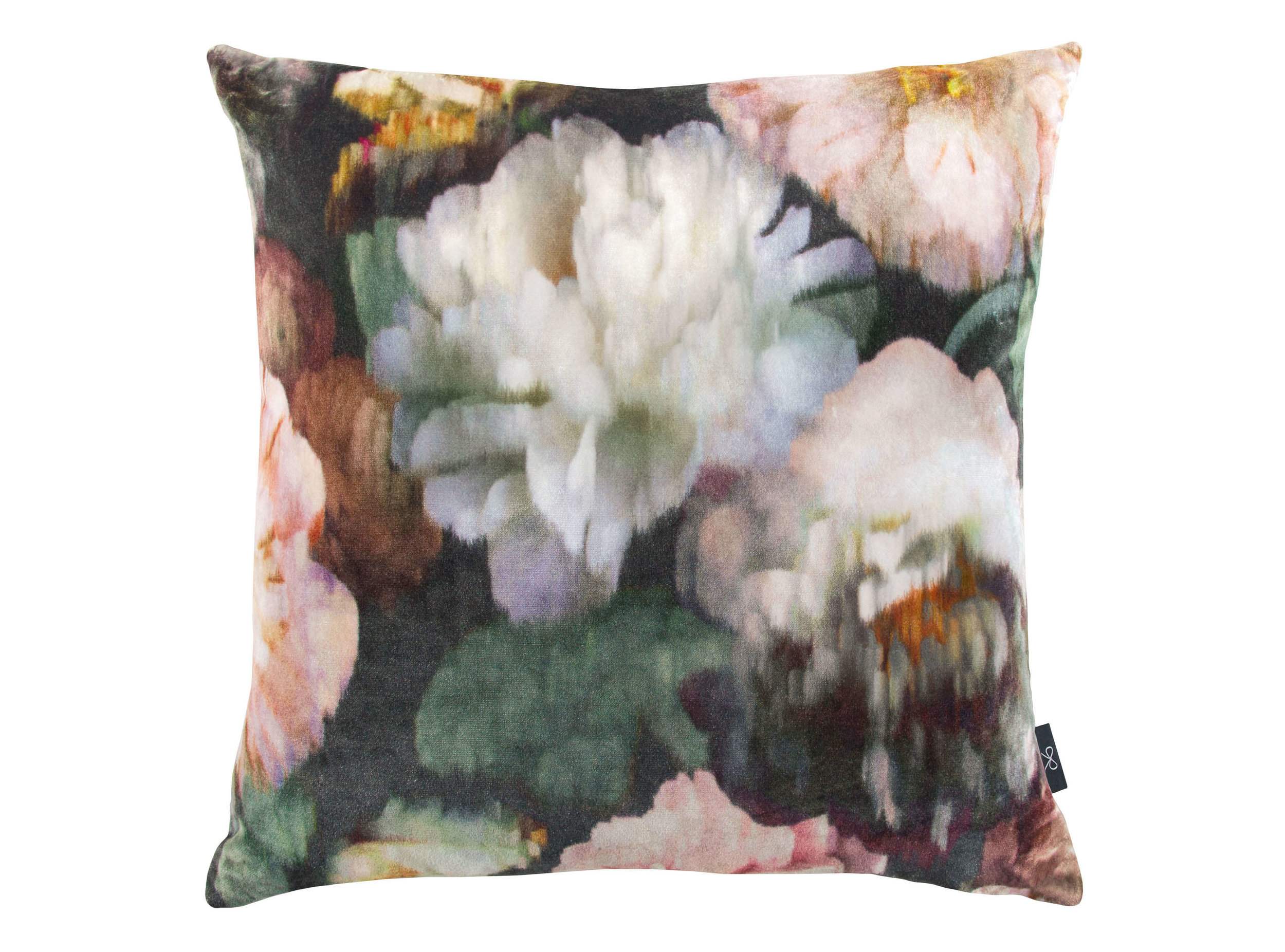
Move over pretty, ditsy floral prints. Make way for the new drama queens of the floral world. Right now it's all about these gorgeous dark, digitally printed blooms which bring a shot of instant grown up glamour to any scheme.
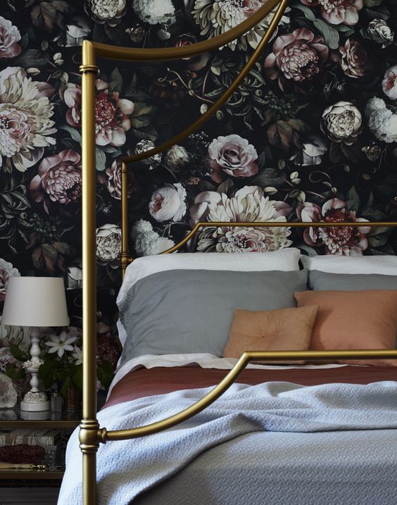
I talked a bit about this trend in my blogpost on incredible statement wallpapers you need to know about. Ellie Cashman's floral wallpaper prints are the opposite of twee and were a major source of inspiration when I was putting together this page. Unfortunately wallpaper doesn't really work with the layout of the Design Doubles so I couldn't include it, but I wanted to give it a shout out here anyway because it's oh so beautiful and it's gives us all another excuse to drool over it.
Image - Design Sponge
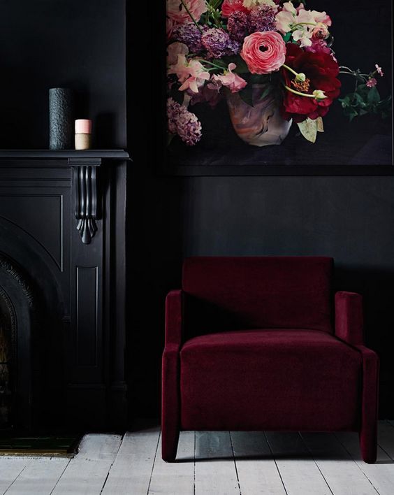
This was another image I had pinned a while back and I kept coming back to these colours in my head whenever I thought about these modern florals. Sexy, sultry and super cool.
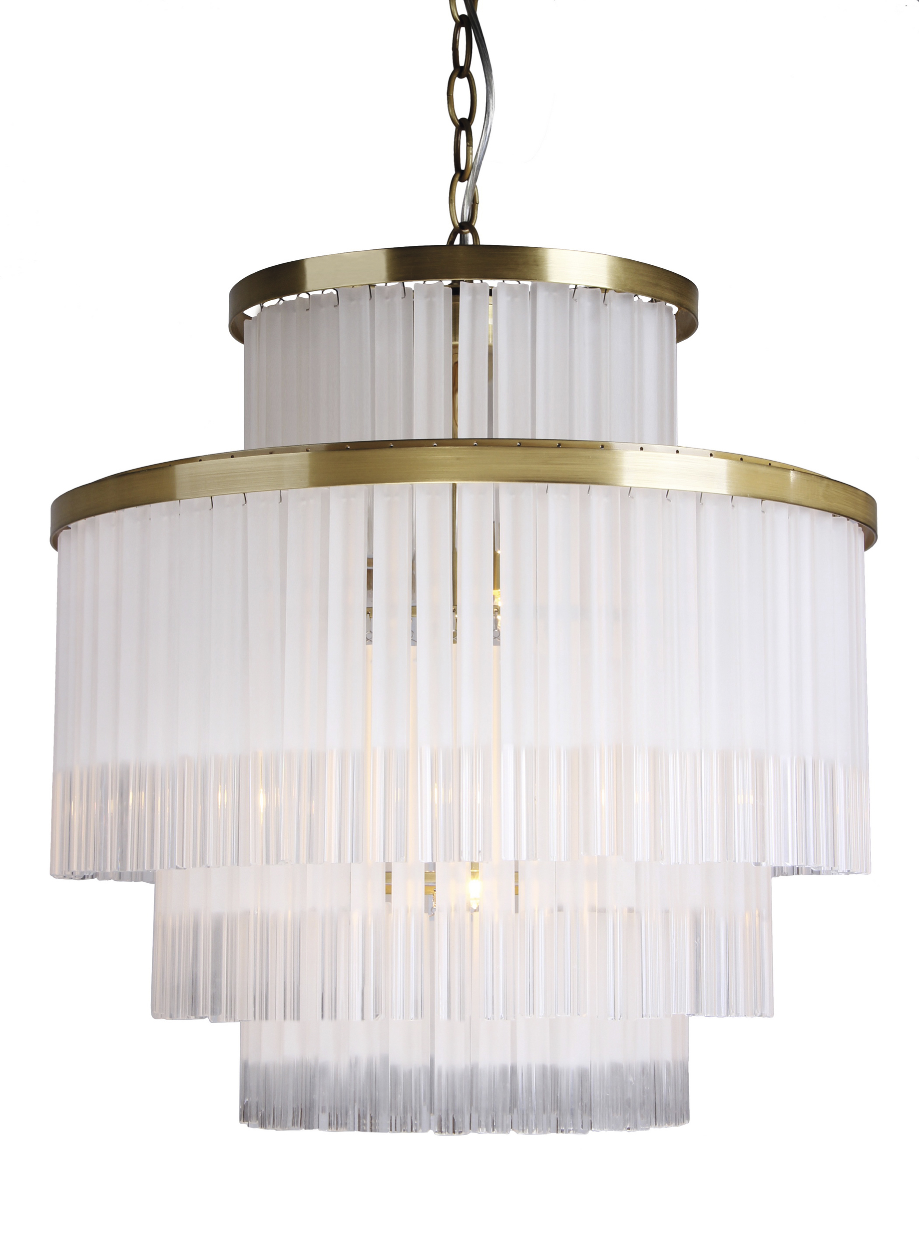
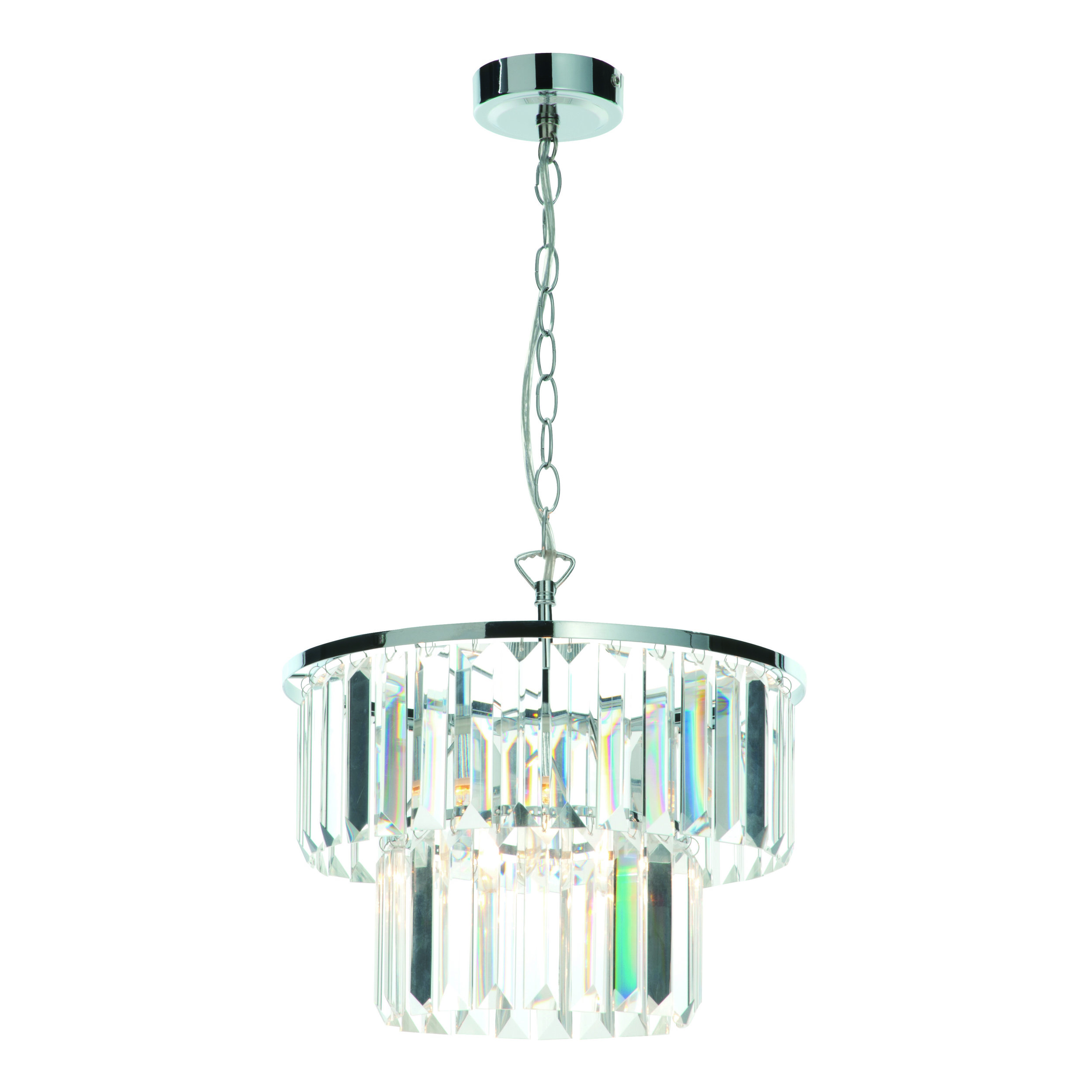
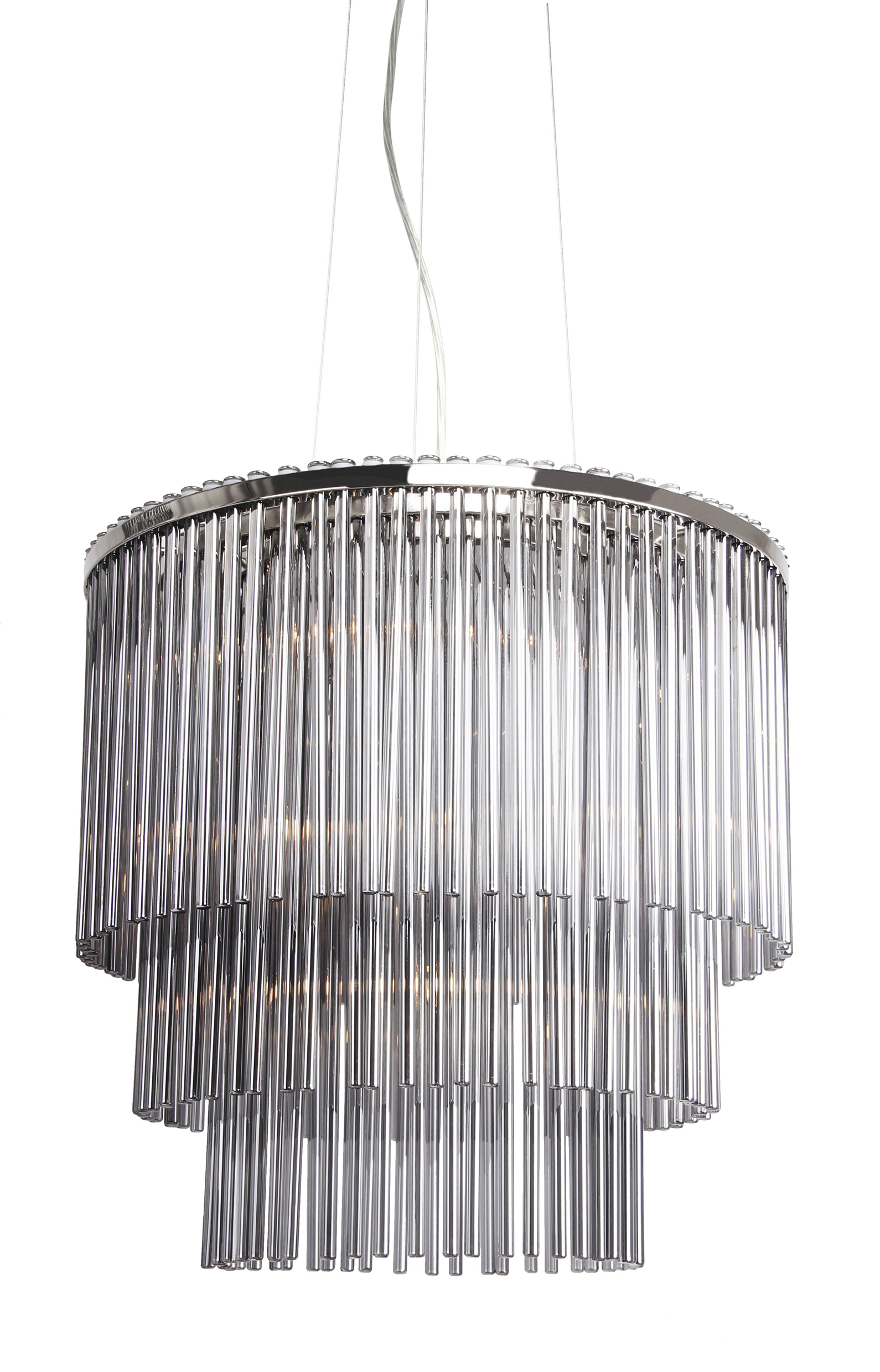
Once I had the modern floral theme in my head, all the other components fell into place. I love the smoked glass rod chandelier from Debenhams. Their Autumn Winter lighting range has some real stunners by the way and I would totally recommend checking them out if you're after some art deco glamour.
I also love this Jaxon pendant from them which would look amazing in a bedroom AND I've just looked and it has been reduced by a whopping amount from £320 to £96. You're welcome!
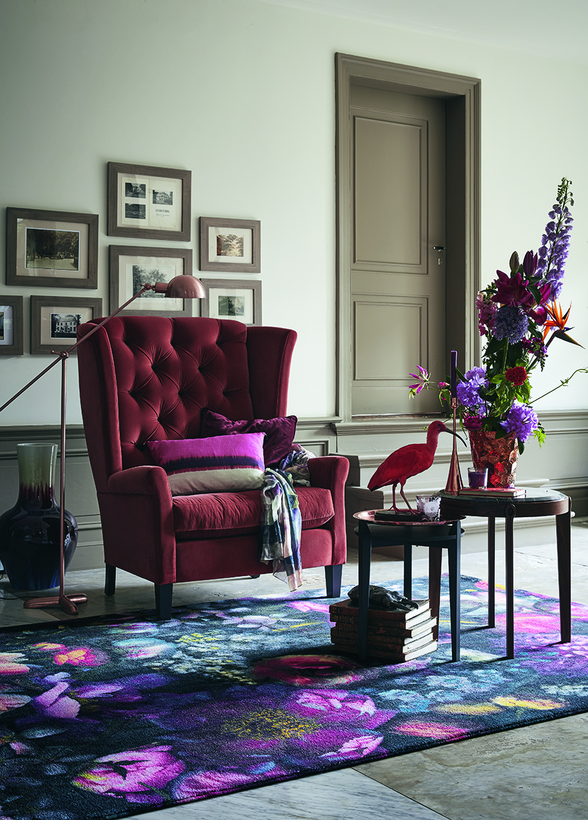
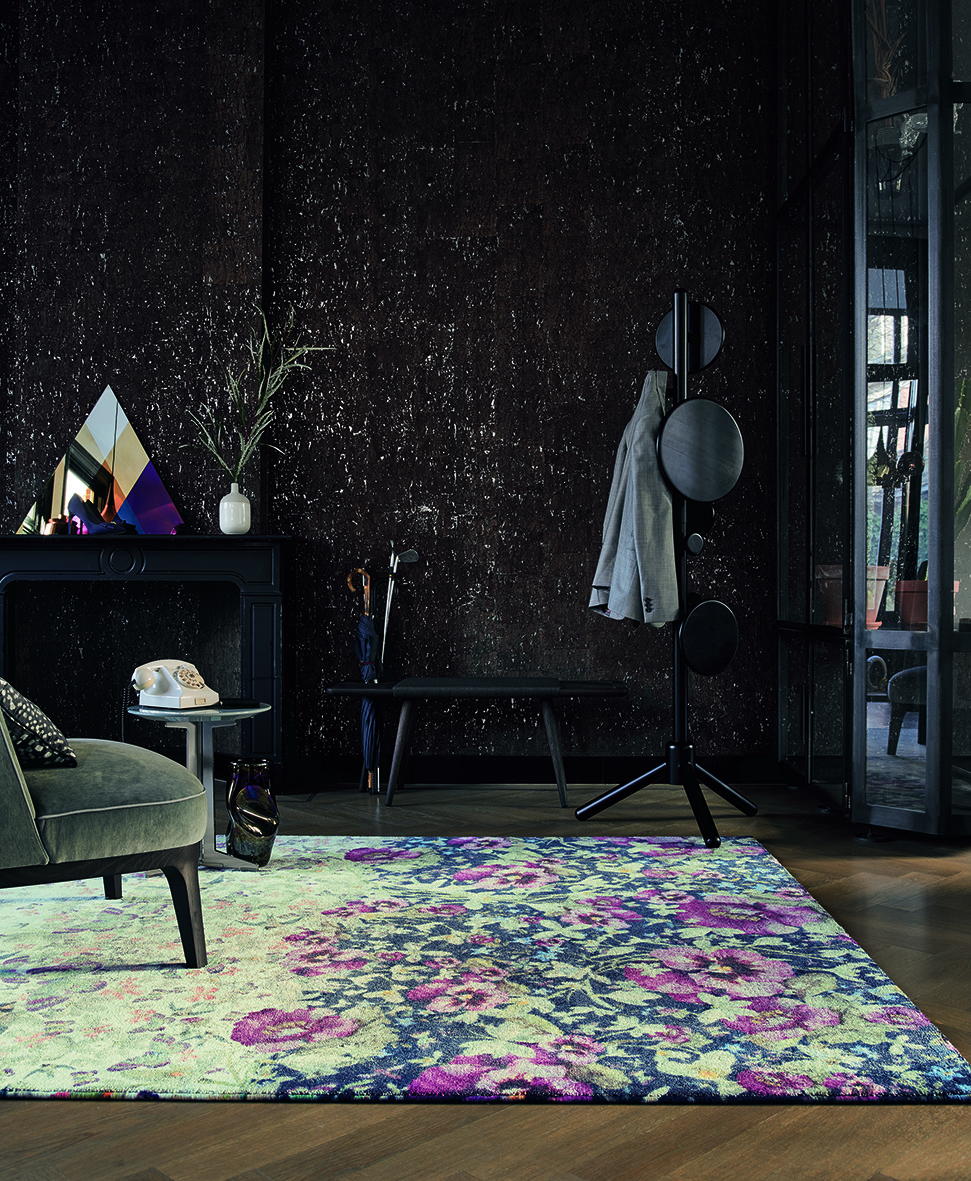
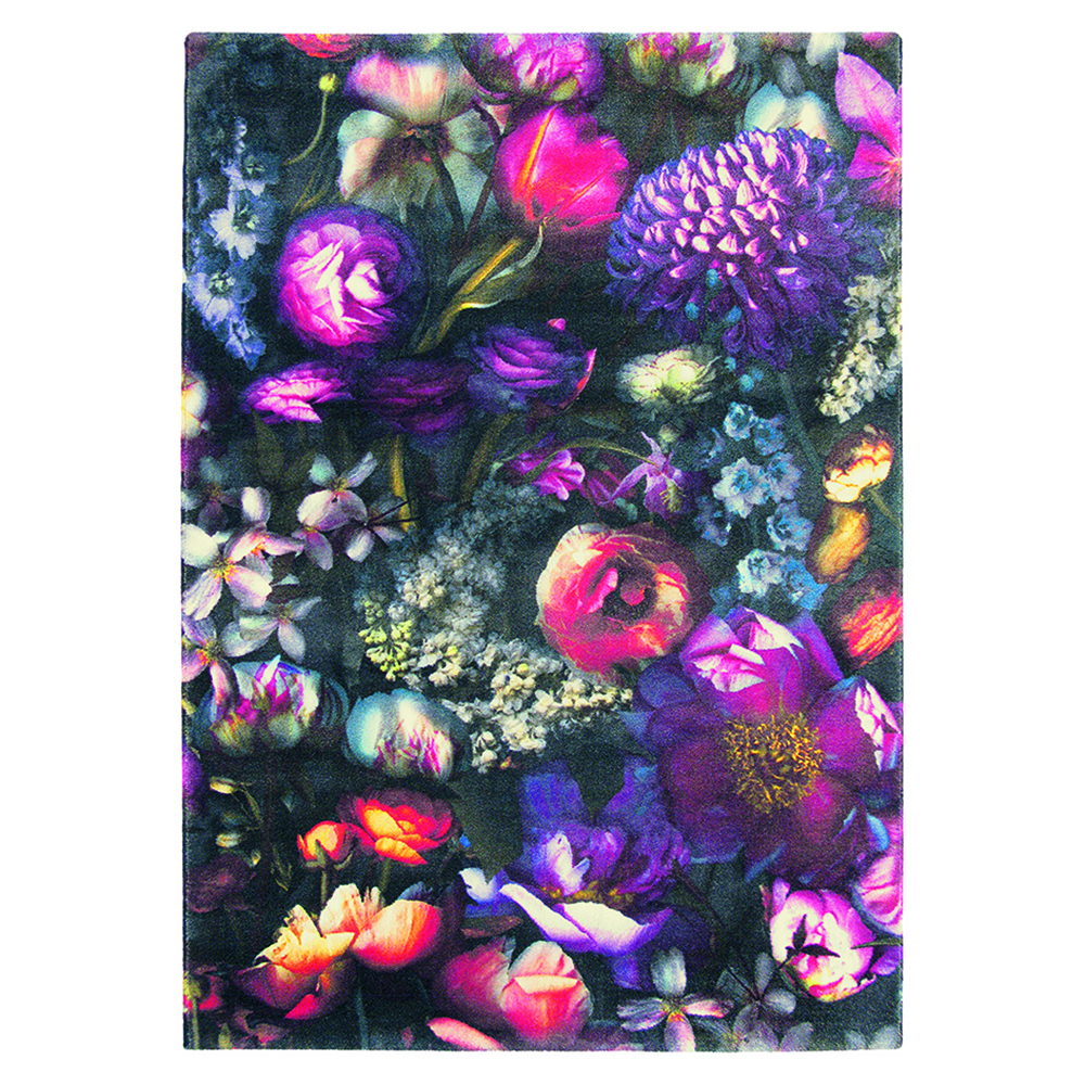
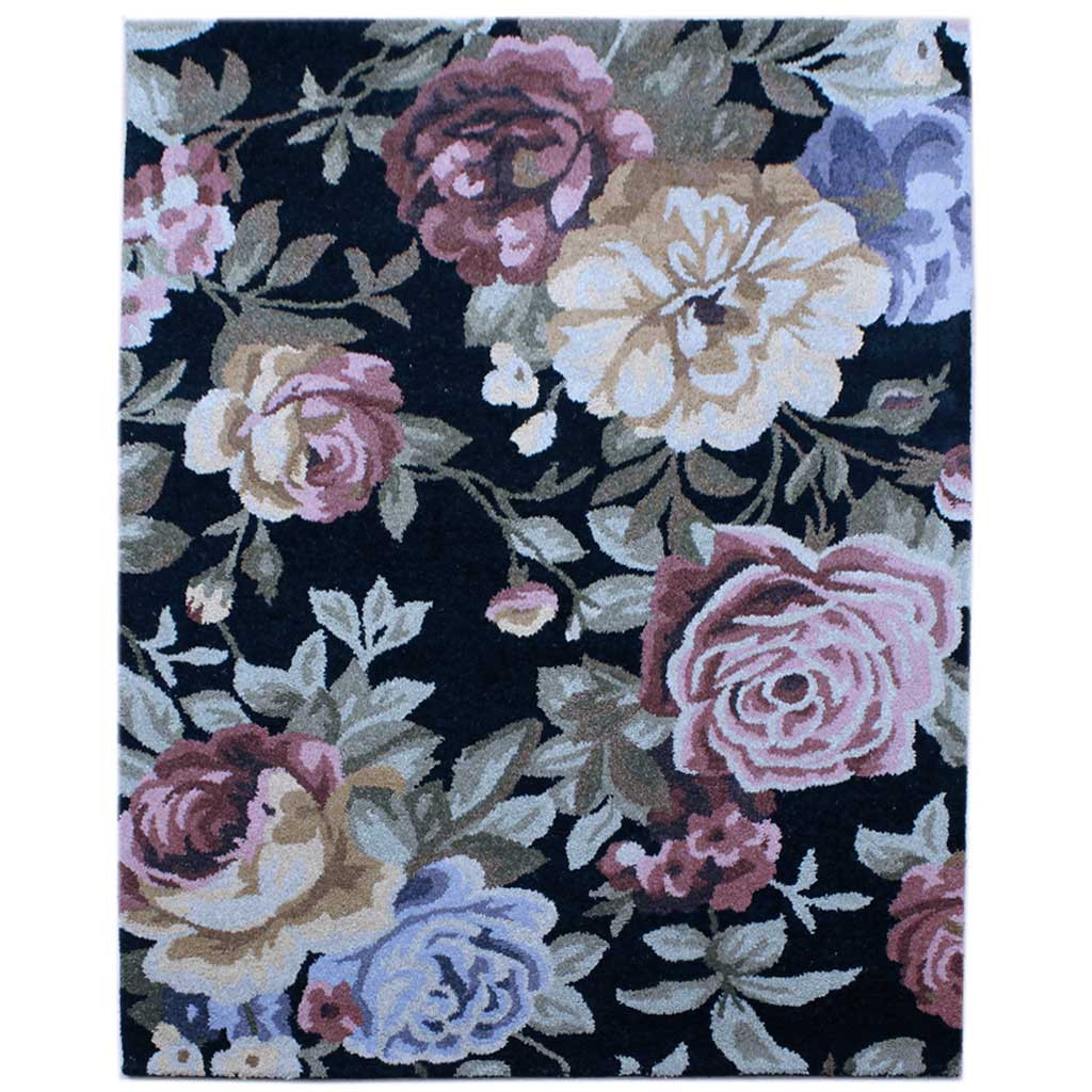
Another thing which planted a seed for this month's floral column was the selection of rugs from a surprising source. Ted Baker! I so do not think of myself as a Ted Baker girl. But I went to a press event earlier this year and was really impressed by their rug collection.
The one I've included in the column (above) isn't actually my favourite but unfortunately it doesn't work that way. If I can't find a very similar double, it ain't going in, no matter how much I might like it. Oh while we are on the subject, if you should ever see any designer doubles on your travels please do let me know. They are my holy grail.
The two rugs that stood out most for me were the Maximil and the Gorse. Both use that digital printing technique to get a beautiful and striking photorealistic finish. I love how the floral Maximil is styled in this industrial chic room...it's a bit like when you wear a girly tea dress with studded boots and a leather jacket.
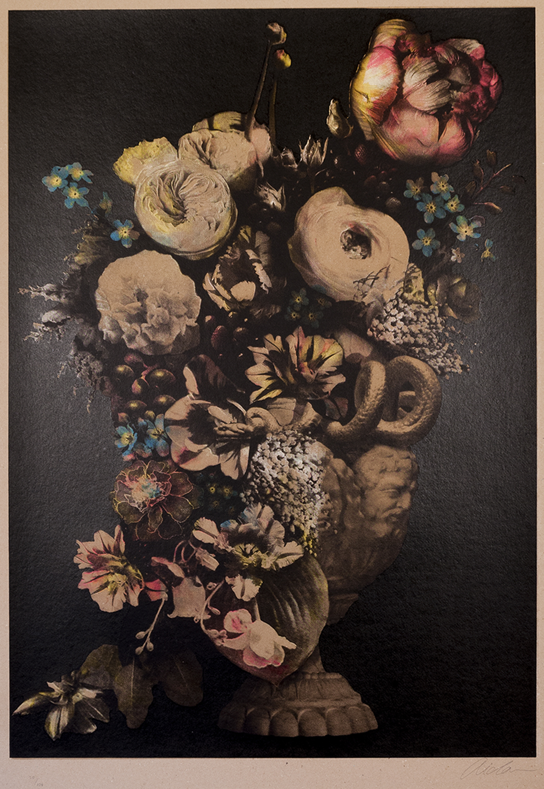
Finally, a few items which I had a soft spot for but they didn't make the final cut, not because they are not nice enough, but in some cases it's just because they aren't the right size to fit the space on the page they need to fill. Two many square or rectangular items makes for a very boring looking page you see. The first is a print called Life Still by artist Aida and in real life the colours are much more vibrant than they appear here. It's very moody and would look amazing against a dark wall like Farrow and Ball's Downpipe or Hague Blue. Which is exactly what the very stylish Wendy Aldridge, who runs online vintage and retro boutique Homeplace, has done.
Image - David Cleveland
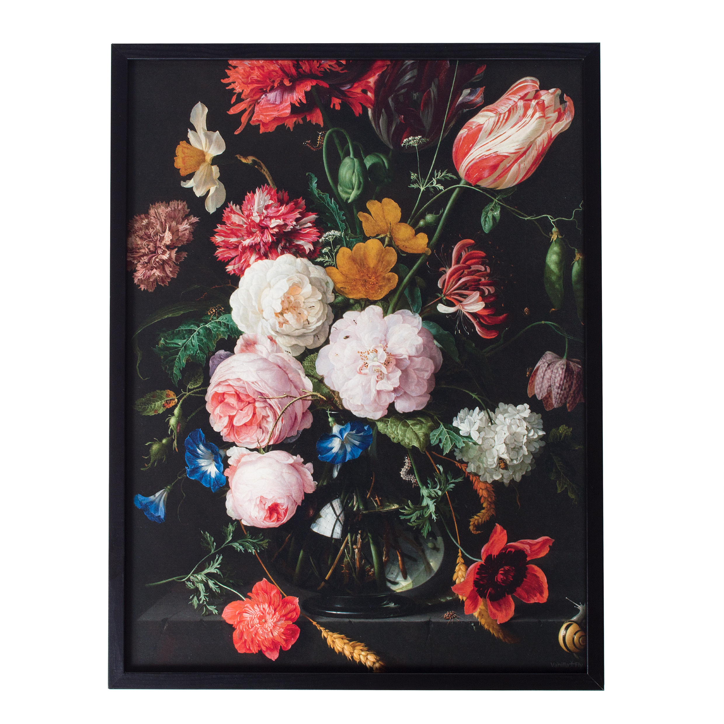
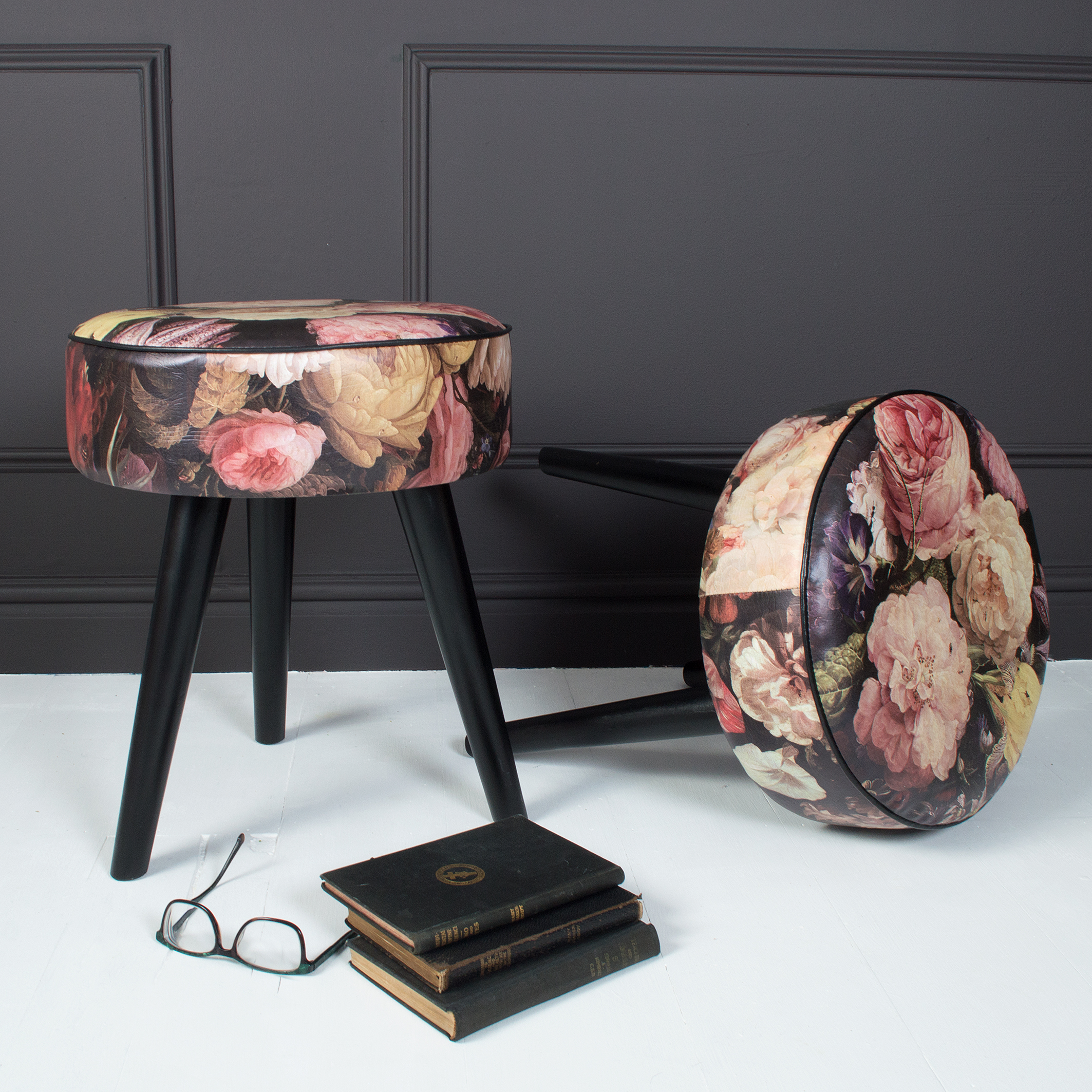
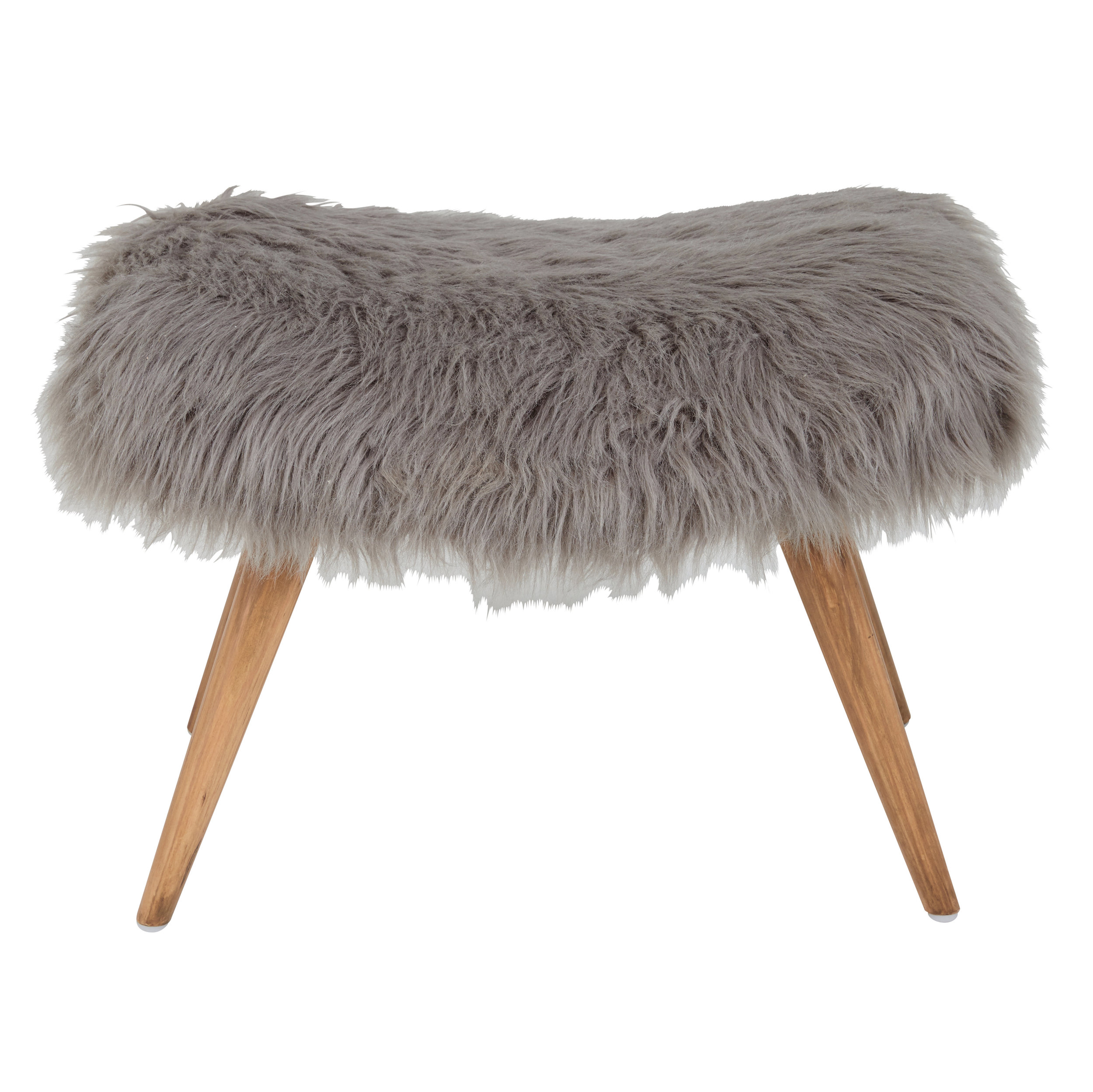
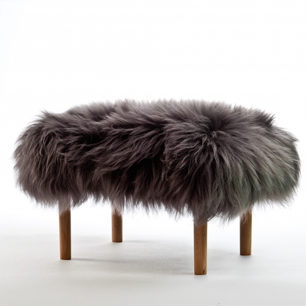
The budget version next to it is from the lovely MiaFleur, as is the photographic floral printed stool which is currently reduced from £102 to £76.
So there's a little insight into how I put the page together and why sometimes I have to compromise on my grand ideals for the greater good of the column overall. I hope it's given you some inspiration. I'm still very much considering where is the best place to use the Ellie Cashman wallpaper in the Gold is A Neutral house. I've added all available links to the products on the page in the gallery below.
Are you a Cosmo reader? I'd love to hear your thoughts on the Design Doubles page?


