Everything You Need To Know About Our Kitchen Renovation
AD - Some of the items I talk about in this blogpost were either paid for with a PR discount or gifted in lieu of payment.
It’s finally here! I had no intention of leaving it this long to publish the blog about the kitchen but there has been a lot going on behind the scenes at the Gold Is A Neutral house and time has slipped away. We are still completely smitten with the new space and can’t believe the difference it has made to family life, and we are very excited that we can finally start sharing it with friends and family. I’m not going to lie, renovating in a pandemic with no kitchen, was extremely stressful at times, particularly during the long stretches we were homeschooling, and it’s not something I’d want to repeat, but it definitely could have been worse, and we survived it.
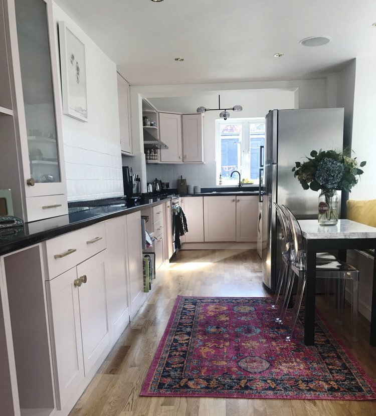
I am going to try to cover off everything in this blog but it’s inevitable that I will miss out something out so please do drop me a line if you have any more questions. If you’re new here, just a little background. We bought this house six years ago and I have wanted to do the kitchen side return extension ever since Day One but we had to wait and save, and then finally in September last year (2020) the day finally came and we started the renovation. For reference, this is what it looked like when we bought the house. We did do a budget makeover in the interim by painting the cabinets and replacing the handles, but by the time we came to do the major building work we had doors hanging off, shelves collapsing and the major lack of storage meant things were stuffed in and precariously balanced on top of each other and ready to topple as soon as anyone dared to delve in. I shared lots of my inspiration and ideas for the new kitchen before we started here.
Do I wish we’d done it sooner? Yes! But good things come to those who wait and we are so, so grateful for this space now. Game changer is a phrase that is bandied around a lot, but if there ever was a game changer for us, it’s this kitchen. So let’s get into it. I’ll try to break it all down into sections to make it easier to cover everything off.
The Design
I knew from very early on that I didn’t want to spend a huge amount of our budget on creating a fancy architectural kitchen extension. For me, the space inside was what was most important, and I just wanted to make sure we were maximising that to it’s full potential. We hired architect Trevor Fairman to draw up just the plans for us. I had initially wanted a pitched glass roof to run the length of the side return extension, but council planning regs and the unusual way our house is laid out, put paid to that idea. Our local council had recently introduced a height restriction of 2.5m at the boundary when extending more than 3m at the rear. Which we weren’t. Or so we thought! What we hadn’t realised is that the existing kitchen had already been extended and that counted towards the allowance so the restriction did apply. This caused a lot of stress at the time, as we were so worried that the ceilings were going to feel low and dark. The good news is that as soon as the Vario by VELUX rooflights went in, all our worries melted away, and it’s not something I even notice or think about now.
Another thing we did was speak to our neighbours about a third party wall agreement. This was pretty key for us, as the buttress was on our side of the wall and if we had to build around it we would have lost at least half a metre of the side return. What we needed to do was take it down and build up right up to the boundary (saving as many of the London stock bricks as we could in the process). Luckily our lovely neighbours agreed, as this really did make a huge difference to the internal space.
Image - Kasia Fiszer Photography
The Layout
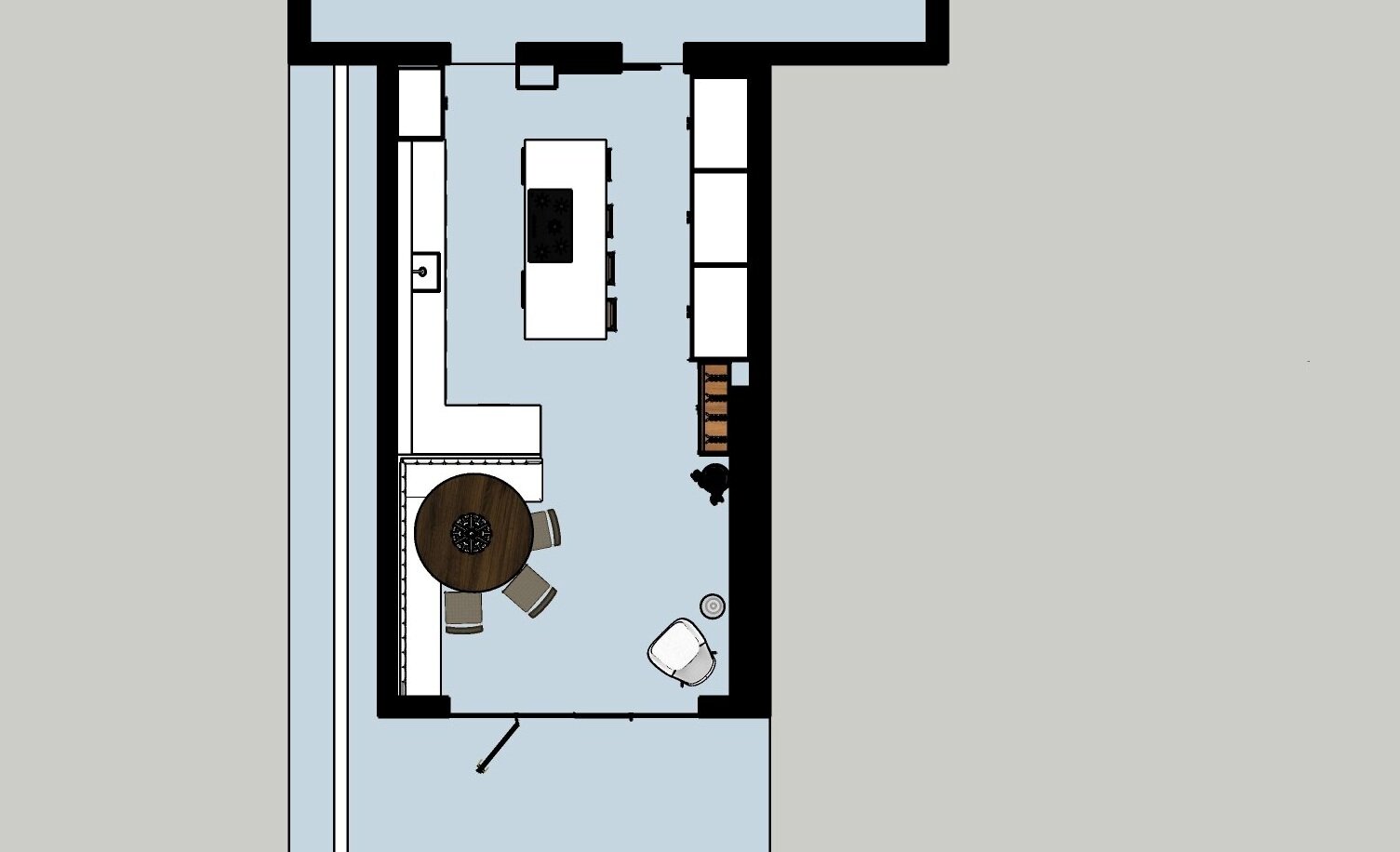
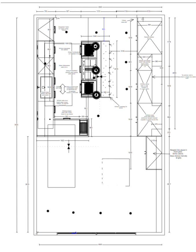
I have had a lot of questions about many different aspects of the kitchen, but I think the thing I have been asked about most is the dimensions and the layout. We extended out 1.5m at the rear and around 2.5/3m to the side, bringing us to a total of 5m wide x 8m long. I think our layout is fairly unusual for a kitchen, and it seems to have inspired lots of you to try and do the same in your own kitchen renovations. The good thing about waiting almost six years to renovate your kitchen is that you get plenty of time to mull over what your dream kitchen might look like. See below for the 3D renders drawn up for me by my friend Kate Tully of at-studio.
The conventional route when designing this kitchen would have been to run the main run of kitchen units, oven and sink along the side where the bank of floor to ceiling cupboards are, have an island in the middle and then try and squeeze a table along the side where the sink is now, or place the table horizontally in front of the French doors. The biggest issue with putting the kitchen on that side for me was the low ceiling, which we were stuck with because that’s the bathroom above. And I didn’t want it to feel squashed. Oh and I didn’t want upper cabinets, so lack of storage was going to be an issue. But what if we flipped it? Put a run of low cabinets under the rooflights, an island in the middle and embraced the low ceilings on the other side by filling them with floor to ceiling cupboards aka storage galore! There’s also a chimney breast behind that big bank of cabinets, and if we’d removed it, we would have had to put another steel in, which we didn’t have budget for, so that needed to be taken into account and worked around too.
Render - at Studio
In terms of the dining space, I knew I wanted to create two different, but complimentary zones between the kitchen and the dining area, and above all I wanted it to be a space for socialising and entertaining. I wanted built-in banquette seating because not only do they look amazing, they are also a great way to use the space and get lots of bottoms around a table. The idea for the peninsula section of the kitchen came around because it acts as a connection between the kitchen and dining area, and meant we could wrap the banquette around the wall to create that all important curve.
So by the time I went to see Rebecca Nokes at John Lewis of Hungerford, I already had a pretty good idea of the layout I wanted, but I wasn’t sure if it was possible, or practical, or where everything would go.
Image - Kasia Fiszer Photography
The Kitchen
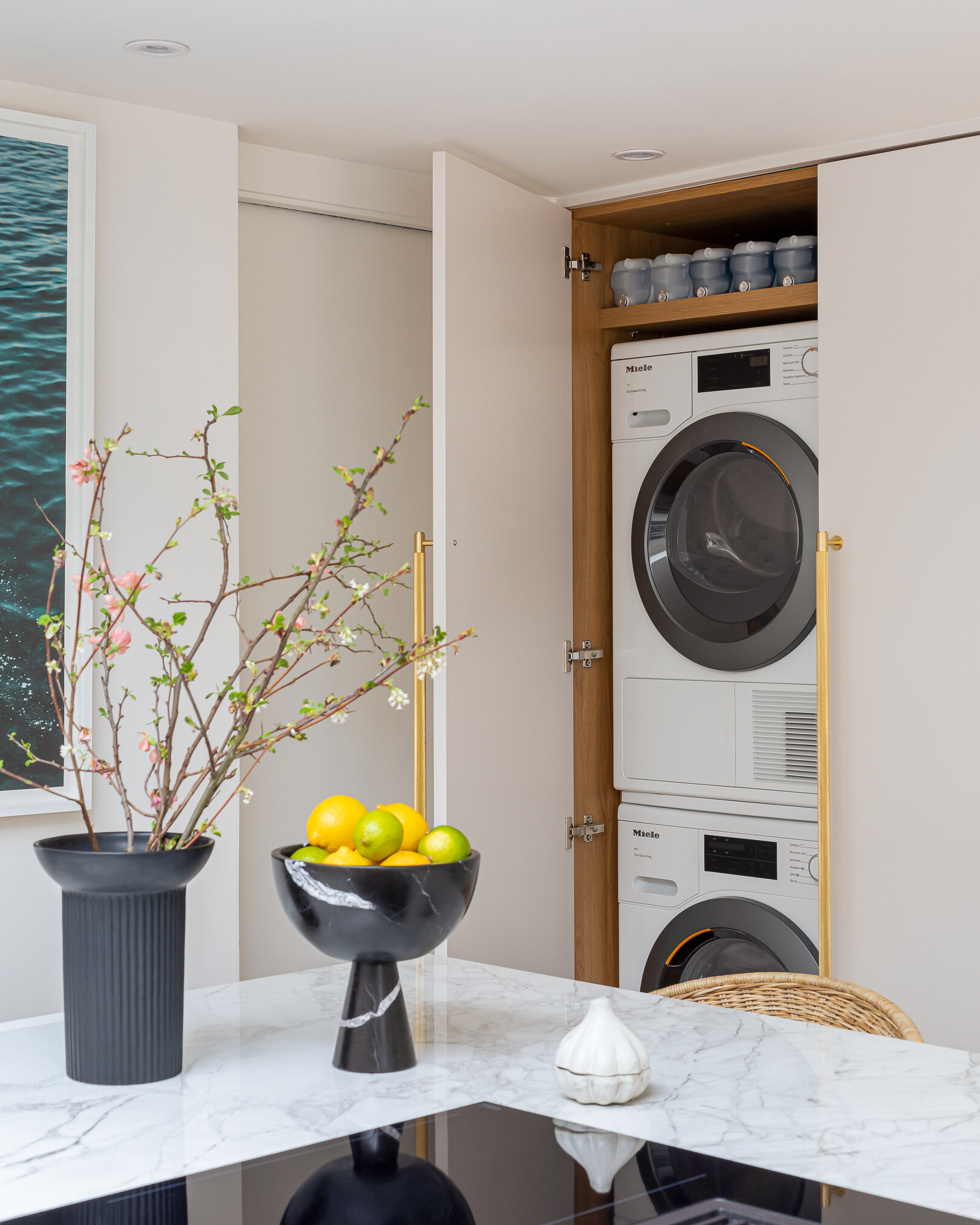
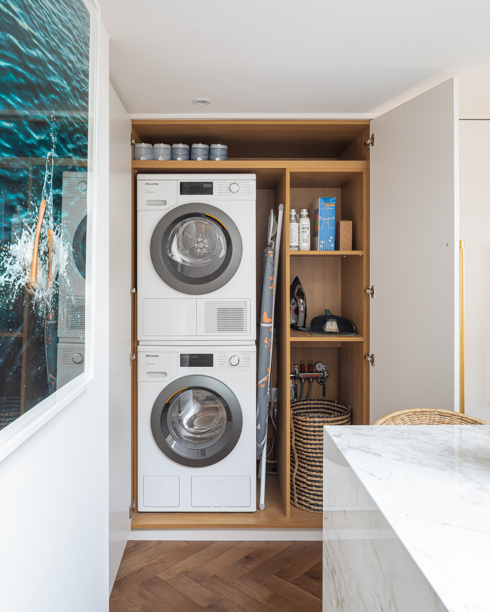
I did lots of research before choosing John Lewis of Hungerford. We considered going down the DIY kitchens, or Ikea route, and adding different doors from Custom Fronts. However once the layout started to take shape in my mind, I started to worry about the logistics of getting cupboards to fit that awkward run of floor to ceiling cabinets along the side. It might look very simple, but behind there is a very clever bespoke run of carcasses housing a laundry cupboard, a stack of oak drawers, a larder cupboard and a huge cupboard with shelves for all our crockery, my vase collection and the kids craft materials. And it all fits perfectly around the existing chimney breast, meaning no space is wasted. In addition, we couldn’t buy off the peg doors to fit the space and would have needed lots of infills to make it all fit together, and I really wanted a seamless look.
After my first meeting with Rebecca Nokes from John Lewis Of Hungerford, it quickly became apparent that a bespoke kitchen was how we were going to get the very best out of the kitchen’s existing quirks. Plus I was totally bowled over by the incredible quality of the kitchens and got very overexcited about having a larder cupboard! There was no going back!
Image - Kasia Fiszer Photography
I knew I wanted to go with a seamless sleek, understated design and let the other materials do the talking, so I settled on the Urban kitchen, with slab doors. I worked with Rebecca to fine tune the space, and that’s where working with a kitchen designer really comes into its own, because they think of all the details you wouldn’t necessarily think of, and they know exactly how much space you need to allow you to move around your kitchen comfortably. The area around the island and peninsula was a tricky one to get right, because we didn’t want to interrupt the flow too much, but having lived in it for the last few months, I can confirm Rebecca got it spot on. We also included a fluted glass cocktail cabinet in our kitchen design, which houses all our glasses and drinks bottles and sits on the dining/entertaining side of the kitchen. The kitchen was fitted by One Call Solutions, who were recommended by John Lewis of Hungerford.
Image - Kasia Fiszer Photography
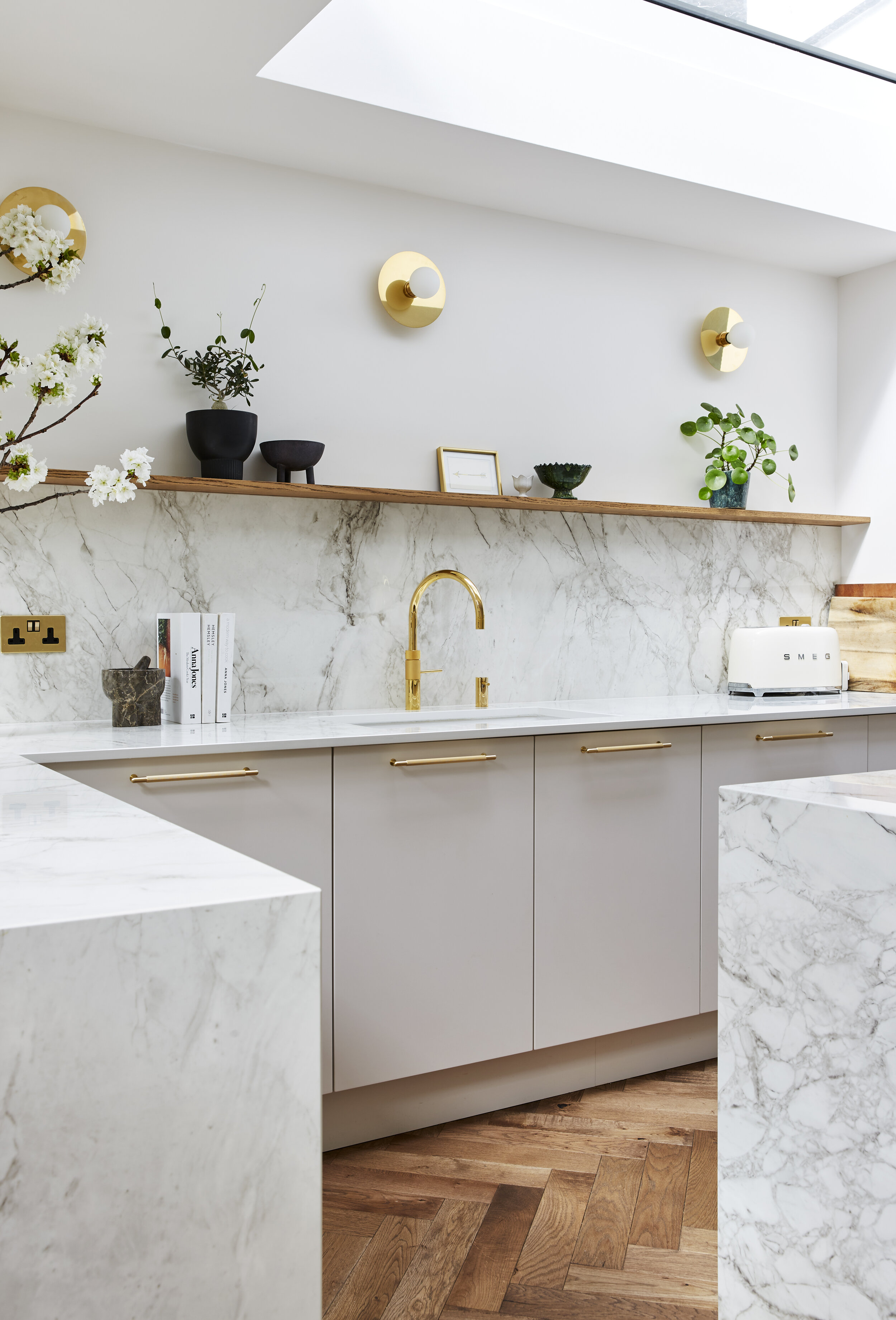
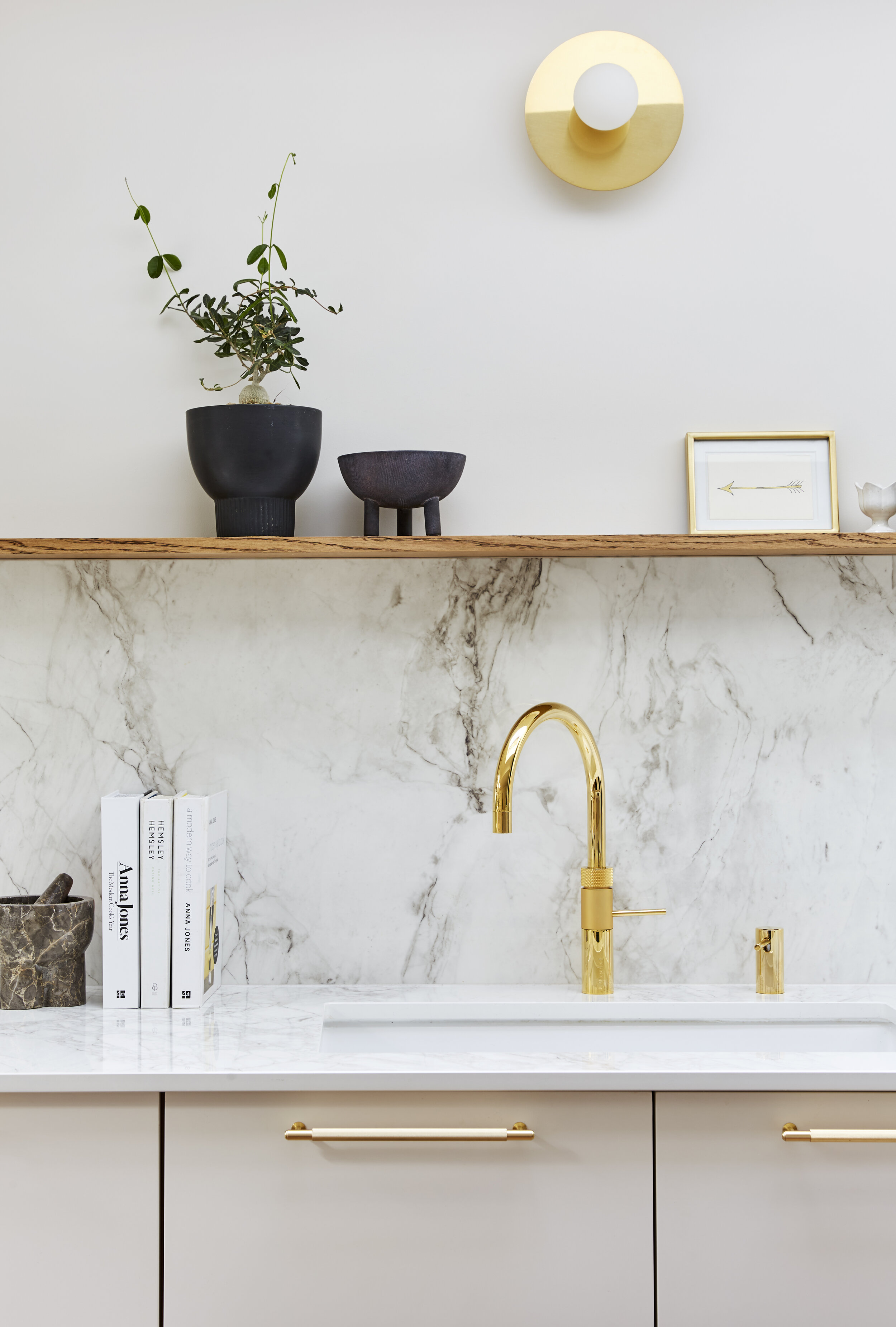
Without a doubt, the hardest part was choosing the colour for the cabinets. I wanted a warm neutral, not too grey, not too pink, not too beige. John Lewis colour match and spray the cabinets themselves and getting it right felt like a really big deal. If I didn’t like it, it wasn’t like a wall where it could just be repainted. This felt more high stakes. I sampled a lot and spoke to colour pro Emilie Fournet to find out what her favourite warm neutrals were. And just as I thought I was running out of options and starting to get a bit panicky, I came across Little Greene’s Tusk. It’s definitely got some pinker tones to it, but enough beige to balance it out, and it’s exactly what I was after. The walls are Slaked Lime, also by Little Greene. It works perfectly with the combination of the cooler toned Dekton countertops and brass Buster + Punch hardware, brass Spark & Bell wall lights and gold Quooker tap.
Image by Kasia Fiszer Photography
The Vario by VELUX Rooflights
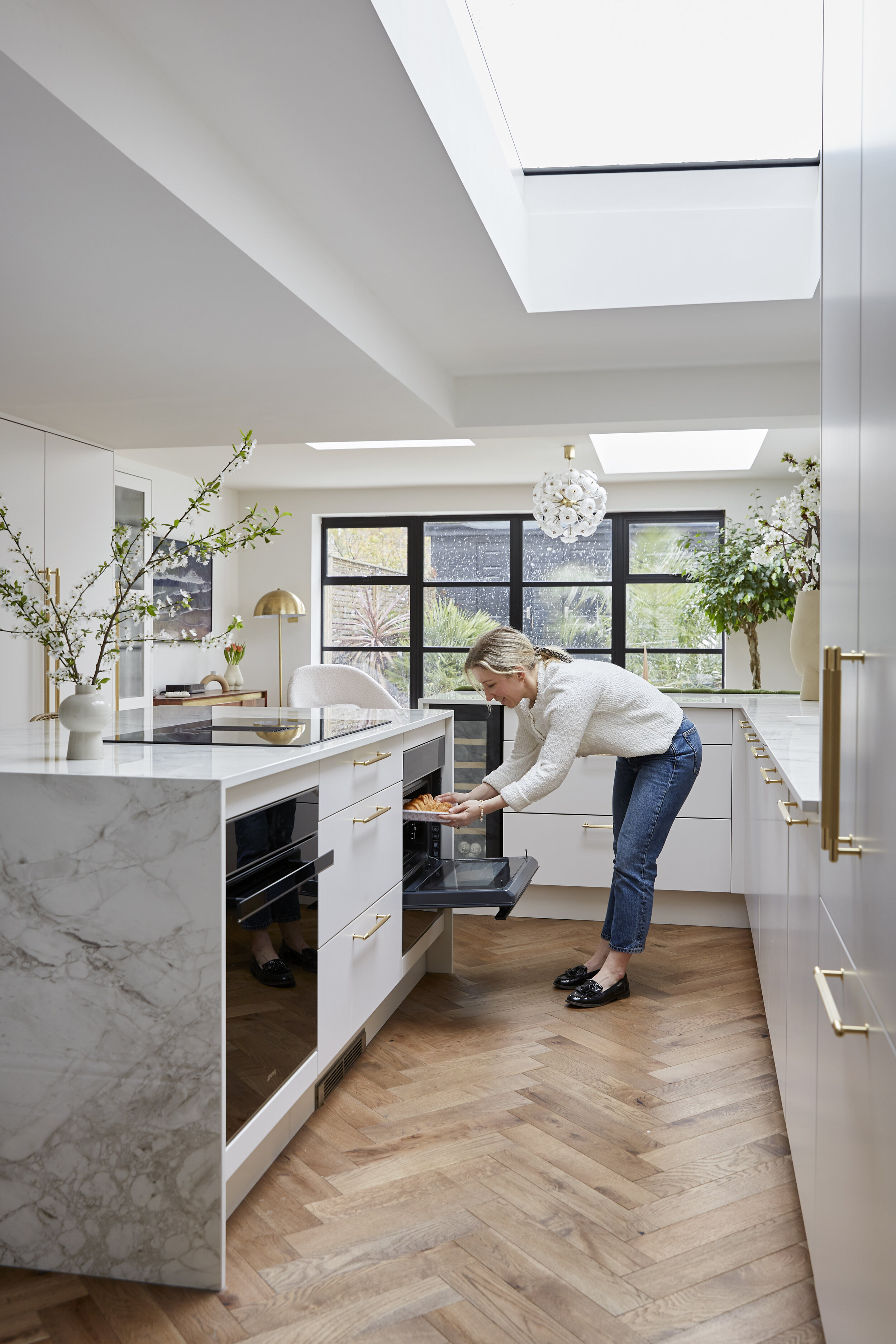
Our previous kitchen had very little natural light and as a result none of us ever wanted to spend any time in there. So getting as much natural light as possible was a major priority in this renovation. We planned for two large rectangular rooflights along the side return (as we knew we needed a steel in between) and a square one towards the rear. Once we got planning permission, I asked our architect Trevor to tell me the absolute maximum amount of glazing we were allowed, and then headed straight for the Vario by VELUX website to design bespoke rooflights to the exact size we needed, using every last bit of glazing we were allowed! The bespoke nature of Vario by VELUX means you can tailor your sizes exactly to your needs. Using the 3D configurator online, you can also choose the frame colour, the type of glazing, and whether you want them to open or not. We have two 2.3m x 1m Rectangular rooflights (one opens) and a 1m x 1m square rooflight. Our builders James and Luke had never worked with them before and were really impressed by the ease of fitting. The moment they went in, was the moment we really start to get excited about the new space. Even with screed floors and bare brick walls in November, the light was incredible in there. Now it’s finished, one of my favourite things is to work in the kitchen and watch the light as it changes and moves throughout the day. Even watching the rain is epic…although we’ve had more than enough rain this month thank you!
Image by Kasia Fiszer Photography
The Countertop
It’s no secret I am obsessed with marble. However I am also fully aware of the perils of having marble in the kitchen. So I set about looking for the most convincing marble like surface, which also ticked all the boxes when it came to practicality. For me, Dekton has the most exciting range of styles out there. It’s a mix of quartz, porcelain and glass and as such it’s heat proof, stain proof and scratch proof. It’s virtually indestructible and it looks beautiful to boot. In terms of style, I love their collaboration with design duo Patternity, but none of them was quite the look I was going for in the kitchen. We settled on Bergen, which is from the Stonika Xgloss range. It has an off-white base, with heavy warm grey veining, which I found to be the most naturalistic of all the stones I looked at.
Image by Kasia Fiszer Photography
We went with a waterfall edge on both the island and the end of the peninsula to really up the wow factor. One thing to be aware of with Dekton is that it can be tricky to fabricate. I used Marble Building Products, who are based in my hometown, and they supplied, templated and fit the marble for our bathroom too. If you’re in London, it’s always worth speaking to a stone yard outside of London to try to get a better deal as their overheads will be lower.
Oh and if you’re planning to create a shelf in the same material as your countertop, that needs to be made clear to your builders from very early on in your build as the stone is heavy and the wall needs to be properly prepped underneath in order to take the weight. We didn’t do this, because I hadn’t decided what I wanted to do there, but it worked out for us because we went with an Oak shelf and I love the contrast and warmth the oak brings.
Image by Kasia Fiszer Photography
The Banquette
I don’t think this needs any explanation really, does it? I’ve always been inspired by restaurant and hotel design, and the idea of a curved banquette was very much in my head from the get-go. I had found the perfect olive green velvet for it by Kirkby Design. My colour palette in the rest of the kitchen is very neutral, so I could have gone with any colour really, but I’ve always loved olive green and I thought it would play well with the huge palms you can see on our patio. It ended up triggering an olive green theme right through the ground floor but I didn’t know that when I chose it. So I had the fabric, and a very good idea of the design, but if I’m honest, I didn’t really know where to start finding someone who could make it for me. I asked around and lovely Lia from Anemone Interiors put me in touch with her upholsterer Simon Collins. Si came out to measure up and talk through what we wanted. Then around 8 weeks later he came back with the sofa in three pieces, and it was even better than I had anticipated. I know you’re wondering if I let my kids eat on it…the answer is yes but definitely not when they’re eating spag bol, and I prefer it if they sit on the chairs instead ;-)
The Floors
Having a neutral kitchen, it was really important to me add plenty of character by layering up the textures, and our Aged Oak Parquet Engineered floors from Yorkshire Wolds Flooring (full transparency, it’s my dads company) are just oozing with character. The beauty of them is in the variation. They are hand finished and as such no piece is exactly the same, which creates such a warm, unique look. I honestly don’t think our kitchen would be anywhere near as good if we had a different floor because for me, the character it brings really helps to ground and tone down the snazzier, shinier and more modern elements. I selected everything with this balance in mind, as I was always conscious of it looking too shiny.
We had water fed underfloor heating fitted underneath so it’s lovely and toasty under foot. I also dragged this house into the 21st Century and bought Hive to manage it all, which I must say I find really easy to use. At this point my dad would like me to tell you that it’s super important that you wait until your screed is fully dried out before you lay your floor, otherwise it will soak up the moisture and bow, which you absolutely do not want. Our flooring was laid by Luke, our brilliant foreman for the whole renovation (I’ll come back to him).
Image by Kasia Fiszer Photography
The Doors
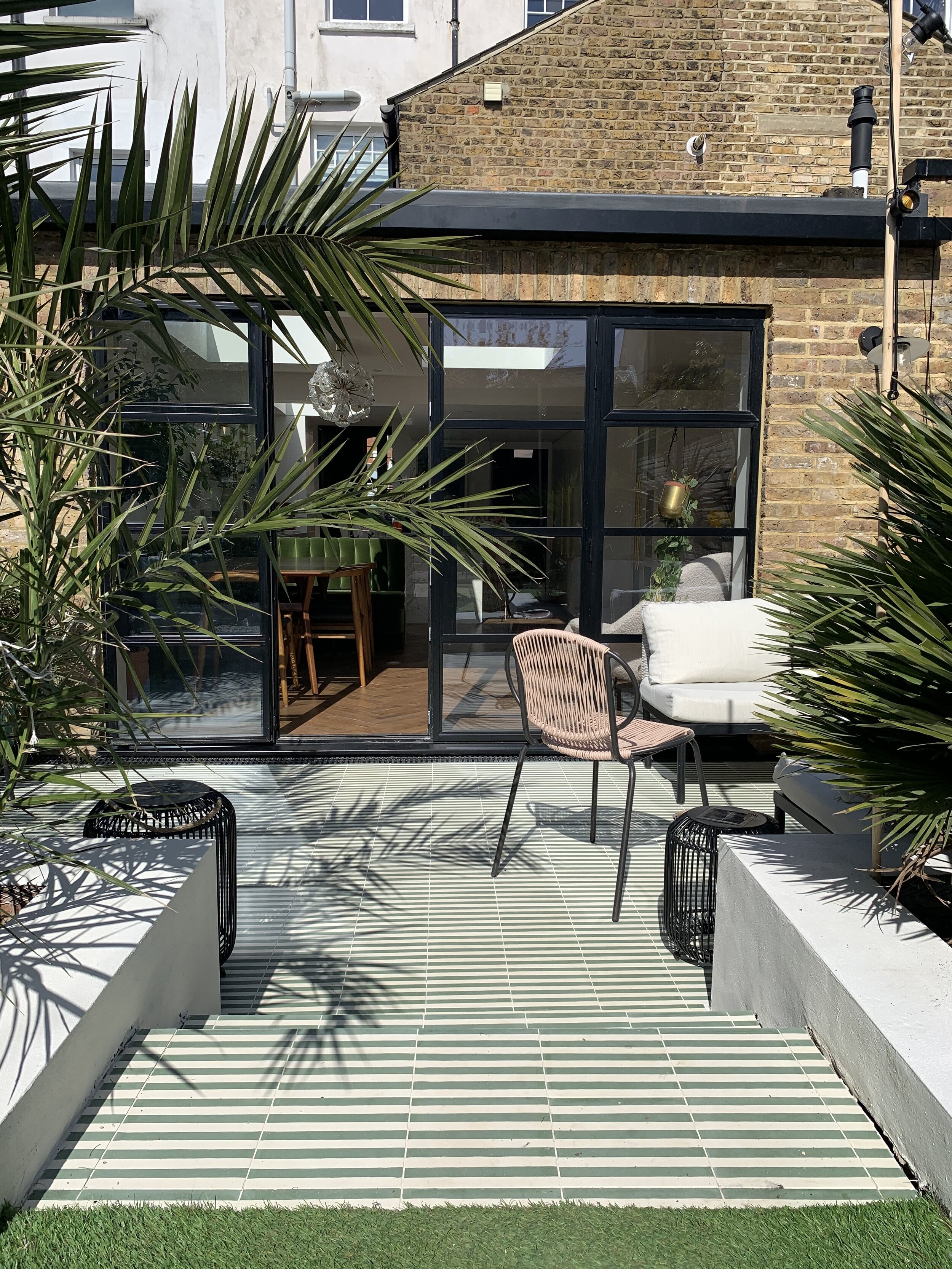
I get a lot of questions about our doors and windows and I have to admit that this isn’t an area I did a huge amount of research into. Budget came into play here, and I knew Crittal or steel wasn’t within our budget, so we went down the aluminium route. Several of our friends had used the Heritage aluminium system in their own renovations, so I spoke to them about the pro’s and con’s, before placing an order. The images below show how the back of the house looked when we moved in vs how it looks now.
In terms of design, we went with French doors, with fully glazed sidelights either side and an opening window on either side. Lots of people queried why I didn’t go for bi-folds, but it wasn’t something we really even considered to be honest with you. I love the look of French doors and I love the versatility of being able to open a window and get fresh air circulating, even when it’s not warm enough to have the double doors open.
Image by Kasia Fiszer Photography
The Appliances
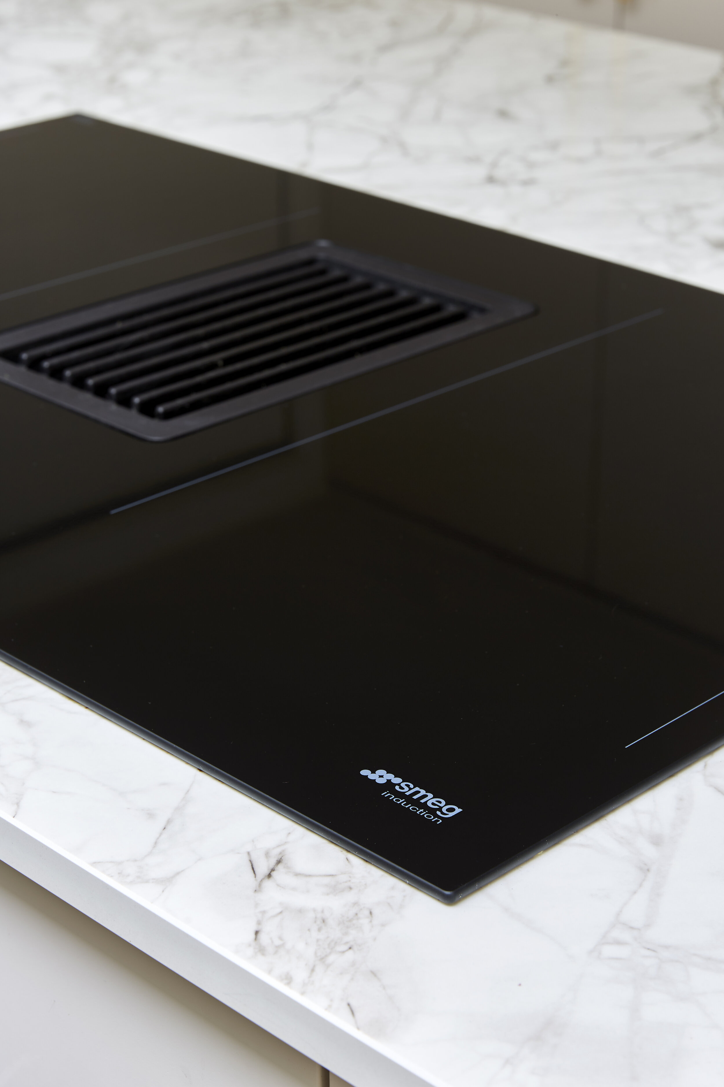
Our kitchen design didn’t lend itself to an extractor fan, which was fine by me because I didn’t want one anyway. It would have ruined the streamlined look I was hoping to achieve. However I didn’t want to forgo an extractor altogether. Step forward Smeg’s HOBD range, induction hobs with integrated extractor hoods. It’s the future. The process of choosing the hob and ovens was one my husband took a particular interest in as he loves to cook. I fully expected him to argue the case for a gas hob, however he surprised me when he said he’d rather an induction. We considered whether it was best to have the sink in the island or vice versa, but again, the way the kitchen is designed means whoever is cooking can stand at the island and still get involved in conversations etc, rather than having your back to the room. It’s also where the kids sit up to do schoolwork or play games while I’m cooking their dinner, so this way round was definitely the right choice for us.
Back to the hob and ovens as I know lots of you were interested in the integrated extractor hood when I shared it on Instagram. The most important thing is that it is very efficient. It has 8 different strengths and we very rarely need to go above 5, it’s that good. It also so easy to clean, because you can pop the filter in the dishwasher. We also bought a Recirculating Kit which fits underneath the hob and filters the air, so no need for it to be ducted out of the room. I ordered the hob during the height of the pandemic when stocks were low and tracked down the last recirculating kit in all of Italy (or so it seemed) in a random shop in Naples. Thankfully it arrived several weeks later and it was the right one, though we did get stung for import taxes of course! Our ovens are from the Dolce Stil Novo range and we have one oven and a Combi-Microwave oven. I did a Zoom session with Smeg’s Home Economist to learn about all the functions and it really helped us to get the best out of them. My biggest takeaway was learning how to cook a jacket potato so it’s fluffy on the inside and crispy on the outside, in under ten minutes! That’s life enhancing stuff.
Image by Kasia Fiszer Photography
The other big appliance decision was our fridge. Again, I didn’t want an ugly great fridge spoiling my sleek kitchen so integrated was a must. But we both wanted an American style fridge. We didn’t have space for a separate fridge and freezer because of the positioning of the rooflights. Which left us with limited options. Fisher & Paykel are the only brand which offers an integrated American style fridge freezer, so that was that decision made. Luckily it’s a great fridge. You can see it in the corner in the image above. Obviously it looks great because it’s encased in our kitchen doors. But inside is pretty great too. My favourite feature is an integrated ice maker which constantly replenishes and refills a container in the freezer, perfect for when we throw a party, as we won’t run out of ice.
The Tap
And when I say the tap, I mean THE tap! I’m obsessed with our Quooker and I don’t mind admitting it. It’s just a brilliant product. It gives us hot and cold water, boiling water, filtered water and sparking water at the turn of a disc….and it’s drop dead gorgeous. We have the gold Fushion Round and the matching soap dispenser. The only downside I can think of is that my tea consumption has gone up, as I don’t wait for the kettle to heat up and then wander off and forget about it anymore.
Switches and Sockets
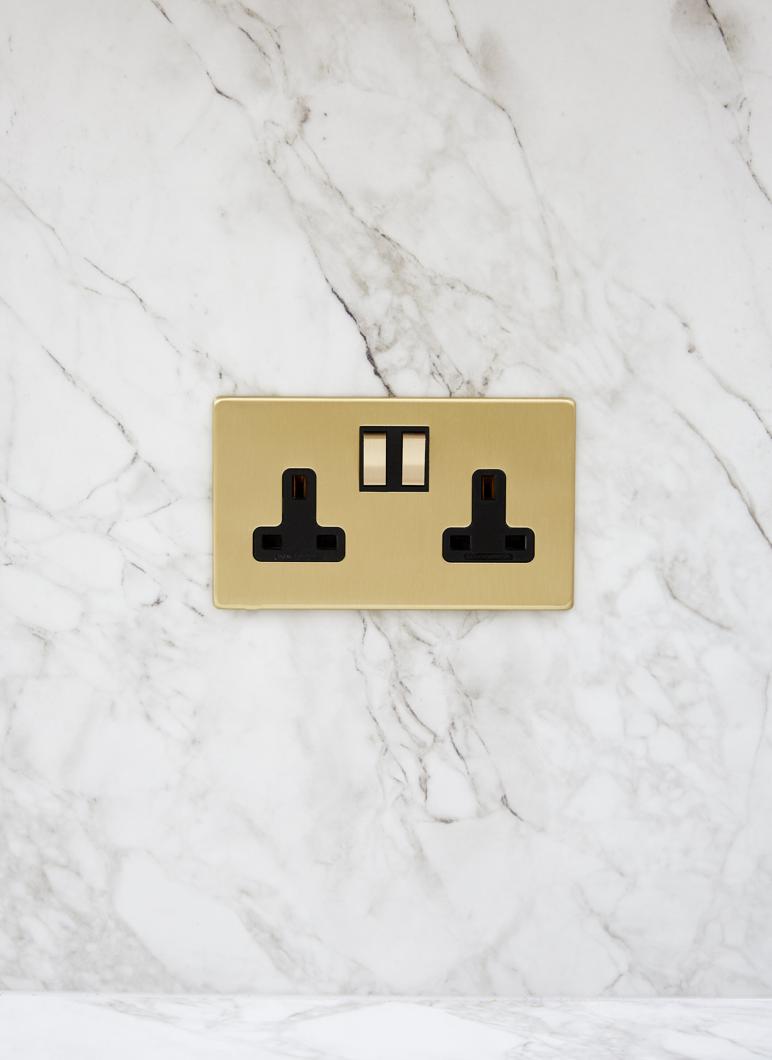
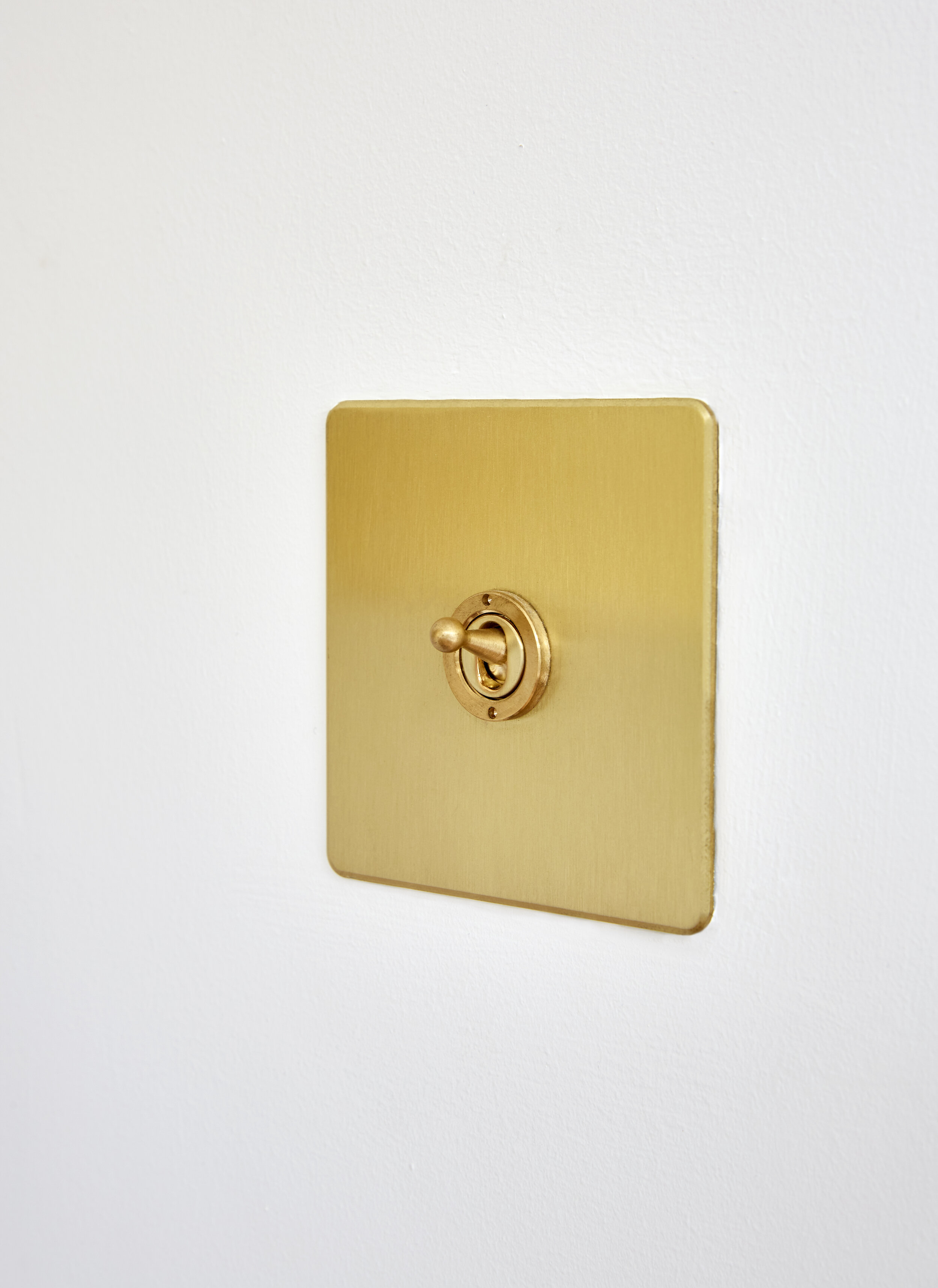
Make sure you plan enough plug sockets, I’d say add more than you think you’ll need. And this is your chance to be clever about positioning them. We have sockets tucked under the island for phones, iPad’s etc, sockets in the larder cabinet for the toaster and coffee machine and more by the sideboard and banquette. Not that they need to be hidden of course because they are beautifully made sockets and switches from Wandsworth Electrical. If they’re not on your radar, this brand produces beautifully made, high quality electrical products in a range of finishes and styles from modern to more traditional. The quality really shines from the moment you unbox them and you get that really satisfying firm click from the toggle switch. We went with sockets from the Penthouse collection with black inlay, and the toggle switch from the Classic Collection.
Image by Kasia Fiszer Photography
Lighting
I’m a long time fan girl of what Emer has created with Spark & Ball and knew I wanted to include one of her designs in our kitchen. I first saw the Arc brass wall sconce in situ in Nicki of And Then They Went Wild’s home. She has three vertically stacked in an alcove in her bedroom and they look amazing. They fit the bill perfectly for what I was looking for in here, they’re simple, modern but low key glam which was exactly the vibe I wanted in here.
Image by Kasia Fiszer Photography
Then there’s the vintage dandelion sputnik chandelier from Pure White Lines, which sits over the dining table. Well, it actually sits slightly off centre above the dining table, because we did have the problem of where was the best place to hang it, given the position of the roof lights. As our ceilings are fairly low we decided not to place it in the middle of the room as we hope that one day (post-Covid) that will act as a dance floor and people might bump their head on it.
The other light sources in the room are spots, which are divided up into three circuits and all dimmable so we can really change the mood and ambiance at night, and light different areas.
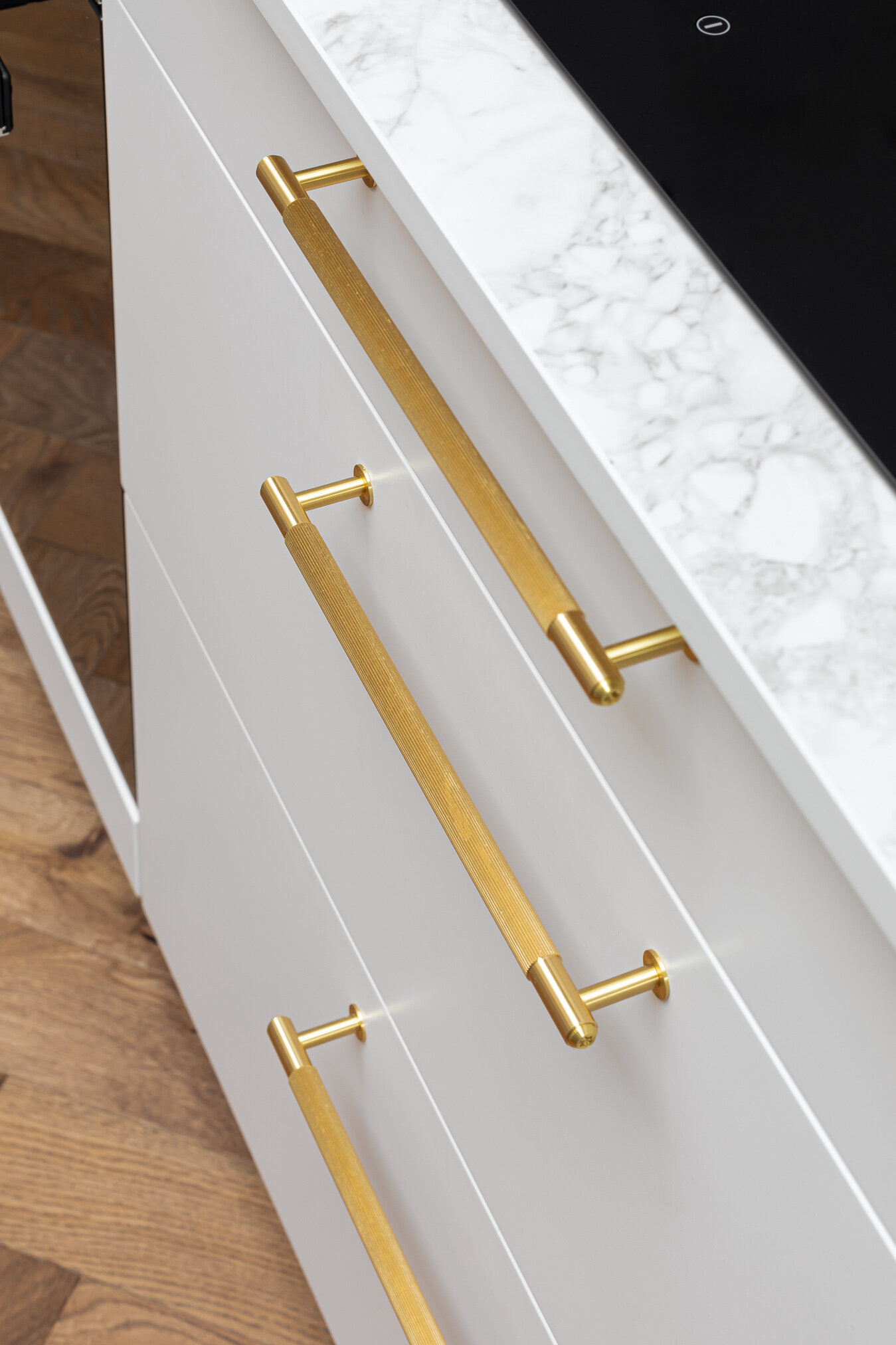
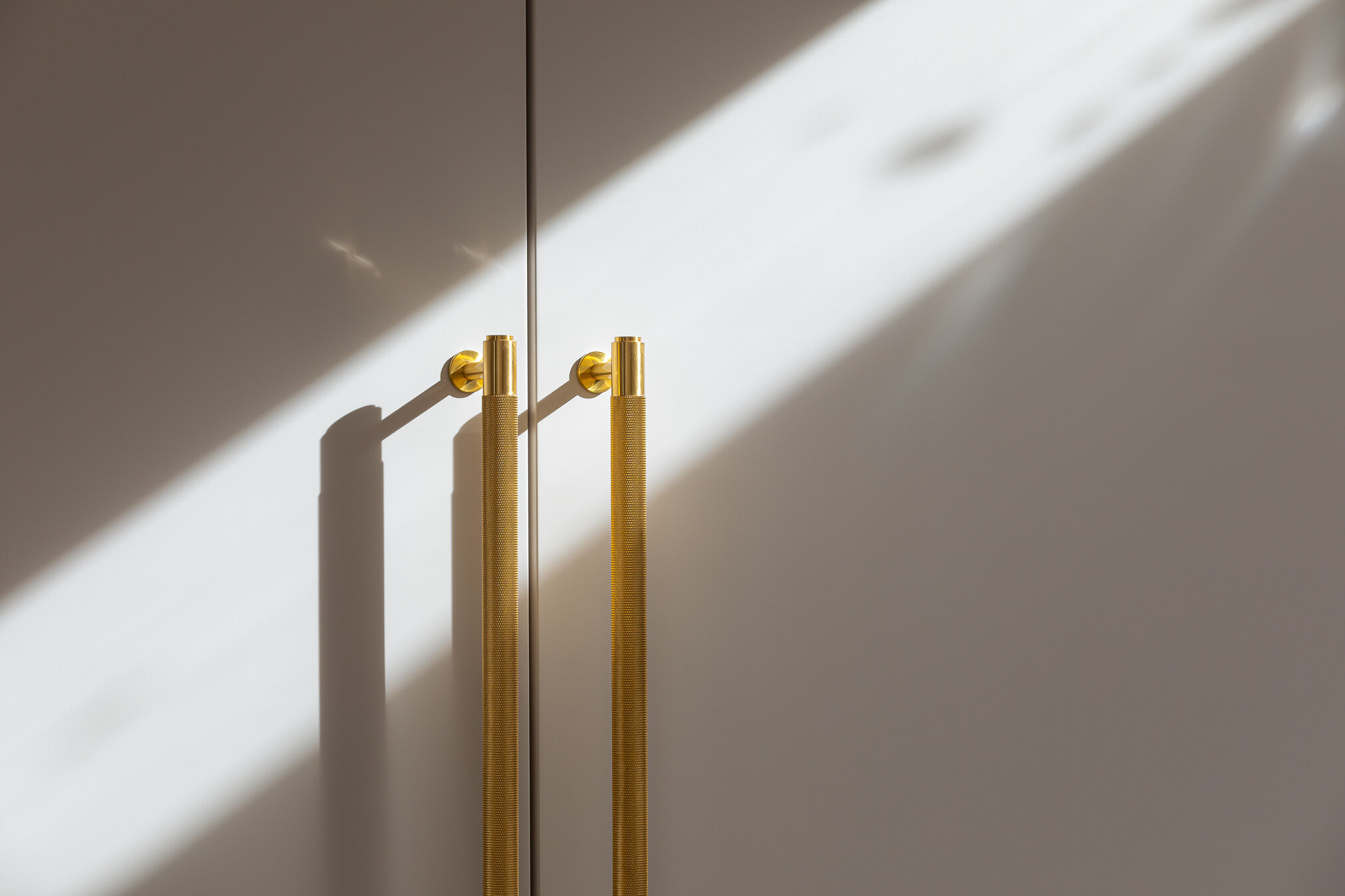
Handles
We went with Buster + Punch for the handles because they were a perfect match for the modern glam look I was hoping to achieve. I used their newer Linear style everywhere apart from on the tall floor to ceiling cabinets, where I used their classic knurled brass extra long closet handles.
The Dream Team
It wouldn’t be right to finish this blogpost without a nod to the people who were instrumental in building us our dream kitchen. We hired JA Whitney builders to carry out this renovation and we are really happy with results. Bearing in mind this renovation happened in the middle of a pandemic with homeschooling thrown in for good measure, it was really important to us that we had a good rapport with our builders, and luckily that was the case. From James and his partner Sian, to Luke our foreman, and Joe, through to Paul and Chris the electricians, Mario who did an amazing job tiling our stripey patio, and closing last, but by no means least, with lovely Jimi, who did a beautiful job painting and decorating the kitchen and lounge, when we got carried away and decided to keep going. But that’s for another blog.
Thank you!! And thank you to photographer Kasia Fiszer for taking these photos.
Some detail shots are by Ryan Wicks Photography, on behalf of John Lewis of Hungerford.
Additional things you might ask about
Bar Stools - Cox & Cox
Sink - Shaws of Darwen
Art - Lucy Laught
Shelf - Oak Store Direct
Indoor Tree - Happy Houseplants
Washing Machine, Tumble Dryer and Integrated Dishwasher - Miele
Large vase - Heals
Pedestal Bowl - No.17 House
TV - Samsung Frame
I think I’ve covered off lots of bases there, but I know that some people are going to want to know exact measurements of things. If you can zoom in on the floor plan and layouts further up, you can get a good idea of the measurements, but if not leave a comment below and I’ll do my best to help.
If you’ve made it this far, thank you for reading, I’d love to hear your thoughts in the comments.
Jess x


