Our New Kitchen Design & Moodboard Reveal!
AD - This post contains reference to some PR samples and discounted products
Hello! It’s here! I’m very excited (and nervous) but mainly excited, to finally start sharing some of our plans for our new kitchen. I’ve had lots of you asking me about when I’m going to share layouts, moodboards etc for the new kitchen and I know we’ve already started, but the truth is planning a kitchen during lockdown with two kids is no joke, so I’ve been beavering away, researching, tweaking and sourcing what we need. There’s still lots to do of course but I’m feeling fairly on top of things for now. Famous last words!
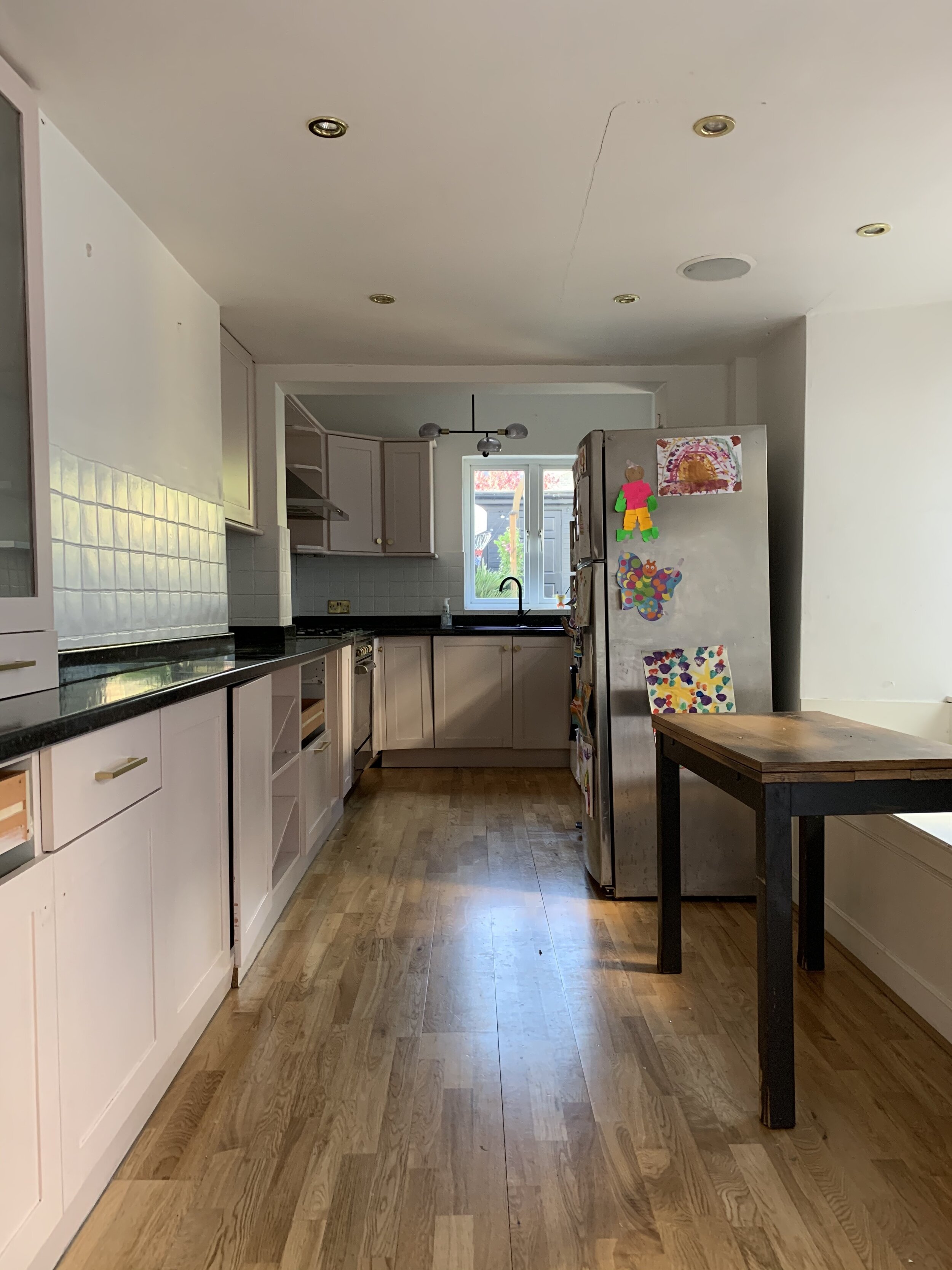
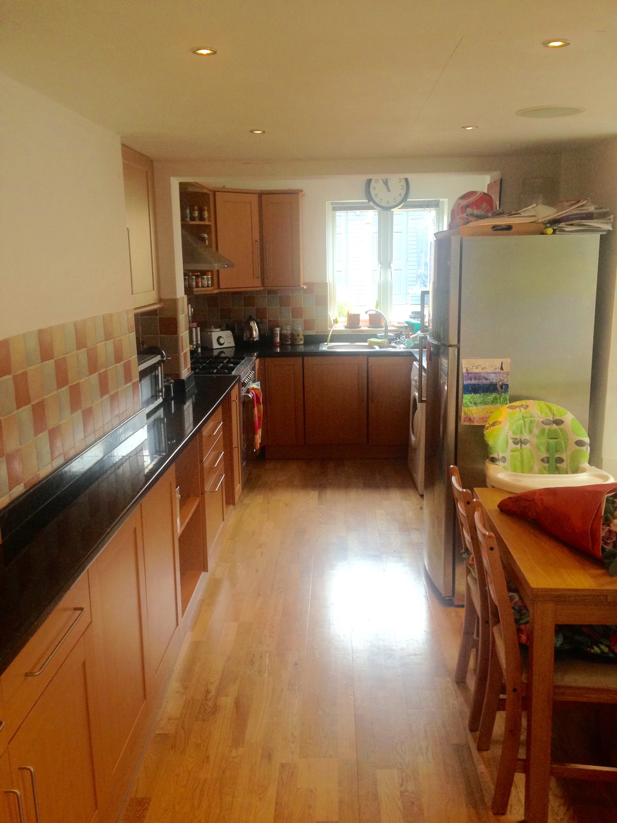
First, a little reminder of what it looked like a few weeks ago, and also what it looked like when we bought the house. We did a budget makeover on it by painting the cabinets and tiles, as we desperately wanted to lighten it up and create a cheerier space, while we saved for the big renovation. It did the trick but this year cupboards have collapsed, doors fallen off and just generally the lack of storage all came to a head. After five years, it’s time!
For my first blog, I thought I’d start with the fun stuff like inspiration, mood boards and what I’m hoping to achieve with the overall look of the kitchen itself, and then circle back to the slightly less fun, but entirely necessary stuff about planning considerations, choosing our builders (we went with James Whitney and so far, very happy) and the extension itself. There are more blogposts coming, we have lots to talk about! But for now, lets stick with the pretty. Sooooo, here’s my moodboard….
What do you think? Let me know in the comments when you’ve finished reading. I might answer some of your questions before you get there..
Why White?
First up, let’s address the elephant in the room. Although if you’ve followed me over on Instagram for the last couple of months,, you will have probably already worked this out by now. We are going for a white kitchen. Well, an off-white kitchen. Having never done a kitchen renovation before, and having waited not so patiently for five years to do this one, never in a million years did I think I’d go white. This is a pretty radical decision for me.
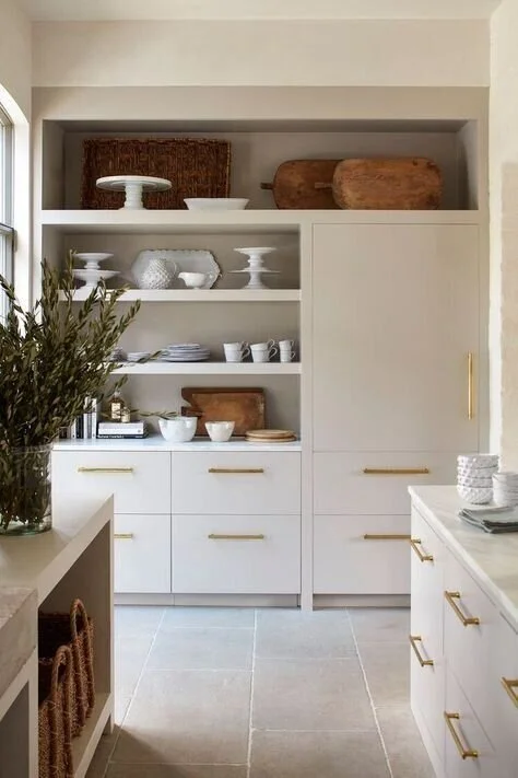
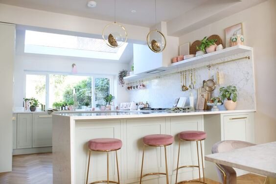
White kitchens get a bad rap as being boring, sterile, characterless, and I myself have definitely uttered the words: “I would NEVER choose a white kitchen!” before. But here’s the thing. The more I looked at kitchens on Pinterest, or in magazines, or on the gram, the more I realised that almost everything I was pinning for inspo was white, or off-white, or warm white, neutral…whatever you want to call it. And none of them were boring! When done right, white kitchens can be warm, bright, welcoming, timeless spaces, and that’s what I’m hoping to achieve here.
Kitchen design by Studio McGee
I haven’t actually chosen a colour for the kitchen yet, but I am sampling away to try and find the perfect warm white tone. Current favourites are The Boltons by Mylands and School House White by Farrow & Ball. I’ve also had lots of recommendations for Slaked Lime by Little Greene so am waiting for my local paint shop to restock the sample pots. The reality is I probably won’t decide until the walls are up and the rooflights are in, because only then will we have a good idea about the lighting in there. That’s the things about whites, they change a lot according to the light so I don’t want to be making any rash decisions.
You can see a few of my fave inspo shots on the moodboard but I’ve scattered a few more around this blogpost as well.
Kitchen designed by Jill Egan Interiors
The Kitchen
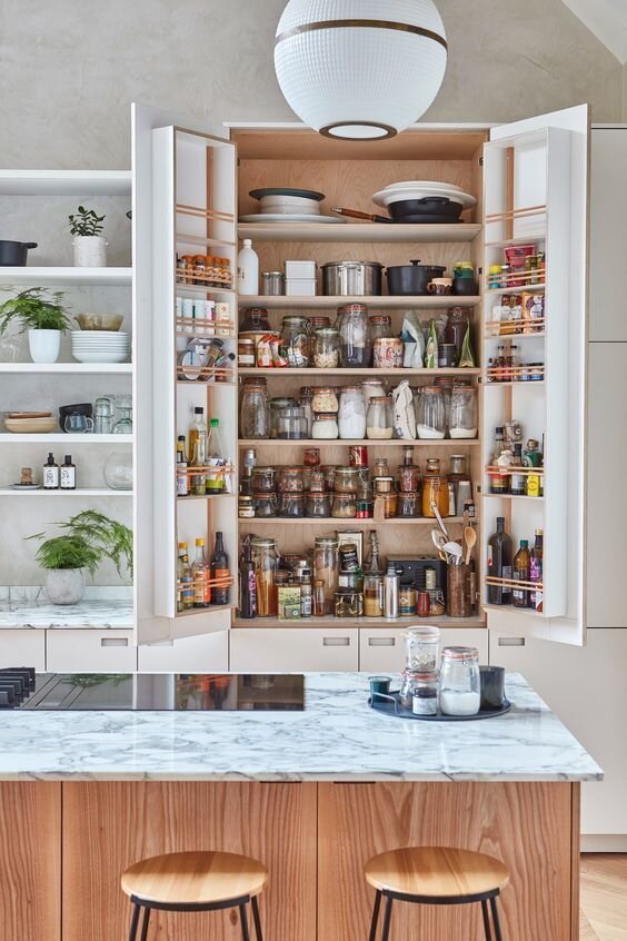
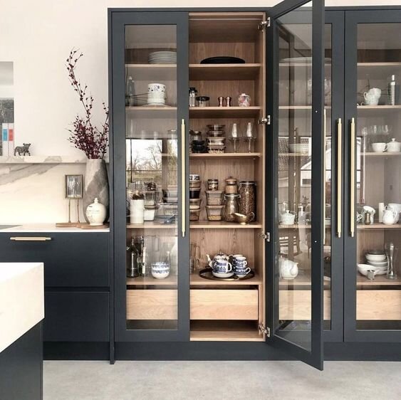
After exploring many options, we have decided to go with John Lewis of Hungerford to make our kitchen for us and I’m super excited about our decision. I researched lots of options including DIY kitchens (which lots of you really rate btw) and jazzing up an Ikea kitchen with custom fronts, but when it came down to it, there were several areas of the kitchen design which required bespoke elements to make the most of the space, and we just weren’t willing to compromise on that. One of which is a built in larder cupboard, which I’m ridiculously excited about owning after years of precariously stacked tins falling on my head. I’ve always wanted one but even more so after seeing chef Anna Barnett’s larder cabinet of dreams!
Chef Anna Barnett’s larder cabinet - photography by Malcolm Menzies of Architectural Digest
I’ve seen what a beautiful job John Lewis of Hungerford have done on both 2LG and Kimberley of Swoonworthy’s kitchens (see pics below) and the quality and workmanship is incredible. I’ve been working with designer Rebecca Nokes from John Lewis on the design and layouts and it’s been such an enjoyable process.
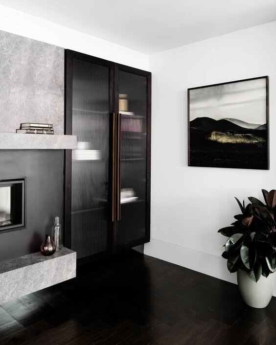
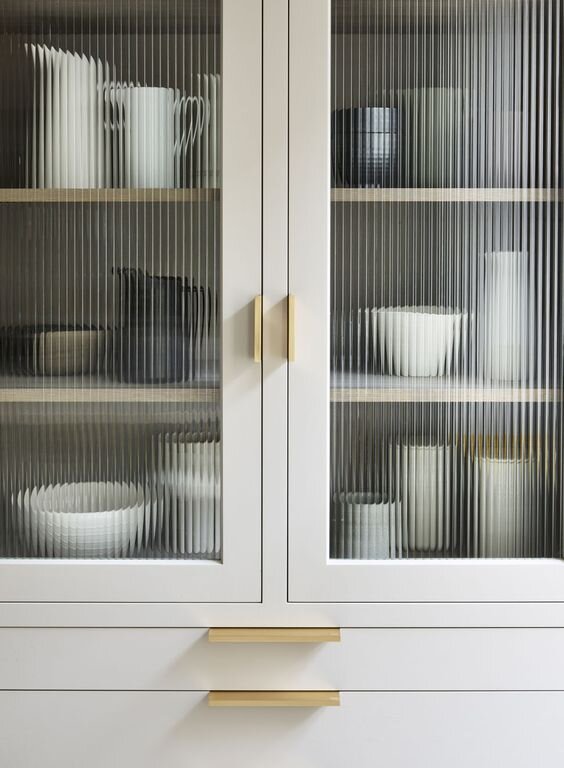
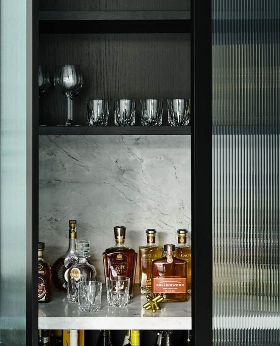
I feel like she totally understands what we want and she has given so much invaluable additional advice regarding things like worktops and appliances. Rebecca has also created a bespoke cocktail/display cabinet for us, which will create a link between the kitchen and the dining/chill area. Here’s some of my inspiration for that cabinet…
I do have detailed plans and renders of the kitchen from every angle, but I don’t want to share it all in one go, because where is the fun in that? I want to save something for the big reveal. However, as requested, I am sharing the floor plan below, as drawn up for me by my super talented friend, interior designer Kate Tully of AT Studio, and a sneak peek of one side of the kitchen (though even this is missing out some key design elements so as to not to completely let the cat out of the bag!). Kate didn’t design our kitchen but she has given me lots of great advice about things like lighting (see more below) and she designed my friends beautiful kitchen which you can see over on Kate’s Instagram feed. Drop her a line if you need help with your project.
3D renders created by AT Studio
Rooflights and Doors
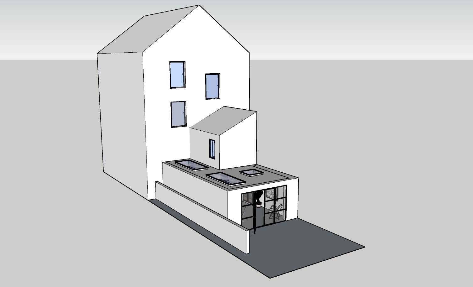
As you can see from the render below (also by Kate) we are maximising the light coming into the kitchen with three separate rooflights. I am very excited to be working with Vario by VELUX and will be creating lots of content with them around this project. Our kitchen will be 8m long in total which requires an additional steel across the middle section, meaning we couldn’t have glazing all the way down the side return extension. Instead we have selected two 2.3m x 1m Rectangular Rooflights, and an additional 1x1m Square one. I love that we’ve been able to completely customise the rooflights to our own specification, instead of being tied to any standard sizes. Every aspect from the size to the colour and openings is completely customisable and easy to do via the tool on the website.
I have opted for Crittal style doors, similar in style to the ones below. The middle section will open like French doors, and the side panels will have one opening panel at the top of each. I’ve chosen this configuration for two reasons. 1) I really like the uncluttered style of the wider horizontal panes with the French doors, and 2) We live in England, I’m realistic about the weather and this gives us maximum flexibility. This way, we have the option of having the doors closed and just opening up one of the panes to let some air in, rather than having to have the whole lot flung open. We have ordered these through our builders, and it’s the Heritage system steel doors.
Image from Pinterest (if you know the source please let me know)
Worktops
I have finally made a decision on worktops and we’re going with Dekton by Cosentino. I wanted the beautiful marble look, without the stress of stains and heat damage that comes with a natural stone. Dekton is a blend of porcelain, glass, and quartz compressed together to make an extremely hardwearing material. I loved so many of their designs, but we have gone with the Entzo style, which has a warm base and brown/golden veining and it should complement the off white of the kitchen cabinets perfectly. I’m currently weighing up how far to take the upstand/backsplash up the walls, but the island will have a waterfall edge on both ends for immediate impact when you walk into the kitchen.
Flooring
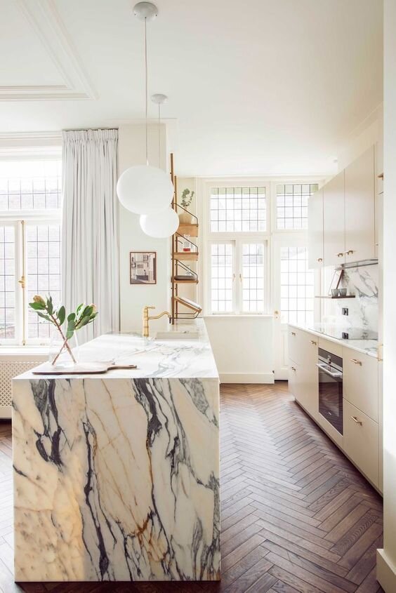
I considered a few options for the floors, including a mix of tiles in the kitchen area and wood floors for the rest of the room. However after weighing it up, I’ve decided to go for a seamless look throughout. We will be having underfloor heating fitted because I don’t want to waste any wall space on radiators so it will be nice and cosy under our toes! We are also going to take the opportunity to have the lounge floors replaced as well, as that has been on our To Do list for a while. The plan is to have same floor in the lounge and kitchen, which will make the transition between those rooms much easier. We haven’t settled on the exact flooring yet and I’m in the process of ordering samples but my current fave is an Oak Aged Parquet from The Yorkshire Wolds Flooring Company. They can finish the engineered oak flooring to suit almost any of your requirements so it’s well worth dropping them a line to get a sample made up. I love the Herringbone flooring, alongside the marble and the off white units, in this beaut of a kitchen designed by Studio 34 South.
Kitchen designed by Studio 34 South
Kitchen Appliances
Dave and I spent a good few hours deciding where we wanted our appliances to go, and whether we wanted the sink or the hob, or neither, to sit in our island. We really like the idea of cooking while facing our guests and the Dekton is tough enough to hold up to hot pans, so we are going for an induction hob on the island, and the sink on the low run of cabinets behind it. As a result of this, and the fact we have low ceilings, we have decided not to have an extractor fan and will instead go with Smeg’s brand new hob with an integrated downdraft extractor. The ovens will be integrated within the island as well. And I’ve managed to squeeze in a little wine fridge too because…chilled rose´ all day! (This is written with a heavy dose of humour in case the tone is lost)
When it came to the fridge, I knew I wanted it to be integrated into the kitchen cabinetry, but I also knew I wanted something spacious with plenty of storage. Fisher & Paykel are the only company who make an integrated American style fridge freezer, so it was a very easy choice to make! It’s also happens to be a seriously good looking appliance and I’m already looking forward to styling my fridge with aesthetically pleasing foods, lined up in a symmetrical fashion ;-) Of course, it won’t be long before the bowls of half eaten pasta and apples with a bite out of them (why would you do that kids?!?) take over. But I’ll do it anyway.
Kitchen by Blakes
Lighting
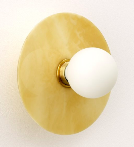
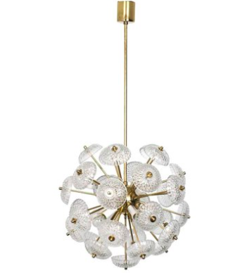
Our lighting requires a little thought and planning because due to some really rather unhelpful new planning restrictions introduced recently by our local council (I’ll go into more detail in my next blogpost) our ceilings are going to be fairly low. But we’re doing everything we can to make sure that’s not an issue. We won’t be having pendants over the island because I don’t want them to obscure the view across rest of the kitchen. Instead we’ll have wall sconces on the right hand side of the kitchen, under the Vario by Velux rooflights, and integrated spotlights on the left hand side. I love these Arc sconces in the Marble Honey finish from Spark & Bell, a small business I really rate and always recommend when people ask me to look for good lighting options. Last but not least I’m on the hunt for a statement vintage 60/70’s pendant to hang over the dining table area. I’m currently scouring Vinterior, Etsy, 1st Dibs, Pamono and my new favourite account Anemone Interiors (Lia has an incredible eye and finds the best pieces) for the perfect pendant.
Dining area
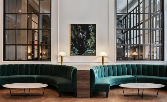
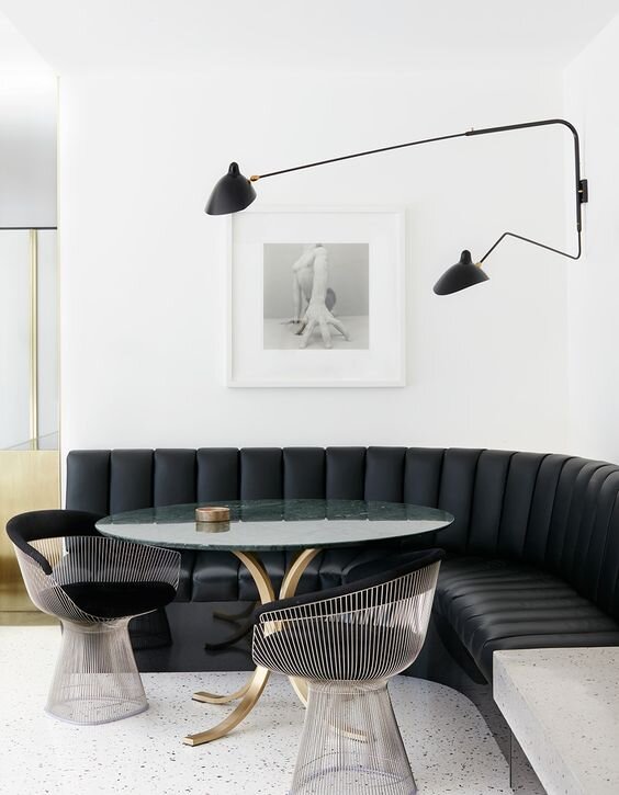
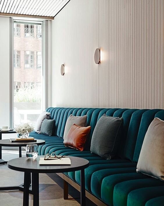
We’ve designed the space so that there is a gentle separation between the kitchen and the dining area/dance floor. The kitchen cabinets on the right will come round in a L-shape and I’ve designed an upholstered banquette to curve around the dining table and facing out onto the garden. This is the part of the kitchen that I’m arguably most excited about seeing coming to life because it’s something I’ve been cooking up in my head for years. I think I’ve found my fabric via Kirkby Design and here’s some of my inspo. I’m saying nothing else but I. CAN’T. WAIT!
Soooo, ending on a high and all that, I think that’s pretty much everything covered off for now. While I was planning the kitchen I kept my Pinterest mood board secret but I’ve now unlocked it, so feel free to head over here for a nosey and you can follow me and all my boards there too.
Let me know in the comments section below if you have any questions, or if there’s anything else you’d like me to cover. I’m planning some kitchen shopping edit style posts too, so holler if there’s anything you could do with some help hunting for.
Bye for now! Jess x


