The Gold Is A Neutral bathroom reveal Before and After: Part 1
It's finally here! I'm not exaggerating (who me???) when I say I'd equate this bathroom renovation to the birth of my first child. Long, painful and at times felt like it was never going to end...but totally worth all the effort and I couldn't be more in love with the result.
I still can't actually believe this bathroom is ours. It is quite literally the bathroom of my dreams and over the last few weeks I have been known to disappear in here and just sit and admire it. My kids are equally smitten, I previously had to barricade my five-year-old in the shower in order to get him to wash but the other day he asked me if he could have a shower after his lunch because he had houmous on his fingers. The husband is a little more grudging in his praise. He loves it obviously, but there have already been a few grumbles about how impractical a brass vanity unit is with small children, to which I reply: "I DON'T CARE BECAUSE LOOK AT IT!"
Glorious Custom Fronts brass cabinet, Victoria + Albert Baths Pembroke sink and Perrin & Rowe Crosshead taps in Satin Brass, Bert & May Pradena tiles Photo: Kasia Fizser
It's true that Brasso and I are going to become firm friends, but it's also true that these doors will patinate beautifully over time and I'm going to relax and let that happen (possibly).
Now, I know these Before and After posts can sometimes be a bit meaty and I figure that first and foremost all you really wanna do is look at the pics and be astounded by the transformation. Am I right?? I hope I am. So to make it a bit more digestible, I thought we'd do some Before and After pics and I'll share my thought process, the planning and an overview in Part 1, and then I'll devote Part 2 later in the week to all the gorgeous, glorious details, like my total dream of a York bath from Victoria + Albert Baths.
Let's start with a little reminder of how it looked before...
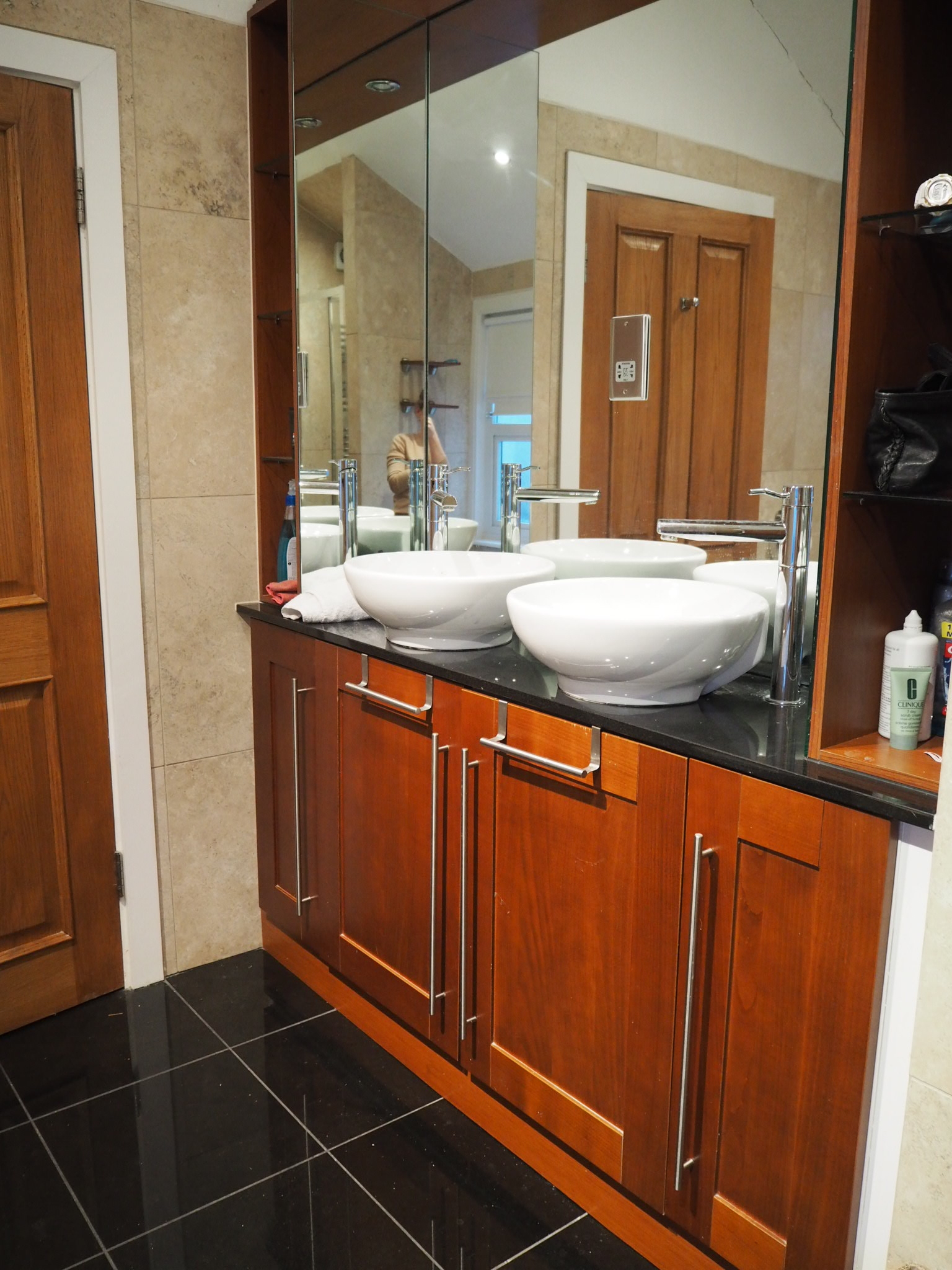
BEFORE - Beige bath, beige shower, beige walls...
If you've followed me for a while you will know that I HATED this room. It was a temple to beige, there was an empty tropical fish tank built into the chimney breast and a vast 2m wide jacuzzi bath which dominated the room. I could not wait to rip it all out and start again. Although I'll admit the enormous bath was ideal for fitting the whole Hurrell gang in (there is no such a thing as a relaxing bath for one in this household)
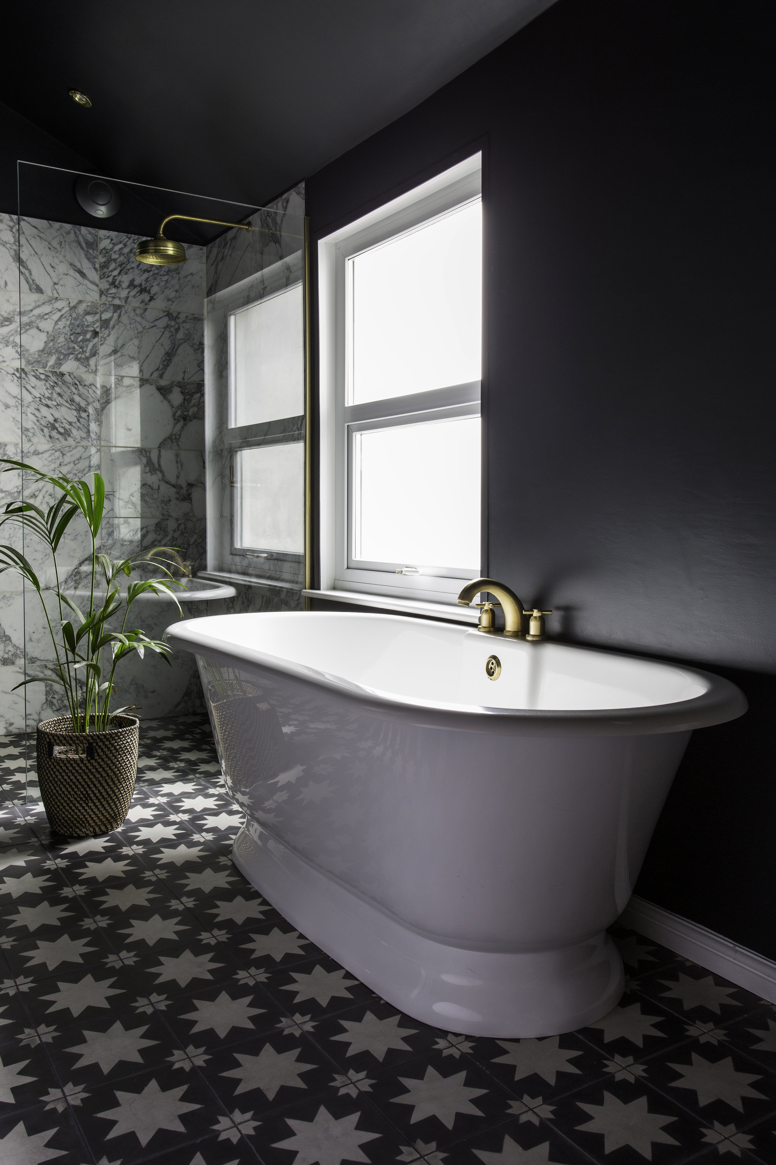
I took a pretty uncompromising approach to this bathroom renovation. All that black, brass and marble might not make it the most practical room in the world but it is the sexiest. What I absolutely did not want was a clinical white box. I wanted it to be sexy...and elegant at the same time. The Angelina Jolie of bathrooms if you will.
Hello sexy! V+A Baths York bath, Perrin & Rowe shower and bath taps, Arabescato shower tiles from Topps Tiles, Pradena floor tiles Bert & May and walls in Farrow & Ball's Off Black. Photo: Kasia Fiszer
The one thing this bathroom did have going for it was the layout. It worked. As far as bathrooms go it’s big with a very high, pitched roof. We have a huge old boiler in the cupboard at the far end of the bathroom on the left and had initially toyed with the idea of replacing it and moving it to the other end, taking out the chimney breast altogether and freeing up all that space down the left hand side of the room. If we had done that, we would have gained the space to have a huge double shower across the back wall. But I wasn't convinced it was worth it. Plus I really liked the idea of reinstalling a fireplace in the space soon to be vacated by the tropical aquarium (I know some of you were very sad to see it go) to add a bit of Victorian character to the space.
Hey, the 90's called and wants its bathroom back...
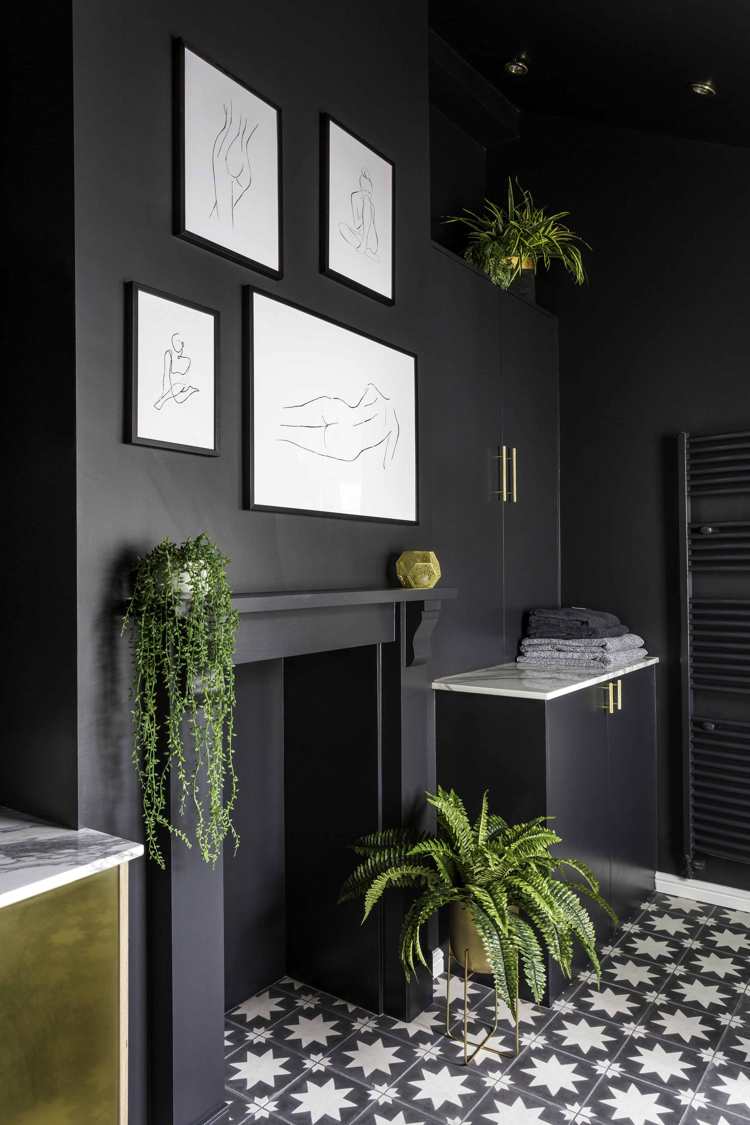
We had to ask the builders to get box out quite a bit of the chimney breast as the hole left by the tank was too big. And you can just see in the picture above the irregular shape of the chimney breast towards the top. I asked them to make this the same width all the way up with some clever application of plasterboard. I knew I wanted to create a gallery wall here and the wonky shape would have been too distracting. Now it just looks like a normal chimney breast all the way up to the ceiling.
Abstract nude prints from Desenio, faux foliage from Hello Flora, brass handles from Dowsing & Reynolds. Photo: Kasia Fiszer
So although we tore everything out and stripped it back to brick, we decided to keep the layout pretty much the same as it had been, which meant we saved a lot of money on plumbing costs. Money which then allowed me to source and select an absolutely beautiful slab of Arabescato marble to sit on top of the vanity and boiler cupboard. You will either understand my excitement over a slab of stone, or you won't. All I can say is that as far as life achievements go, this is up there alongside my lunch date with Tom Hardy, and is a big fat tick off my Interiors Bucket List.
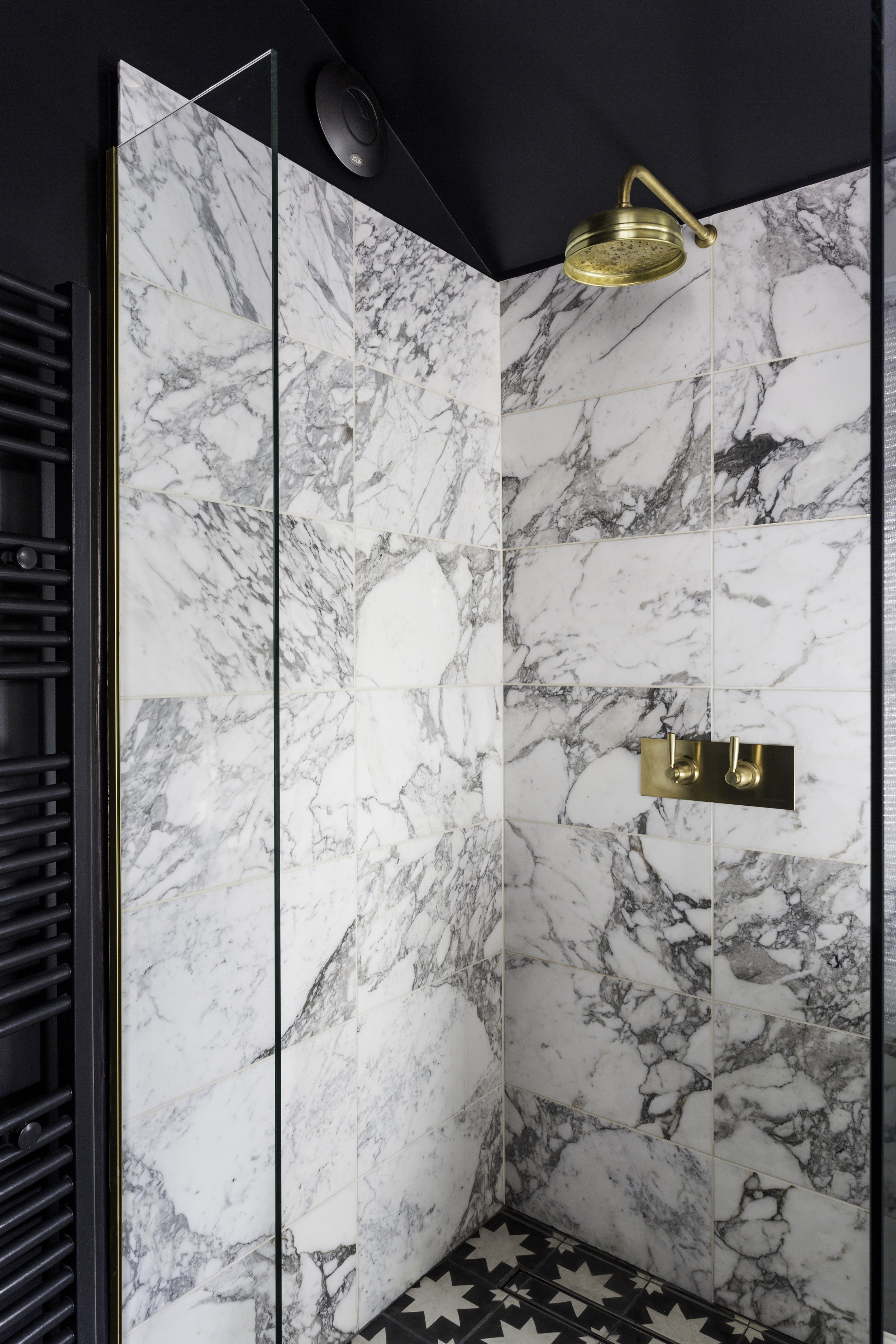
One structural change we did make was to take down the stud wall between the previous shower and the bath which allowed us to create a much bigger wet room style shower. I'll come back to this, but suffice to say I have spent a lot of time in this shower since it's been finished. That shower rose, or "golden shower" as my son calls it (LOL!!!) is a little bit of heaven after the dribble we have been washing under since January.
I know I'm biased but this is the best shower I have ever had. Shower mixer with levers and shower head from Perrin & Rowe, Arabescato marble wall tiles from Topps Tiles , floor tiles from Bert & May. Photo: Kasia Fiszer
Our builders also had to do some major redirecting of a multitude of pipes that had been concealed by the inset bath. My new freestanding bath had a much sleeker and elegant profile than the previous bathing behemoth, and exposed pipework would not do at all. But it was an unexpected plot twist and I heard a lot of what I'm pretty sure was cursing in Spanish by our builder Carlos, who had the unenviable job of making the spaghetti junction of copper piping invisible.
Our sink area is where my sexy bathroom game plan reached its peak. The existing vanity cabinet and double sinks were all ripped out. Despite previously having two sinks, for some reason we only ever used one so we decided to let the Pembroke sink take centre stage, along with the uber cool, yet simple and sophisticated, deck mounted crosshead taps. (I'll show you these close-up and in all their glory later this week)
The brass fronted vanity cabinet was actually inspired by a number of brass kitchens I had seen and fallen hard for, and I didn't see why I couldn't use them in the bathroom too. I don't know for sure if I'm the only person to have a brass vanity cabinet in their bathroom, but I haven't seen any others despite an extensive search. So when I came across Custom Fronts just as they were about to launch their bespoke brass cupboard doors, it felt like fate. Rachel and Ian were an absolute pleasure to work with and the birch ply doors mounted with satin brass are everything I hoped they would be and more. I asked my builders to make the cabinet using birch ply and they attached the doors once they were ready. It was at this point that I may have cried actual tears of joy, and was swiftly told to get a grip, which was fair enough really. But I was very happy.
Photo: Kasia Fiszer
That's all for now but I'll be back on Wednesday with another post giving you the lowdown and close-ups on all the details. I'd love to hear your thoughts in the comments below.
**The York bath and Pembroke sink were kindly gifted by Victoria + Albert Baths; the Bath and Basin taps, Shower mixer and Shower head were kindly gifted by Perrin & Rowe and the Arabescato Marble tiles were kindly gifted by Topps Tiles) All design, project managing and styling was done by me.


