Living Room Makeover...how I banished the bland and brought the glam (Before and after reveal)
Here it is. My first ever before and after reveal. I've been wanting to do this for ages but couldn't find the before pics anywhere which is a pretty poor state of affairs when you have an interiors blog. Anyway, thank god I located them. And I've got to admit they even surprised me a bit, as I'd forgotten it was this bad, so I hope you'll enjoy this too. The brilliant thing about rediscovering these images is that it's a reminder of how far we've come. It's almost two years to the day since we moved in to this house and at times it's felt like things have been progressing too slowly. I fell for the bones of this house and wanted to transform it into a colourful, inspiring and glamorous family home. It's been a lot harder (and more expensive) than we thought it was going to be and we still have a lot to do. But finding these pics (other room transformations to follow over the next few weeks) has given me renewed enthusiasm to keep going.
I am starting with the living room, because it was the first room we decided to tackle. And you can see why right???
I was six months pregnant with Nellie when we eventually got in to the house. And the idea of spending my Winter maternity leave sitting in this room watching Game of Thrones with a baby clamped to my boob was enough to make me crack out the paint charts pronto. I'd go mad in there. But where to start? SO much to do. First up, we had the shelving and built in cupboards ripped out and rebuilt by our very talented friend Lee at Freeborn Carpentry. What you can't see in these pics is that the previous owner was nuts for gadgets and behind that shelving is a fake wall concealing a shit tonne of wires for various things including CCTV cameras in every room...and no I have no idea why he needed CCTV in every room. So that was all ripped out and we gained a lot more depth to create proper cupboards and shelving.
Another thing that absolutely had to be tackled was that gas fire. Not least because we discovered it had been leaking for the first week after we moved in. I know!!!! Though even if it hadn't almost killed us, it was still destined for the dump from day one. I wanted to reintroduce a Victorian period fireplace which would have been been there originally, and I had my heart set on a marble surround. I found the cast iron fireplace on Ebay. But once we started to price up the marble surrounds, along with all the other changes we wanted to make, I knew I was going to have to compromise on this. So I found a wooden surround on Ebay as well and we chose a marble hearth for a little bit of added glamour and texture.
There was also the conundrum over what to do with the large window at the front of the house. It's a beautiful big wide sash window which lets in tonnes of light. At some point we'd like to replace the PVCu windows with proper sashes but that will have to wait for the time being. But while it lets in lots of light, it also invites in lots of nosy parkers, being so close to the pavement. So we wanted something which didn't obstruct the light but could also give us a little privacy. Curtains and traditional blinds were out for that reason. The previous owner had installed "bottom-up blinds" which scrolled from the bottom up, rather than from the top down. I can appreciate that this is a practical solution to the problem, I really can. But practicality is not always top of my list and quite frankly I wanted something a bit more aesthetically pleasing. Which only really left us with shutters. The beauty of the split style being that you can have the bottom set closed but tilted open all day so you can sit in your living room and not feel like you are sitting in a shop window.
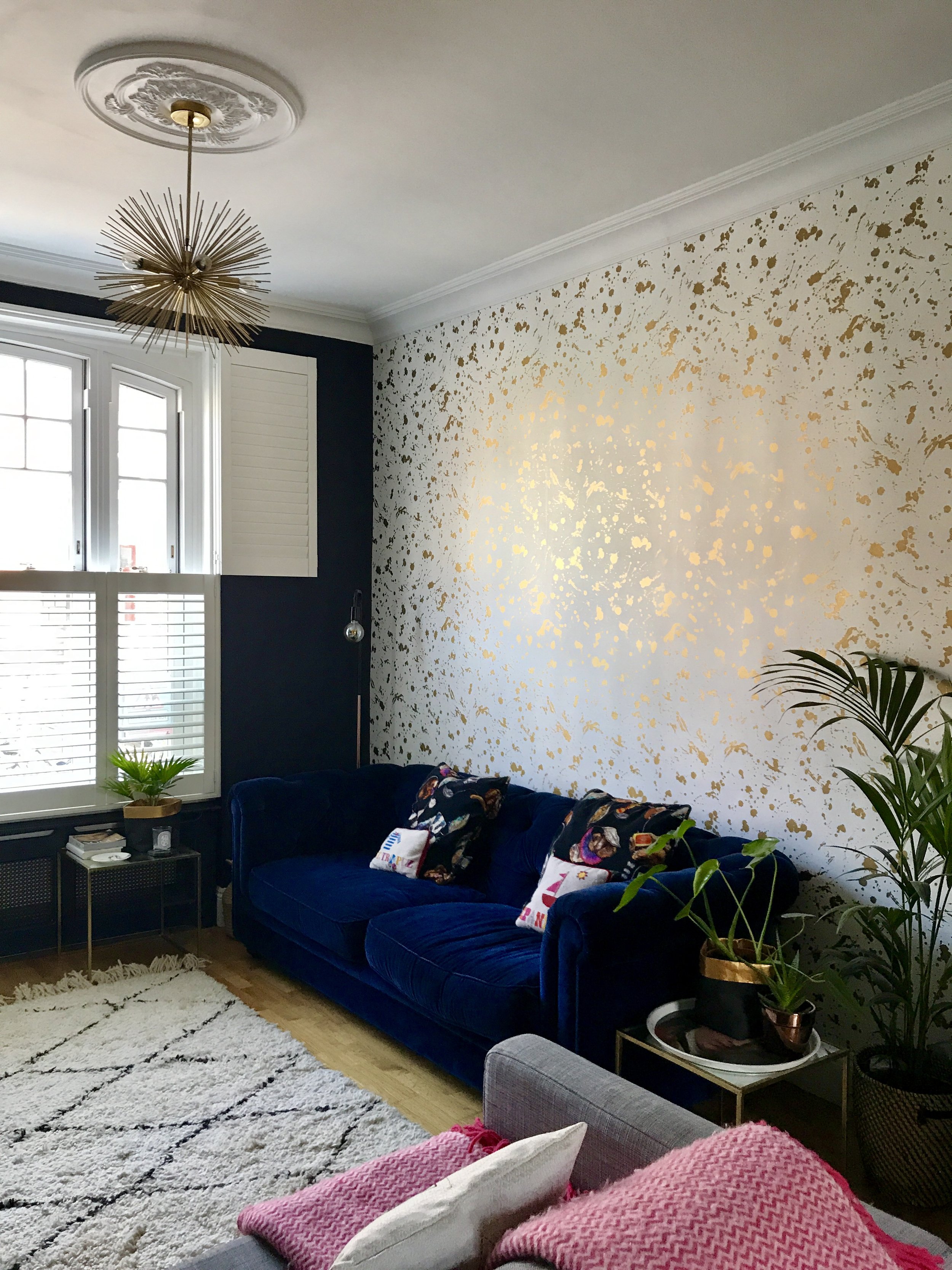
Sputnik pendants from Ebay, Navy blue velvet sofa from Sofa.com, cushions House of Hackney, Beni Ourain brought back from Morocco, Cactus and planter from West Elm
Additional jobs that needed tackling included....having a door filled in which wasn't serving any purpose; filling in two decorative portholes that ran along the hallway wall (handy for passing plates out at the end of dinner but not much else); having over 20 spotlights ripped out, filled in and replaced with a pair of ceiling roses and sputnik pendants (also found on Ebay) and having several of the walls replastered. All of that had to happen before we could even think about painting and wallpapering. Now, I'm not averse to picking up a paintbrush but this was a much bigger job than I could take on so we found people to help us. I should add that time was ticking and I was now very heavily pregnant as working out all of this stuff and actually lining everything up took aaaages.
Wallpaper and needlepoint cushions from Jonathan Adler, Side tables from Zara Home, Paper bag planters from Etsy
Once all those jobs were done it was finally time for the fun part! When I was planning this room in my head, one of the things that I kept coming back to was that I didn't want to compromise my taste just because I had a young family. So often I hear people say: "Oh I'll decorate once the kids have grown up" which is fine if that's what you want to do, but personally I don't see why you have to chose one over the other. You can still create a beautiful space that works for you and your kids. We like to entertain at home...we have kids so we can't really go out that much anymore...so I wanted the living room to be a place where grown-ups like to hang out too. Ideally that would be a Den like the stunner created by Emily of The Pink House...but in the absence of a den, this room will do very nicely indeed.
Cactus and planter from West Elm
Which is where the very subtle (I'm kidding) Jonathan Adler Drip wallpaper comes in. I had clocked it months before and spent ages hunting for a cheaper alternative. But sometimes the heart wants what it wants. That combined with raging pregnancy hormones meant my husband was powerless to fight it. And I promised I'd eat only beans for the next six months.
It was going to be several months until the wallpaper actually arrived so we decided to just crack on with the painting. And whatever wall colour I chose had to work with that. I was aiming for cosy and glamorous so I knew I wanted to go dark...aka the exact opposite to the stark, white characterless box we had started with. And I decided pretty quickly that I wanted a dark, inky blue. The challenge was finding something dark and inky enough which didn't have too much green or grey in it. As soon as I tested Little Greene's Basalt I knew it was the one and I still love it now. It's pure class by day and reads almost black in the evening when the lights are dimmed. Kate at Mad About The House was also singing it's praises earlier this year so I must be doing something right. The dark blue also has the added advantage of almost camouflaging the TV on the wall. I hate wall mounted TV's but after looking at various different options (including buying a much smaller TV which David got quite agitated about) this was the best place for it. If we ever do our kitchen extension, I plan to move the TV into there.
The gorgeous cushion is part of M&S's new AW17 collection
We had traditional brass library lights fitted on top of the shelves on either side of the fireplace to add another lighting option. I would definitely recommend you consider the lighting early on in a project and have lots of different options scattered around your room, as recommended by the Interior Fox ladies in a previous post. In the evenings we often only switch on these and a floor lamp to give the room that cosy, moody feel.
Mirror from Hurn & Hurn, Drinks trolley and gold pineapple from Oliver Bonas, Hammered metal tray and bowls from Sainsbury's
The retro fabulous bamboo drinks trolley was an anniversary present from David and slotted perfectly into this alcove.
The oil painting was a Kempton Market find and the tattoo flash is by Angelique Houtkamp from Nelly Duff, table lamp from Aldi, candlestick from Maisons Du Monde and peace sign hand, Rockett St George.
We use one half of the room as a sitting/TV room and the other side is currently a playroom. I've tried to think of ways around this but the reality is that the children are too small to play upstairs in their rooms so it makes sense for them to have this space to tip building blocks, Lego, Play Doh etc all over. That white Ikea cabinet is one of the first things we bought over ten years ago and I'd love to replace it with something a bit nicer but it's full of toys and board games so serves a purpose for now. The art is still leaning as I never got round to actually putting it up and now I quite like the lean. It means I can move pieces around, which I often do.
I still don't consider this room done and dusted. For example, we'd also like to put a round dining table and chairs in the 'playroom' side of the room at some point, replace the grey sofa and we definitely would like to replace the floors with parquet further down the line.
But I'm so, so happy (and a little bit proud if I'm completely honest) with how far this room has come. I hope you like it too?
J x
SOURCE LIST
Patrick sofa - Sofa.com
Grey sofa - Exact model no longer available but Ikea
Rug - bought on travels in Morocco (for similar try La Redoute or West Elm)
Planter - West Elm
Wallpaper and needlepoint cushions - Jonathan Adler
Eye cushion - Marks and Spencer
Drinks Trolley - Oliver Bonas
Hammered Moroccan tray and bowls - Sainsbury's Home
Side Tables - Zara Home
Sputnik lights - Ebay
Tattoo flash art - Nelly Duff
White sideboard - Ikea
Table lamp and floor lamp - Aldi (no longer available)
Paper bag planters - Etsy


