Our Mid-Century Modern Dining Room Makeover Reveal
Exciting times in the Hurrell household. We’ve gone and got ourselves a proper grown-up dining room…which can only mean one thing, proper grown up dinner parties! Well, dinner parties, don’t hold me to the grown up bit. But seriously, I’m delighted with this new space, on which I collaborated with the wonders at West Elm to create. It feels super sophisticated and I can’t wait to have people over and play hostess with the mostess.
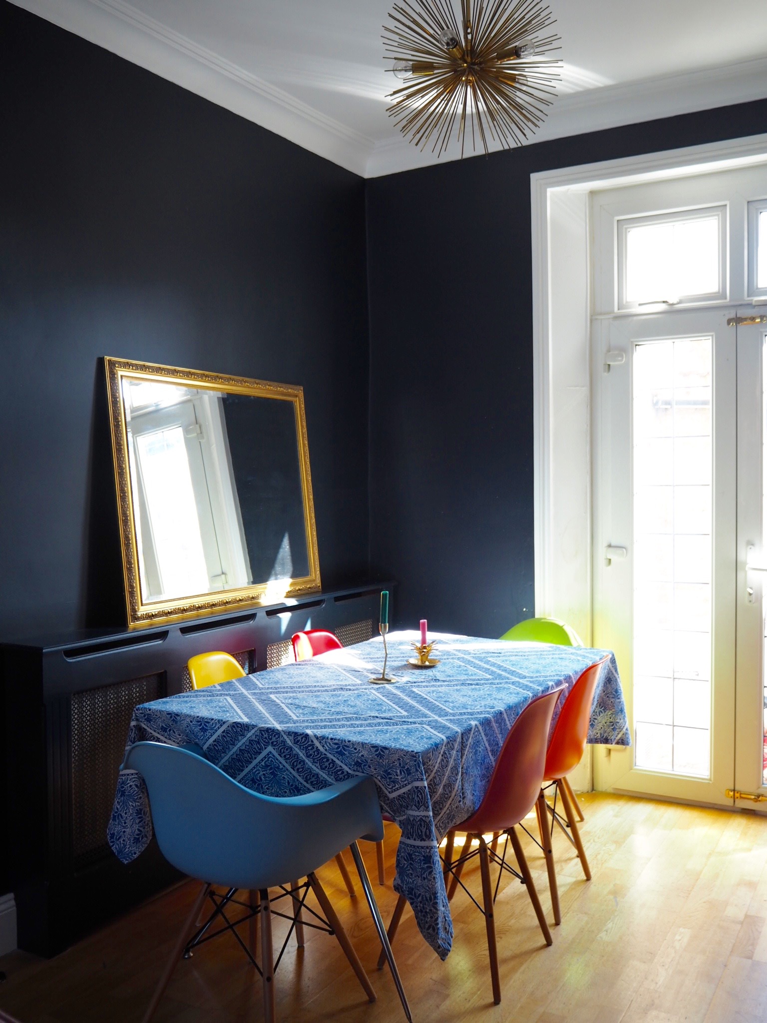
Here’s a reminder of what it was like when we bought the house…
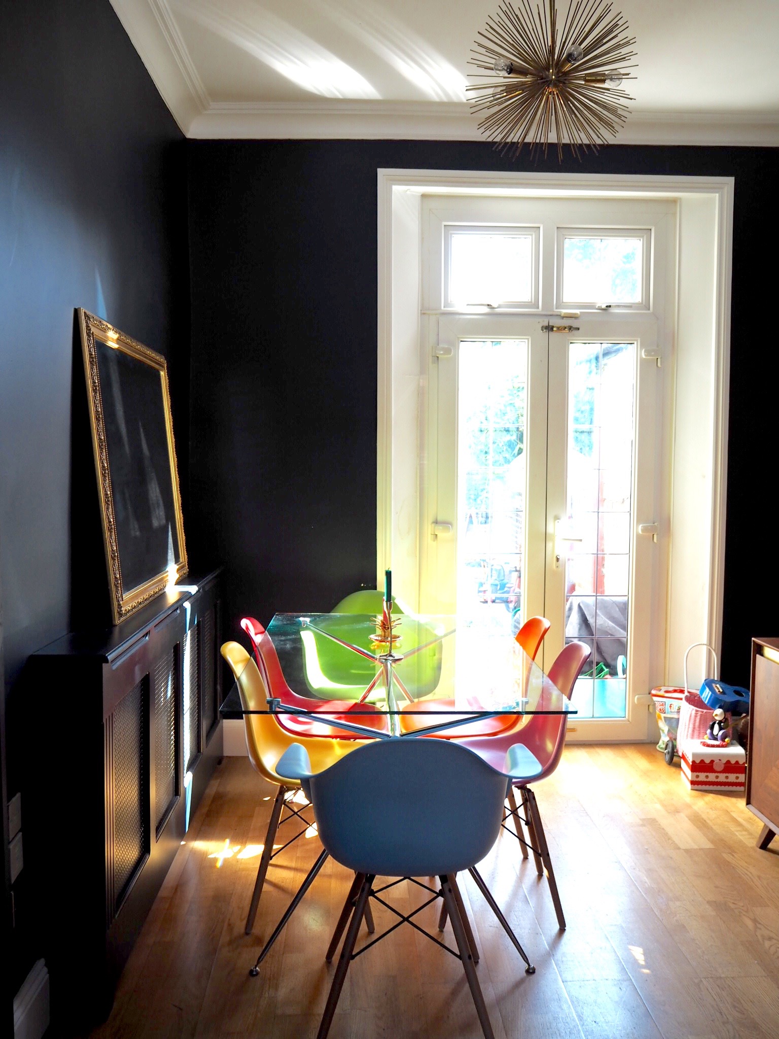
Then we moved in and painted it all, but we made do with our very old dining table and chairs in here while we focused our attention on the other side of the room (the sitting room) and got on with other more pressing jobs in the house. There was a lot to do, and before we knew it, three years had passed. But earlier this year we decided it was high time we show this space some love and create a warm and friendly, sociable dining space.
As you can see, we hadn’t even put our mirror or art on the walls because I wasn’t prepared to commit to anything, so everything was just doing “the lean”.
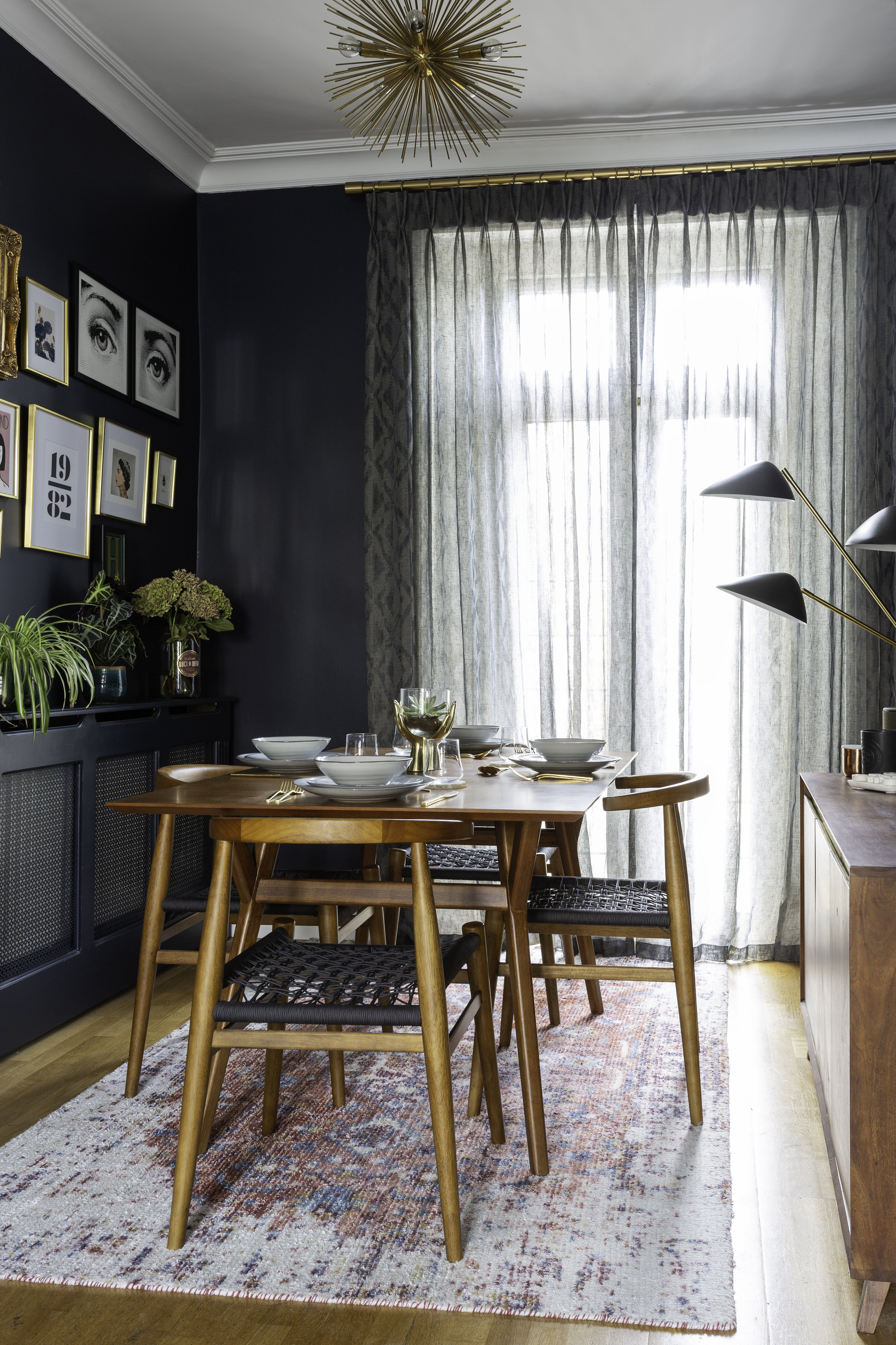
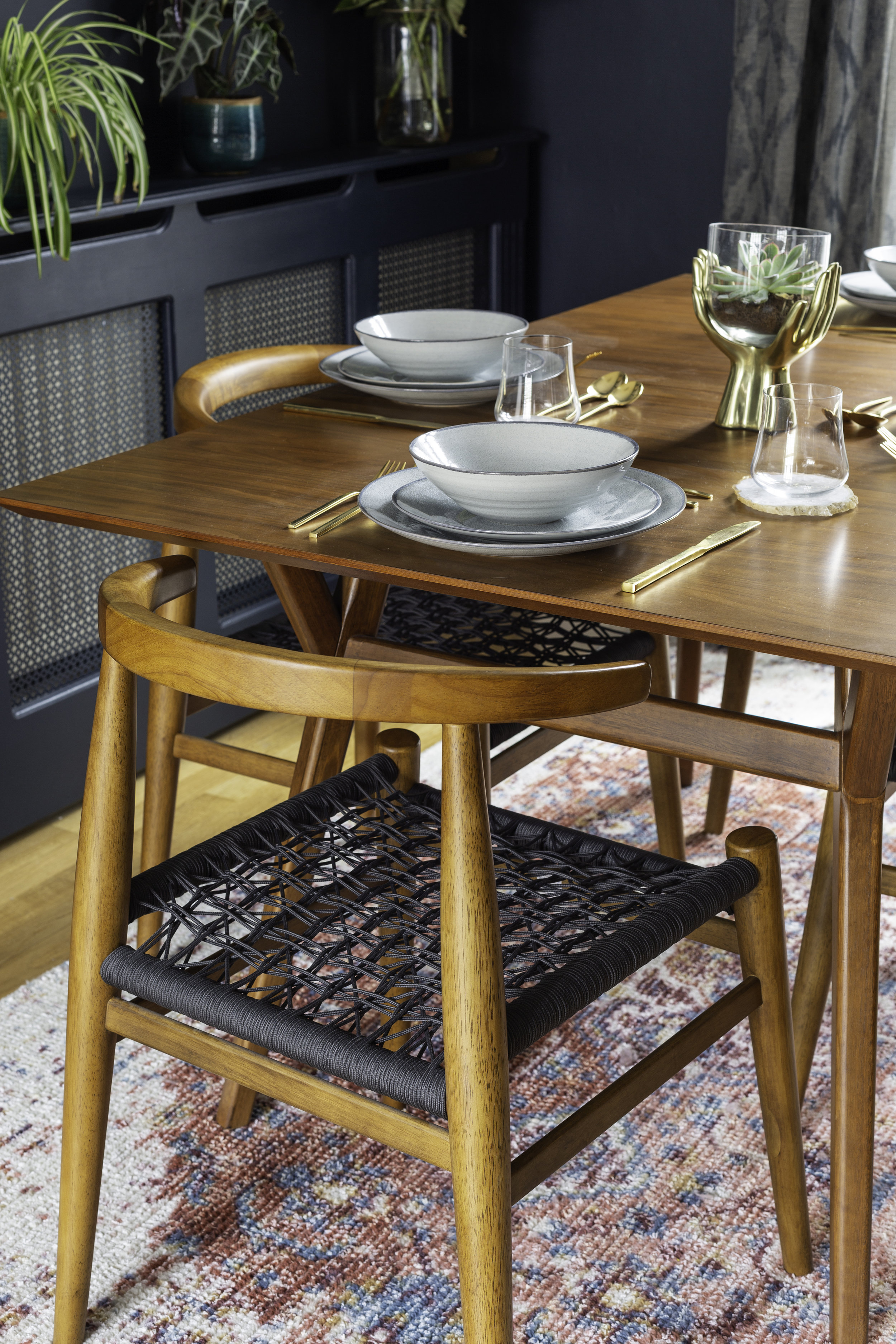
But not anymore…here is our finished Mid-Century Modern dining room. I looked at a lot of dining tables and chairs and I knew I wanted a timeless style which would work in a number of different settings (you know, in case we decide to move house ;-)) The Parker Expandable Dining Table appealed because of it’s middle section, which can be added in so that it comfortably seats up to 8 people. That’s ideal for us, as we only have room for a small table in the kitchen so we can have family dinners round this, and then extend it out whenever we have anyone over.
The chairs were trickier to decide on, I wanted pale pink velvet but my common sense wouldn’t allow it. It’s one thing having a pink velvet sofa with two small, messy children. Pink dining chairs are just asking for trouble…and for spaghetti bolognese to be squished into them. So I stuck with the Mid-Century Modern vibes and went for these, which are a lot more comfortable than they look.
One of the most important parts of this makeover for me was finding the right curtains to cover up the majority of the ugly white PVC French doors which lead into the garden. I asked Mary from The London Curtain Girls to come and take a look and measure up for me, and it was one of the best things I could have done. I had pink flax linen sheers in mind, as I thought it would bring the room together nicely, but as soon as she suggested this bluey green patterned sheer I knew instantly that she was spot on. They are sooooo sophisticated and add so much elegance to the space. And the best bit is that we can keep them pulled closed so as not to have to look at all that ugly white plastic, but they still let the light in.
I may have been off about the curtains, but I was right about the beautiful Rani rug helpig to tie the two rooms together by picking out the pink from the sofa in the sitting room.
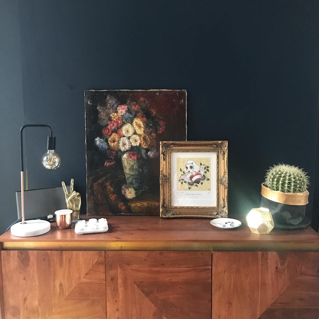
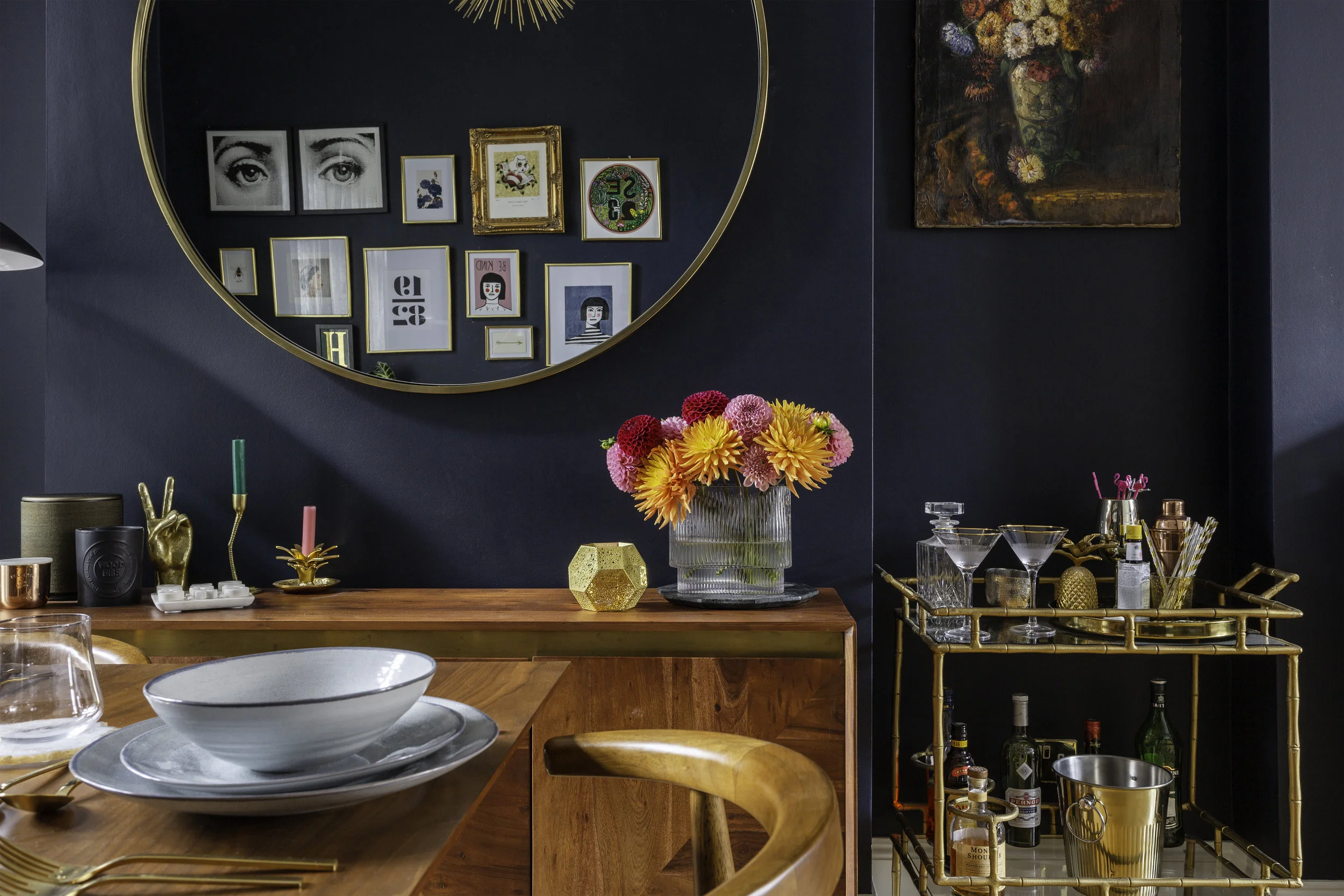
While planning the dining room I had a bit of an epiphany about what to put on the wall where the sideboard is, and ordered the biggest circular mirror West Elm have. Then I was a bit worried it was going to be too big, right up until the moment we got it on the wall. But I needn’t have worried because it’s a total game changer in here and I can’t imagine the room without it. When it comes to mirrors, more often than not, it’s best to go big or go home. I then moved our favourite oil painting to the alcove above the cocktail trolley, where it looks equally at home.
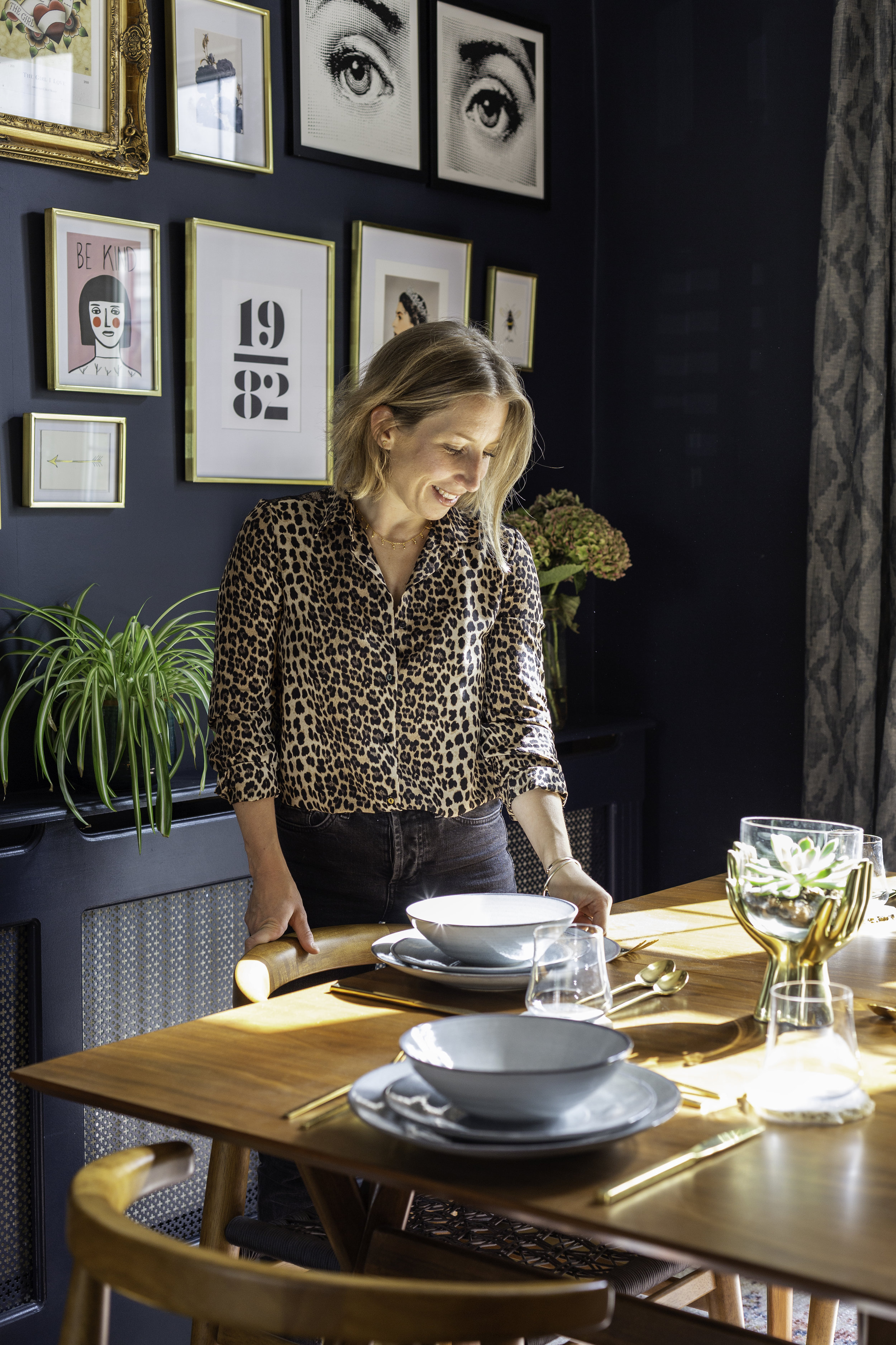
On the opposite side of the table I embarked on something I’ve never done in this house…a gallery wall. I have to admit I’ve always been a bit anti gallery walls, as I preferred to buy bigger statement pieces. But here was a big empty wall that was crying out for some creativity. I already had a few pieces that I knew I wanted to include, including our beloved SE23 print from Niamh Gillespie Design, and the Girl I Love tattoo flash from Angelique Houtkamp, which was a wedding present from David. For the rest of the gallery I set about hunting for pieces I really loved. So it felt a bit like it was meant to be when I bumped into Margo from Margate, whose pieces I’d admired for a while, at an Etsy press show. She kindly let me sift through all her work and select two pieces which I absolutely adore and have become very attached to. The other pieces on the wall include the super cool typographical print featuring the date of both mine and David’s bday from Gayle Mansfield Designs, one of my favourite bumblebee designs by my bezzie Carol at Max Made Me Do It, a gold foil initial from Etsy and a selection of cheap and cheerful prints from Society 6. These were then arranged in either their existing frames, or displayed in West Elm’s Brass Gallery Frames which are the best quality off the shelf frames I’ve ever laid eyes on. They are pricey but they are totally worth every penny if you are after something a bit special to display your favourite pieces in.
So far, so good. Very, very good in fact. But there’s no point having a fancy dining room to entertain in, if all you can serve them is cracked and chipped plates. Our crockery collection, which we’d had since we bought our first flat over ten years ago, had taken a dramatic beating when I accidentally overloaded the kitchen shelves with plates and the whole thing came crashing to the ground over my head. We’d eaten off chipped plates for almost two years so we were ready for a change. This Grey Speckle set is perfect for everyday use but still smart enough for occasions.
So that’s it for my Mid Century Modern Dining Room Makeover tour. I’d love to hear your thoughts on what we’ve done, so please feel free to leave a comment in the section below. I’m off to go and read my recipe books now and plan for our first dinner party.
Oh haiii!
Source list - Mid- Century Dining Table, West Elm; Rani rug, West Elm; Mirror, West Elm; Floor lamp, West Elm; Curtains, The London Curtain Girls; Curtain Pole, West Elm; Gallery wall art, various (see blogpost); Brass Gallery wall frames, West Elm; Sideboard, Swoon Editions; Grey Speckle Dinnerware, West Elm; Hand vase, West Elm; Coasters, glasses and cutlery, all West Elm.
This room makeover was generously created in collaboration with West Elm but I was free to choose the pieces I love and will cherish for years to come.All thoughts and opinions my own.


