Buy Better, Buy Less....Why Classic Design Is Worth The Investment.
AD - This post is a part of a paid partnership with Heal’s
If you had asked me 15 years ago, which interior design classic piece I would like to one day own, my answer would have unequivocally been the Eero Saarinen Tulip table. I have coveted this table for as long as I can remember, so the fact that I now own one blows my mind a little bit.
I was delighted to be asked by Heal’s to be involved in their ‘Design That Lasts A Lifetime’ campaign, because I really believe that good design stands the test of time, and if you can do it, it’s always worth the investment. I like a trend as much as the next person, but what I don’t like, is the idea of throwaway design. That’s part of the reason it has taken so long for us to renovate our house. When I design a room, I tend to sit with it for a while and mull it over to make sure I’m not being too caught up in whatever is big at the moment. Will it still look good in five years? Are the pieces well made? Would they work in other settings? I don’t like the idea of buying something, getting bored of it after a year and then looking for something else.
It’s not about being boring and playing it safe, for me it’s about buying well and making a good investment. Personally I’d rather wait and save for some quality pieces and then have the odd splurge on smaller, cheaper items to scratch that trend driven itch. Buy better, buy less. It might cost more in the first place, but it will bring you a lifetime of joy! I absolutely acknowledge these are hard, strange times we are living in and this isn’t an option for everyone, but it’s also worth mentioning that many of these design classics I’m going to talk about often crop up in vintage stores or secondhand websites, because they are built to last. As the daughter of a woodturner, I also massively value quality craftmanship, and a more sustainable approach to shopping where we can.
Of course there are times when all of this goes out of the window and you will fall hard for something frivolous (like the pink fringed Wink pendant in our bedroom) and you just have to have it! But even then, if you love it that much, the chances are you always will, or at least for a long time anyway!
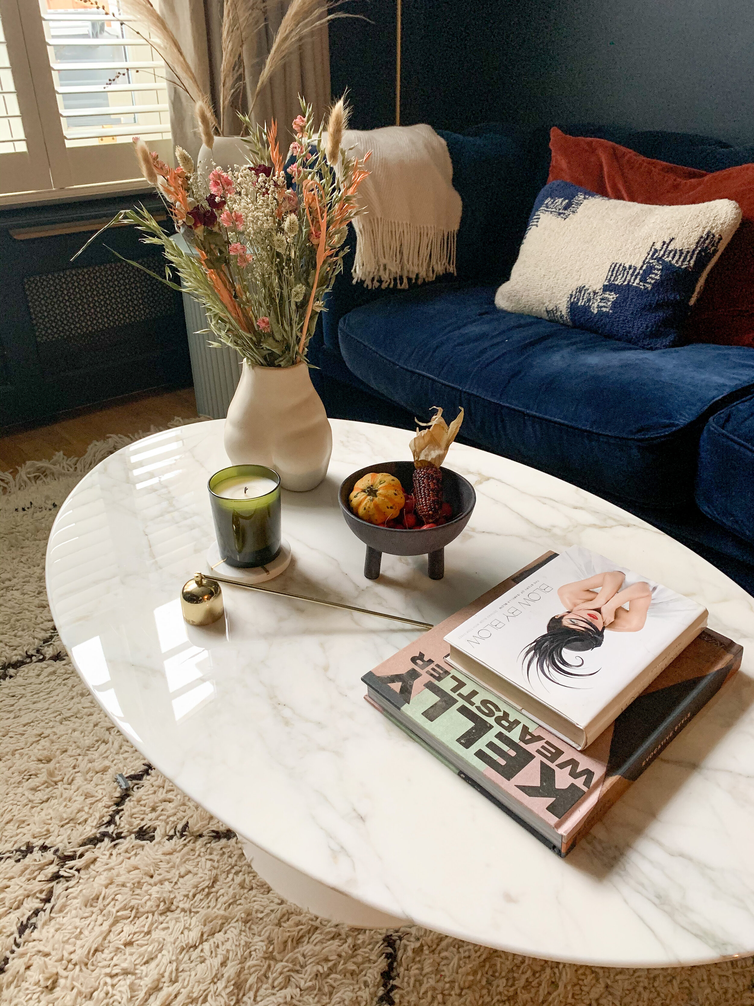
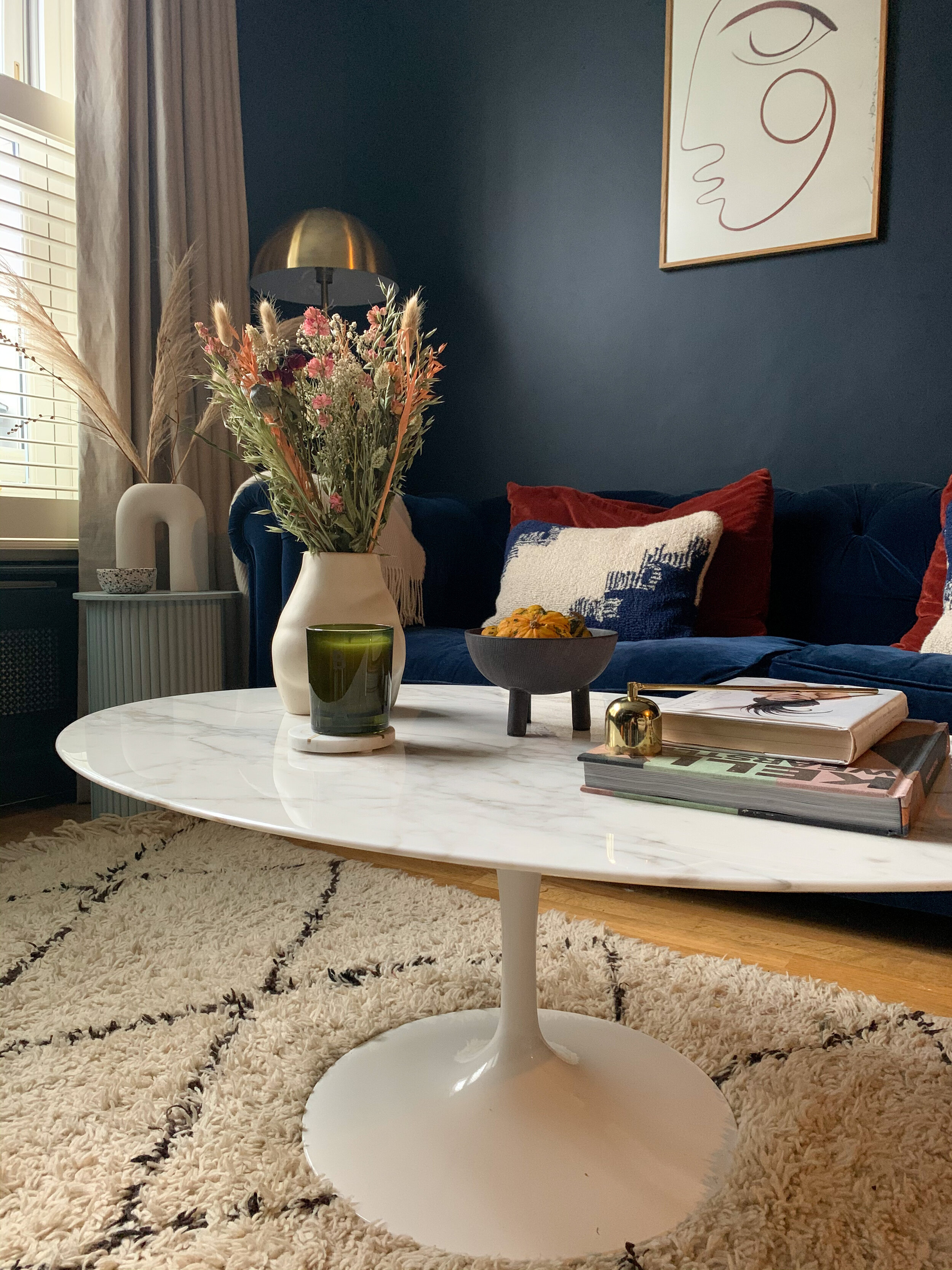
For this campaign, Heal’s invited me to select a design classic from their range (for full transparency the table was received as payment for this blog and corresponding Instagram content). They have so many truly classic design pieces but like I said, there was one piece I’d had my eye on for many years, Eero Saarinen’s tulip coffee table. The table design came about when Saarinen vowed to address the "ugly, confusing, unrestful world" he observed underneath chairs and tables, the so-called by him "slum of legs." A five-year design investigation led him to the revolutionary Pedestal Collection, introduced in 1958. This table was designed over 60 years ago and still looks every bit as relevant and modern today, with it’s original curves and it’s glossy, deep veined marble top. Ours is the Calacatta marble with gold and brown veining and it is beautiful.
I think one of the true marks of a design classic is it’s ability to work in a range of different settings. This table would look equally as at home in an industrial warehouse, or grand Parisian apartment, as it does in our Victorian terrace in South East London. I am already hoping it will become an heirloom piece which we can pass down to the children, if they inherit my excellent taste in furniture of course ;-)
On a purely practical level, having a coffee table in the lounge is a bit of a revelation! We’ve never had one before on the grounds that I have never found one I liked enough, and it also would have been a bit cramped in here with the dining room through lounge set-up. However the dining table is soon set to move into into the kitchen, meaning we won’t have so much crammed in and the coffee table will have room to breathe. So yes, I know having a coffee table is not new, but it’s new to us in this house, and having somewhere to put your tea/coffee/wine down is brilliant. Always with a coaster though…it took a few reminders but the kids have finally grasped the coaster rule. I didn’t wait 15 years for this table, for it to get a juice stain on it! I also love the fact that I have a new styling spot. For the moment it is styled for Autumn with dried flowers, my favourite candle, a knobbly gourd and some crab apples in a Duck bowl, also from Heal’s. But I’ll switch it up with the seasons.
I mentioned earlier how many design classics live under Heal’s roof, and I thought I’d share some of my other favourite classic design pieces.\
Eero Saarinen’s Womb chair
Eero Saarinen can do no wrong in my eyes. We also have the Womb chair he designed, it’s a replica but we’ve had it over ten years, recently had it reupholstered, and it’s one of my favourite things in our house. It’s also ridiculously comfortable, which is as it should be for a chair with this name. It was designed to meet his friend ground breaking architect Florence Knoll’s request for “a chair that was like a basket full of pillows” . Heal’s stock this chair in a very striking red, which would look incredible in a simple white room, or against a dramatically dark teal wall for example.
Our Womb chair
Ligne Roset Togo
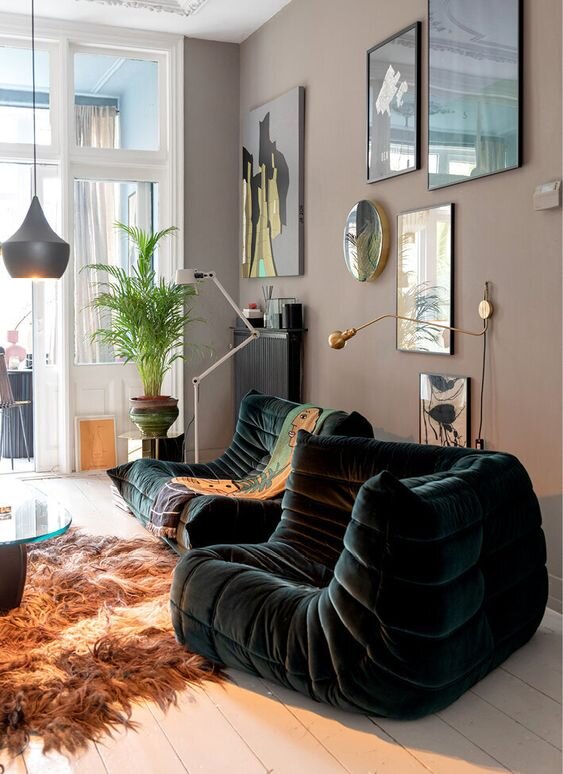
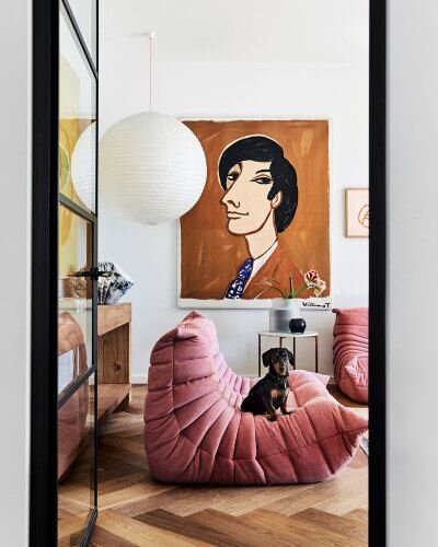
This one needs very little introduction. The ultimate in 70’s lounge seating, the Ligne Roset Togo is a super cool customer. It comes in a variety of colours and materials and is perfect for a relaxed snug, or if you have the room, the full set in an open plan space looks amazing! Our friends have just bought a second hand set of Togo’s and I can’t wait until we are allowed round to their house to sink into them with a cocktail in hand.
The Flos Snoopy Lamp
I have a major weakness for lighting and Heals is the best of the best when it comes to their lighting range. They currently have 15% off all lighting until Sunday so nows a good time if you’ve been thinking about making a purchase. I had a hard time narrowing it down to just a couple of my favourite classic lighting designs so I went with the two I am currently crushing hardest on. The Flos Snoopy lamp will give any side table or desk a cool, sophisticated edge. As the name suggests, it bears more than a passing resemblance to a very famous cartoon dog, but it’s a serious design heavyweight designed in 1967 by iconic lighting designers Achille & Pier Giacomo Castiglioni.
Flos Snoopy lamp - Image from Est Living
The 9602 Floor Lamp by Gubi
I can’t tell you how much I love the 9602 Floor Lamp and how much I want to give one of them a home in my lounge. Designed by Paavo Tynell in 1935, this lamp was nicknamed the ‘Chinese Hat’ thanks to it’s distinctive conical shad. It also comes with a very on trend, but nevertheless classic, rattan shade as well. Considering how long ago it was designed, it doesn’t feel remotely dated, and it sits so well in both neutral, minimalist rooms, and more modernist rooms with splashes of colour.
Image credit - Gubi
The Cesca chair by Knoll
The Cesca chair is having a major moment at the erm, moment, thanks to the huge trend for all things cane. That aside, it’s a beautiful piece of design which once again, has stood the test of time. It was designed way back in 1928 by Marcel Breuer and was a groundbreaking design at the time because he managed to marry traditional craftsmanship with industrial methods and materials in the form of the cantilevered steel frame. It has spawned many imitations but none can quite match this for it’s elegant design.
There ends my favourite design classics but there are so many more incredible pieces at Heal’s which didn’t make this line-up. They have a huge range in store and with something like this, it’s always worth going to see the quality and craftmanship in person and up close.
I hope you enjoyed this dose of dreamy design!
J x


