My Hallway Makeover plans...giving a dark and narrow space the wow factor!
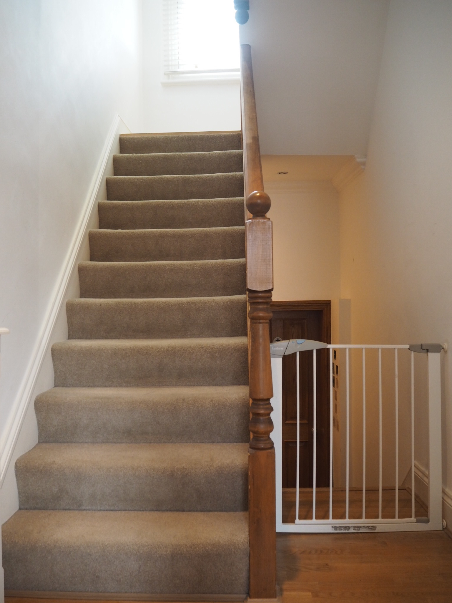
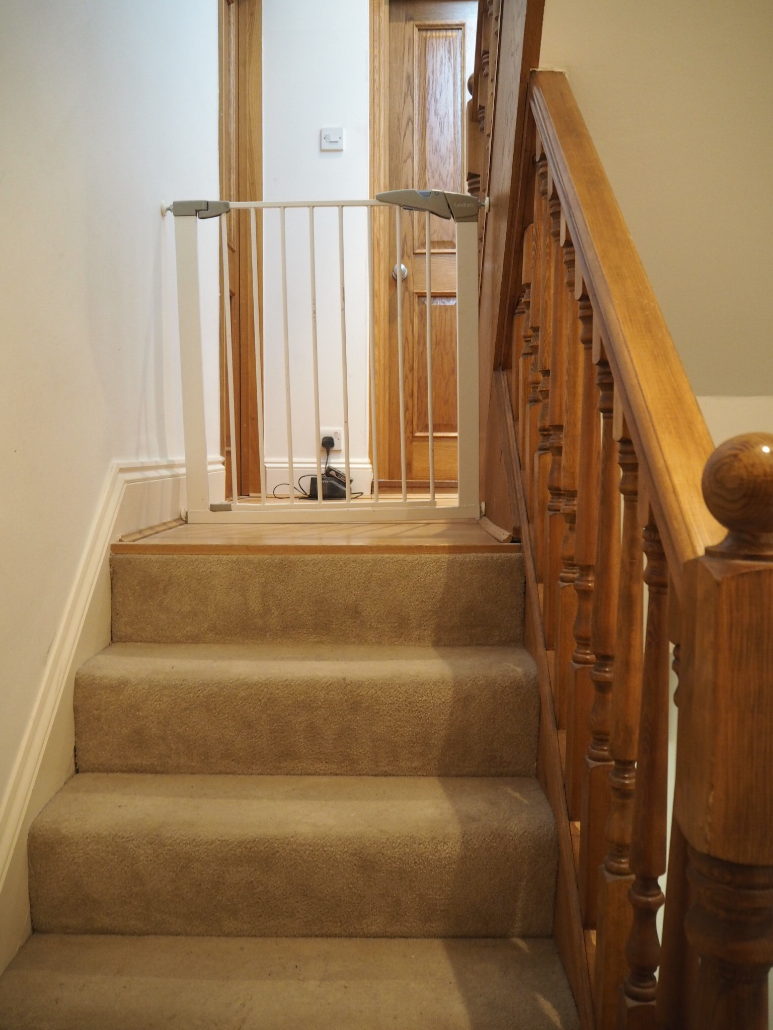
I must be a glutton for punishment. As the completion of "the longest bathroom renovation in history" draws tantalisingly close, I am already well and truly on to the next thing...or things. Because in the next few weeks I am going to be tackling my bedroom, my dining room and my hallway. Today I'm talking about my hallway plans. Much like everything else in the house, it's been a long time coming. This is what it currently looks like....
I know...no words. Well, one word maybe...BEIGE! It's a miracle I've lived in this habitat for so long. Apart from a small makeover for my Amara Christmas styling challenge last year, the hallway has been left in it's near original state since we moved in. Mainly because we knew we were going to be ripping the bathroom and various other things out so there was no point decorating until all that was finished. Well now it (nearly) is! And so without further ado I've decided to keep the momentum going and get shit done. Which means you're going to see lots of makeover action on this here blog over the next few months. Let's not talk about the fact this means I'm not going to get my house back for at least another two months.
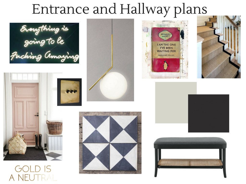
The good thing about all of this taking so long is that I have had plenty of time to think about how I want it to look. The biggest challenge for me when planning this hallway was that I wanted it to have impact, while also creating flow and cohesion with all the other rooms that come off it. After much chopping and changing I think I've come up with a plan that does this and I've created this mood board in an attempt to show you the inside my Pinterest addled brain.
So here's what I'm thinking...
1) I'm sticking with the pink door
At one point I was dead set on changing the existing Calamine pink door, but I've fallen back in love with it. Since I'm all about the flow, it makes sense to keep it pink because if you're standing in our Calamine pink kitchen at the bottom of the hallway, the eye is drawn naturally along the hallway towards the door in the same colour. The pink will also provide a nice contrast when you emerge from the uber glam black bathroom and down the stairs. Plus it will look fabulous with my new monochrome Bert & May tiles...
2) Monochrome tiles
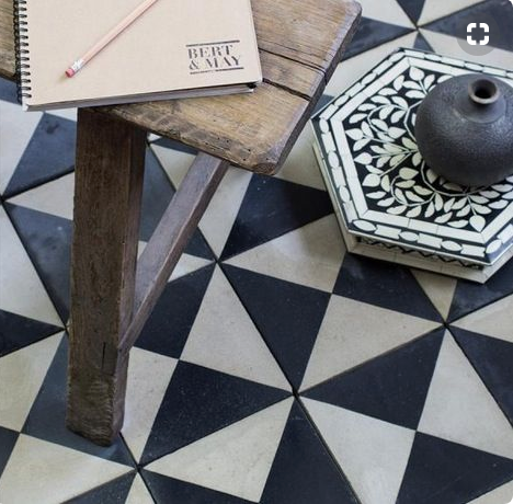
Given the narrowness of the hallway there are few opportunities to make an impact. I definitely didn't want wallpaper, I prefer something I can paint over when it gets covered in grubby fingerprints and bike/scooter handle smudges. Which leaves the floor. I've gone for the black and white Churriana tiles from Bert & May and ordered some plain tiles to cut up and use as a border round the edges. I went for the monochrome look so I didn't need to worry about it working with the living room and kitchen if (when) I redecorate in the future. And if I want to change the hallway up again, the monochrome tiles will work with every and any colour I might want to use.
Bert & May's Churriana tiles
3) 50 Shades of Grey
Having already started painting the staircase out in Little Greene's Lamp Black I can honestly say I absolutely love the very dark charcoal colour and will definitely be continuing that all the way up. The colour is elegant and a bit dramatic particularly in contrast to the pink door and light grey walls. However what won't be staying the same is the white treads I so painstakingly prepped and painted last year. Six months later and they are looking pretty grubby, so I've decided to paint them and the skirtings out in Lamp Black too. The walls are going to undergo a colour change too, just a slight one but I'm going from Little Greene's French Grey Pale to French Grey Mid. I know, I'm wild....but the Pale, which I only painted up to the first floor for the shoot last year, is just too light and marks too easily. I think the Mid will fare better.
Black staircase and light walls - Image via JJ Locations
4) Laminate and grubby beige carpet be gone
Our house is tall and narrow and as such we have four flights of steps and four separate landings. There is horrid beige carpet on the steps and horrid laminate flooring and dubious beading on each landing. Not for much longer. Last year I ripped the horrid beige carpet off the first flight of steps and painted them and it was one of the most satisfying things I have done in the house so far. Now it's time for the other stairs to lose their grubby covering and get a well deserved new coat. I'm thinking a classic Jute Herringbone runner like this one from Kersaint Cobb, whipped at the edges and then covering the landings too, hence ridding us of the dodgy laminate, beading and grubby carpet in one simple and stylish sweep. Yes! And yes I know this is technically beige too but this is chic and stylish, as opposed to shabby and stained so we're all good.
5) The lighting
I had planned to use the Flos IC2 light in our bathroom but it didn't work out because of the ceiling height. But I'm determined to have one in my house and this is my chance. David has never been keen, and is still not keen, but this is one of those occasions when I'm doing it anyway. I'm nothing if not persistent. I love it's sleek, elegant and unfussy design and I think it will tie in beautifully with the simple colour scheme.
You will be mine! The Flos IC2 - Image via Quincoces Drago & Partners
6) The art
Truth be told I'm feeling a bit uninspired in the art department at the moment. I'm mega fussy about what we put on our walls, but I've usually got my eye on something and will bide my time until I've got somewhere for it to go. I had the Ex Animo print, by Faith 47, on my wish list for well over a year until I finally found it's perfect home above our bed. But I currently have nada on my wishlist...oh except a Harland Miller original (see below) but I have no plans to sell a kidney...just yet. So I'm on the hunt. A neon sign is one option. I thought I was over them. It's fair to say they have been used a lot and I hate to be predictable BUT here's the thing...I'm so NOT over them. Because let's face it, they are bloody cool. Ours would be an Arctic Monkeys lyric because I think Alex Turner is an actual genius. However I'm yet to be 100% convinced (by myself) that this is the right course of action. So this one is tbc.
The holy grail...a Harland Miller original - Image via Remodelista
7) The details
If you haven't yet seen the Smoked Gold switches and sockets offered by Dowsing & Reynolds, then ooooh you are in for a treat! I've ordered a job lot so it's bye bye to the standard issue white plastic plugs and chrome switches and helloooo to the sexy Smoked Gold with Matt Black toggles. I have also snapped up this little Raleigh bench from Made.com. It's unusual for me to buy furniture on a whim but I saw this and thought it would be the perfect addition to the hallway. We are approaching the point of no longer having a buggy clogging up the narrow walkway (which is both brilliant and heartbreaking in equal measure) and this bench is slimline enough not to encroach on the space too much and will be ideal for little and big people alike to sit and put their shoes on.
So that's what I'm cooking up next for the Gold Is A Neutral house. Next week, I'll be revealing my new office space (even though we don't have an office) so come back to find out how I managed to create an extra room.
Opening image credit - The Laslett hotel


