The 7 insider secrets to a perfectly styled Instagram-ready room
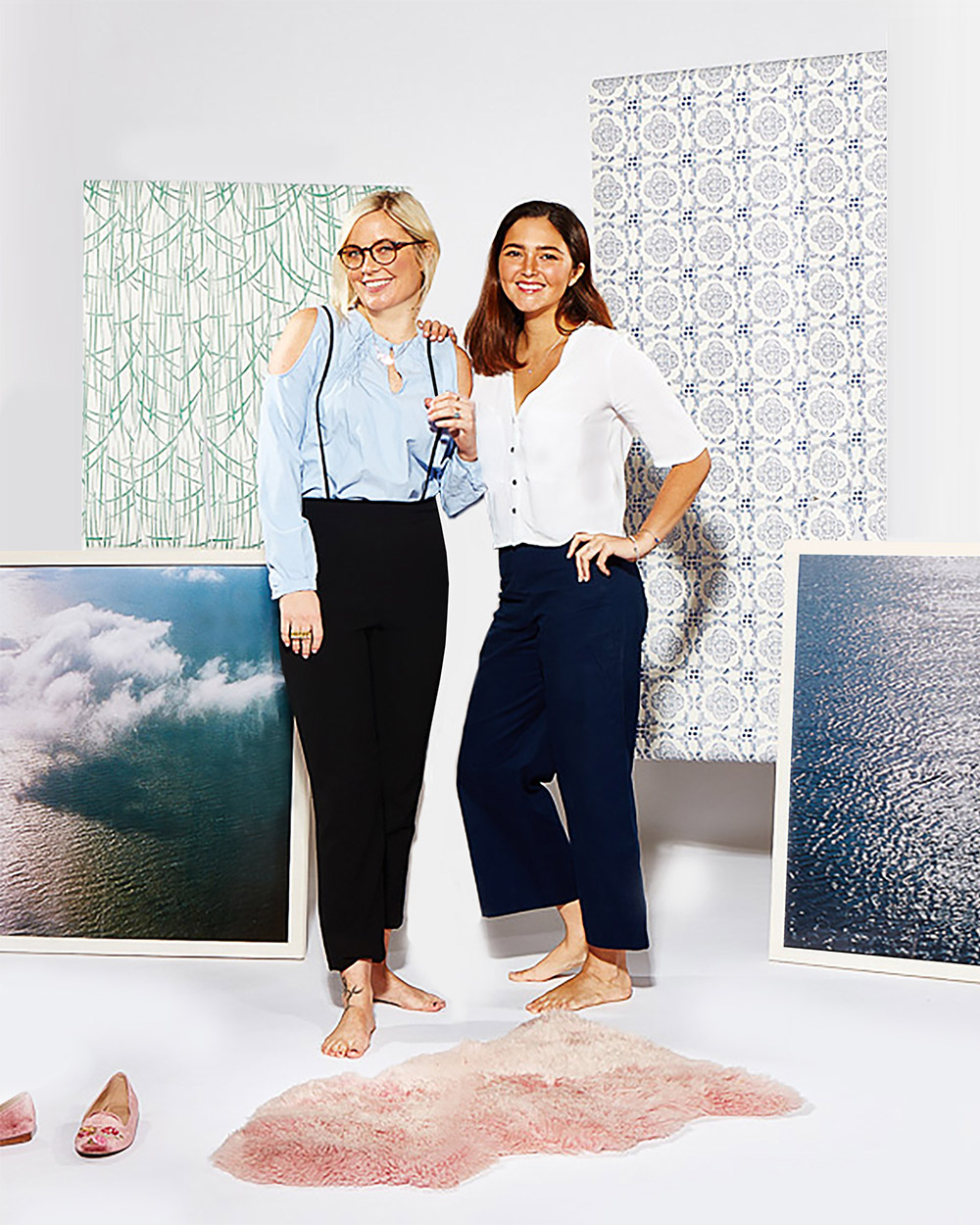
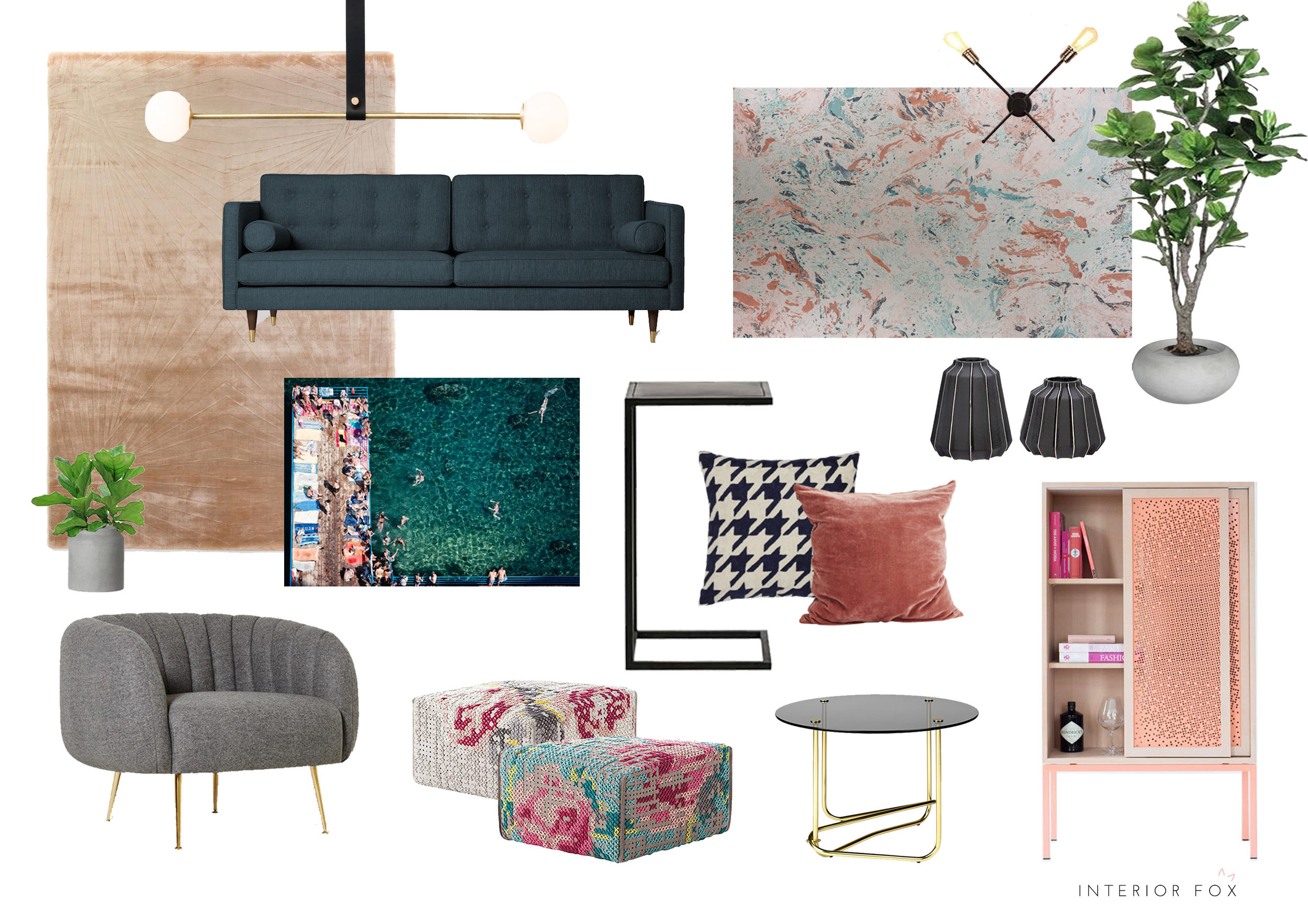
I came across three foxes last week. One of them tore Nellie's new silver shoes apart. Livid. Thankfully, the other two were a lot more civilized and showed no interest in devouring my shoes. I'm talking about Mariana and Jenna, the lovely ladies behind soon-to-be launched E-design service Interior Fox and the masterminds behind the beautiful and super cool scheme above. I'll take all of it! (Scroll through to bottom for sources)
Interior Fox duo Jenna and Mariana
The Interior Fox concept is all about offering an affordable, boutique and trend led design service. You set the budget, then Mariana and Jenna set themselves two weeks to take you through a series of design phases to help them hone and curate your dream room. Then, at the end of the two weeks you will receive a mood board and a shopping list of everything you need to go and buy to make that dream a reality. Simples.
The girls will launch their brilliant new business to the world in a few weeks time but before they do, they sat down with me to share some of their top insider styling secrets and how you can transform your room from so, so to so woah!
1) Lighting
"Lighting is really important", says Mariana. "A lot of people only think about it at the very end of a project. But it's important to plan your lighting well in advance because it can really make a room feel amazing."
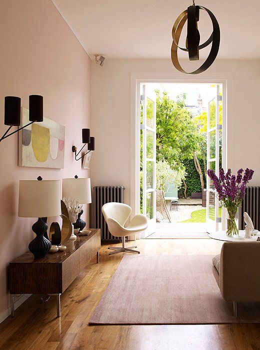
"It's all about layering," says Jenna. "You want to try to make the room glow with multiple sources. If you have spotlights, bring it down to the floor with maybe a floor light. And uplight things that are on top of a sideboard. And always think about whether you can put in a statement pendant light somewhere." They also recommend getting dimmers fitted to give you different options for different times of the day. "You want to avoid anything too stark," says Mariana. "If a room is too bright it can make people really uncomfortable."
Layers and layers of lighting. Image - Mel Yates/IPC Syndication
2) Art
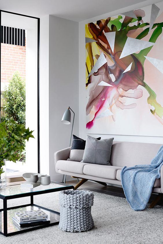
"We value art to be just as important in a room as a piece of furniture", says Jenna. "We do love affordable prints and places like Society 6 but having a legitimate piece of real art can really elevate a space from basic to high end. It could be a contemporary artwork, photographs, custom drawings or paintings."
But how do you find cool original artwork which doesn't cost the earth? Jenna recommends regularly checking in on websites like Degree Art for work by up and coming art school graduates and PDN for emerging photographers. Saatchi Art also has a huge collection if you've got the time to go through it. Jenna and Mariana are also regular visitors of First Thursdays, where a number of London galleries hold open nights.
Image - Design Milk
3) Texture
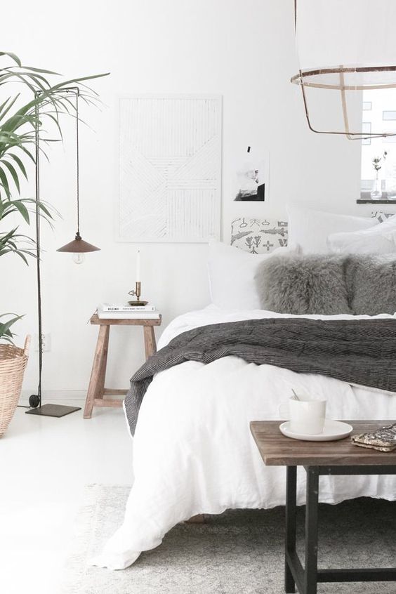
Texture is everything if you want to give your room that extra edge in the style stakes. And there's no exceptions. "Even if you want everything white and minimalist, you have to at least add texture in cushions and throws etc because that's what makes everything interesting." says Mariana. "If everything is plain, just add a cable knit cushion or blanket or a Mongolian lambswool stool. Switching up the texture will make the rest of the scheme pop."
Image - Audrey Yap
4) Layer your rugs
"I'm not a huge fan of wall to wall carpet. But we love to layer rugs", says Jenna. "So for example we'd start with a hardwood floor and then throw a seagrass mat over that, followed by maybe a cowskin and then if we were feeling really bold we could put a sheepskin on top of all that. It sounds mad but it works."
Image - Glitter Guide
5) Embrace Eclecticism
Don't get bogged down in everything being matchy matchy otherwise you run the risk of your house looking like a show home.
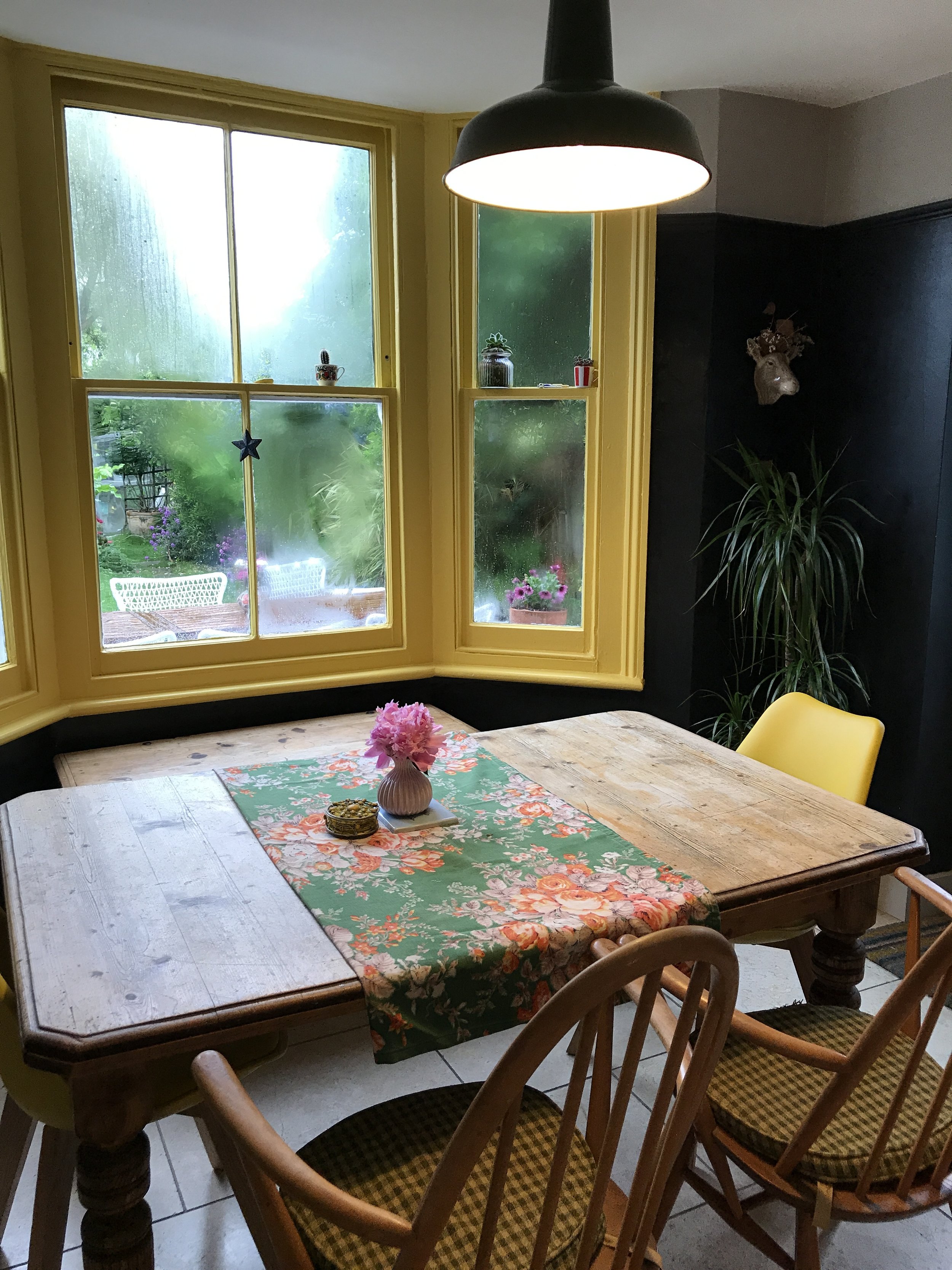
"We always make sure we mix it up a bit," says Mariana. "If there's too much symmetry throw one aspect off. So we'll go for all different dining room chairs, or have all the same style but in different colours. Anything to make it not feel less basic or monotonous."
Image - SFGirlbyBay
6) Power of three...and two
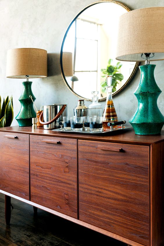
However Mariana and Jenna are not against all forms of symmetry and they particularly like three of the same object displayed together, or two of the same lamps. Jenna says: "Odd numbers are good for styling. And pairs are perfect for light fittings. We love a pair of lamps on a sideboard, or two suspended pendants lights on either side of a bed. I'd throw off the overall look with an odd number of pillows or slightly different bedside tables."
Image - My Domaine
7) Wallpaper
If you're a regular reader of this blog, you'll know I'm all for a statement wallpaper. But Mariana and Jenna say the vast majority of their clients are wary of it. But if you get it right, a bold wallpaper will make your home stand out amongst a sea of beige.
"We love wallpaper!" says Mariana. "Put art on top of wallpaper for extra dramatic impact. And then have wall lights shining on to the artwork on top of the wallpaper. It's bold but has real wow factor."
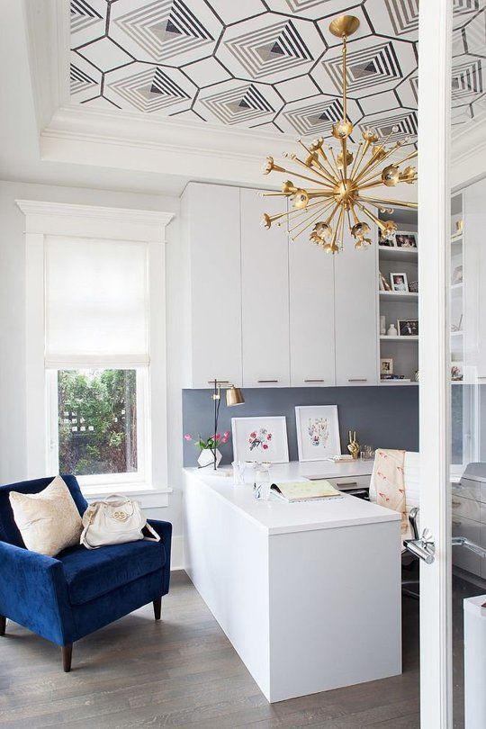
Jenna also recommends treating your ceiling as fifth wall, which I love! "I'm moving into a new house", she says. "And the first thing I want to do is wallpaper my ceiling, paint the walls a really bold colour and then fit a statement sputnik light in the middle of it all. I love that look."
Image - Apartment Therapy
Source list for the Interior Fox moodboard
Stardust Pink Rug - Floor Story *splurge
Untitled light - Eporta *splurge
Metallic Saffron and Turquoise Makrana Wallpaper - Matthew Williamson
Porto Sofa in Agate Blue - Swoon Editions
Monroe Grey Armchair - Swoon Editions
Coffee Table - Gubi on Clippings
Black Side Table - Maisons du Monde
Footstools - GAN *splurge
Eleonora Pecorella art - Saatchi Art *splurge
Navy Houndstooth pillow - Trouva
I don't know about you but I'm feeling inspired. I LOVE the idea of wallpapering one of my ceilings. Hmmm, hallway maybe? What do you think?
Find out more about the brilliant Interior Fox service here


